
Why is Responsive Web Design So Important?
Responsive web design is crucial because it ensures a seamless user experience across all devices, improves site accessibility, boosts SEO rankings, and increases engagement, leading to higher conversion rates and customer satisfaction.
Gone are the days of responsive website design (RWD) being a mere trend. In today’s mobile-first landscape, it is a fundamental necessity. To reach and engage your entire target audience, you need a website that flawlessly adapts to the diverse range of devices they use: from smartphones to tablets of all shapes and sizes.
Just look at the top 10 most visited websites globally: Google, YouTube, Facebook, Instagram: and the list goes on. One thing they all have in common? A laser focus on RWD. These industry leaders leverage flexible images, fluid layouts, and media queries to deliver exceptional design and user experience across any screen.
A responsive design ensures that your website is mobile-friendly, visually appealing on all devices, and equipped with all the design elements needed to keep visitors engaged longer. And while search engines like Google haven’t explicitly confirmed RWD as a ranking factor, they have hinted at its importance on multiple occasions.
Let us discuss all the reasons why responsive web design is important for your company’s website and what you need to know before investing in it.
What is Responsive Website Design?
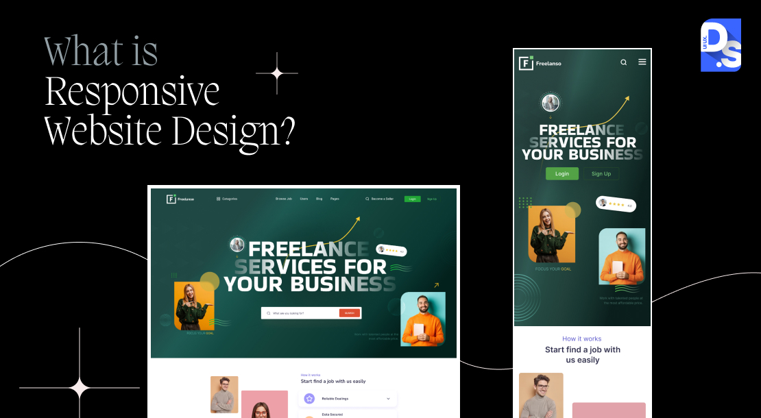
Before we dive into the specifics, here’s a quick explanation of what RWD is and how it works. RWD is a design approach where the goal is to ensure your website seamlessly adapts to any screen size, from desktops to smartphones, and delivers flawless user experiences.
A responsive website adjusts its layout, images, and content to perfectly fit the user’s screen, eliminating the frustration of clunky desktop website layouts on tiny phone displays.
Imagine a potential customer landing on your site from their phone only to be met with overflowing columns and jumbled text designed strictly for a desktop monitor. Frustration sets in, and a sale is potentially lost forever. RWD solves this problem by using flexible grids, CSS media queries, layouts, and images.
These elements allow your website to dynamically adjust to the user’s screen size, maintaining intuitive navigation and clear content presentation.
Another way to create websites that can respond to different devices is with adaptive design..
Responsive design vs. Adaptive design: which is better? That’s a whole other discussion.
However, it is generally acknowledged that most successful websites prioritize RWD for its ability to provide consistent user experiences across wider ranges of devices and screen sizes.
Importance of Responsive Web Design
Why responsive web design is important? It is mainly because of device fragmentation. The modern digital landscape is a kaleidoscope of devices: smartphones, tablets, desktops, laptops, and even wearables, each boasting varying screen sizes, resolutions, and capabilities. This “device fragmentation” presents a major challenge for website owners: how do you consistently deliver seamless user experiences across this ever-expanding spectrum of devices?
Enter responsive web design. RWD websites dynamically adjust their content, structure, and visuals based on the specific device accessing them. This is achieved through flexible grids, fluid layouts, and responsive media queries; essentially, the website adapts to the user, not the other way around.
Embracing Fluidity
Just five years ago, RWD relied on fixed breakpoints tailored to specific devices and resolutions. However, the rapid rise of high-resolution displays and vertical smartphone browsing habits has compelled web designers to evolve and adopt a more fluid approach. Modern responsive websites prioritize fluid design, meaning elements dynamically adjust/resize based on the viewport’s (the visible portion of the screen) size and orientation.
This approach caters to high-resolution screens, vertical phone scrolling, and the ever-evolving user landscape. With fluid design, web designers use techniques like percentage units and max-widths to ensure layouts adapt to both mobile and desktop viewports without distortion.
What’s the ultimate benefit of websites embracing fluidity for users? Users no longer have to contend with excessive resizing, scrolling, zooming, or panning, which leads to more enjoyable and engaging experiences. For website owners, this translates to lower bounce rates, increased time spent on the site, and ultimately, higher conversion rates.
Why Responsive Web Design is Important?
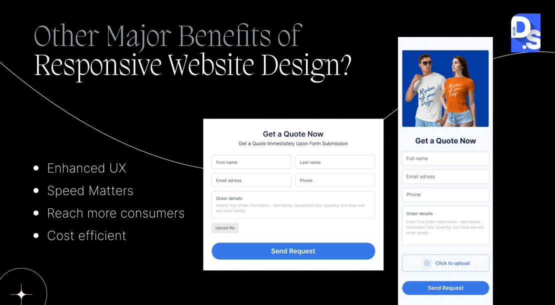
Let’s quickly go through the wide variety of benefits of embracing responsive web design:
Streamlined, Cost Efficient Maintenance
No more maintaining separate mobile and desktop websites. RWD eliminates this expense, allowing you to invest in a single, adaptable design that caters to all devices. Updates and maintenance become a breeze. A single change spreads across all website versions, saving designers time and resources.
Enhanced User Experience (UX)
As established above, RWD eliminates the need for excessive zooming and scrolling, allowing users to access websites and website content quickly and efficiently. Combine that with fast loading times and improved navigation, especially on mobile phones: and you have the perfect recipe for a world-class online store.
Increased Time-on-Page and Conversion Rates
Time spent on a website indicates user engagement and satisfaction. Responsive design fosters Time-on-Page metrics by making content readily accessible. Such positive user experiences directly impact conversions. That’s why responsive websites have longer visit times and higher Conversion Rates than their device-specific counterparts.
Improved SEO Rankings
At its core, SEO revolves around happy users. By prioritizing UX through responsive web design, you create a ‘happy’ online presence consistently delivering satisfying, multi-device experiences. This presence will translate to higher search rankings, higher user engagement, lower bounce rates, and all sorts of positive signals that Google and other search engines value when determining the relevance, quality, and ranking of websites.
Once Google starts favoring responsive websites in their search rankings, the website owners get quick access to business-friendly features like Google Discover which is exclusive to mobile devices. This further enhances the websites’ discoverability.
Speed Matters
RWD eliminates the need for separate mobile and desktop versions, simplifying website management. This translates to a single codebase that adapts to all devices, reducing server load and complexity. This quality of RWD is especially beneficial for companies that have mobile-only websites. That’s because traditional mobile websites often require additional resources like mobile-specific stylesheets.
By converting a mobile-only website to a responsive one, you get rid of all this redundancy; all devices access the same consolidated codebase, decreasing the number of HTTP requests users’ devices have to make. Fewer requests and fewer data transfers translate to much faster loading times.
On top of that, the responsive images on responsive websites resize dynamically based on the device. That means users don’t need to download device-specific assets, every time they visit the site. This drastically upgrades the loading process, particularly for mobile device users with slower connections.
Content Consolidation
By creating a single, responsive site, you avoid the confusion that often arises when maintaining distinct sets of content for mobile and desktop versions of a website. With responsive design, you have a single source of ‘truth’ for your content.
Reach More Consumers
Even in a hypothetical world where the practical or SEO benefits of RWD are absent, responsive web design (RWD) would still be an economical imperative. That’s because the mobile commerce revolution is undeniable. In the first 4 months of 2024 alone, mobile commerce generated a staggering $156.9 billion in online spending.
That was a 9.8% year-over-year increase and this sector is only getting bigger. Adobe forecasts mobile apps and websites overtaking desktops again during the upcoming holiday season, capturing a projected 52.5% share of online revenue.
Imagine that nearly half of your potential revenue vanishes during the holiday season just because your website isn’t all-device-friendly. Without RWD, you risk alienating a significant portion of your customer base who prefer the convenience of shopping on websites on their mobiles or laptops. If your site is not accessible at all times, they’ll simply turn to competing sites that are.
RWD: The In-Store Shopping Weapon
The dominance of mobile shopping extends beyond online transactions. According to a recent survey by Google, 56% of in-store shoppers use their smartphones to research items or compare prices while physically inside stores. Customers are increasingly turning to their devices for real-time product information, bypassing traditional sales interactions.
Imagine a customer in your store, eager to read reviews on a product they’re checking out, only to be met with a clunky, slow-loading, non-responsive website. This will either force them to engage with a salesperson (modern shoppers hate doing that) or it will drive them to a competitor who offers seamless mobile browsing experiences.
Social Sharing Powerhouse
Responsive, mobile-friendly websites are easier to share on messaging boards, social media platforms, and text messages. That’s why many responsive web designers prioritize adding built-in social sharing capabilities to their sites. Each share exposes your brand and content to a wider network, potentially attracting new customers.
New Tools Are Making RWD Easier

The RWD toolkit is constantly maturing, making it easier for designers and front-end teams to craft exceptional user experiences across an ever-widening range of devices. Gone are the days of basic device-class detection (phone, tablet, desktop); modern RWD leverages media queries, fluid grids, and flexible visuals that allow for precise adjustments based on the user’s specific browser window size and screen resolution.
This granular control guarantees optimal website performance and aesthetics on both smartphones and high-resolution 4K desktop screens. Media queries can be used to deliver high-res images to 4K and 5K Retina screens, while automatically serving smaller, optimized versions to mobile devices with limited bandwidth.
Final Take
Creating visually stunning and responsive websites is not only easier than ever, but it’s also more essential than ever for business success. By partnering with a qualified responsive web design services company that leverages the latest tools and techniques, you too can easily create a website that adapts flawlessly to any device, captivating users and driving sales across all devices!
comments
Add comment