
What is The Neubrutalism Or Neo Brutalism Web Design Trend
Neubrutalism Trend in Web Design
Neubrutalism in web design is a trend characterized by minimalist aesthetics, stark typography, and a raw, unpolished appearance. It emphasizes simplicity, functionality, and a departure from traditional design principles, often using bold colors and asymmetrical layouts.
In the wild world of web design, there is a new ‘cool kid’ on the block: Neubrutalism. Characterized by strongly defined shapes, audacious ‘in-your-face’ fonts, and daringly high contrasts, neubrutalism in web design is a bleak departure from the sleek contours of minimalism, and the raw, unforgiving aesthetics of brutalism. Its unapologetic embrace of rawness and imperfection sets neubrutalism apart from pretty much every other web design trend in the 21st century.
That is why neubrutalism is more than just a stylistic preference; it is a statement of defiance against the notion that web design must always conform to ultra-polished and heavily-refined aesthetics. In other words, neubrutalism deliberately breaks the conventional norms of traditional web design to ‘up the ante’ and create unforgettable website experiences for visitors.
It defies the conventional norms of web design, favoring raw and unadorned HTML structures (reminiscent of the early 90s UI design ethos) over fancy, over-complicated interfaces. It challenges traditional color theory, almost exclusively uses unconventional typography, and at every chance, favors simplicity over complexity.
Here are some other core characteristics of neubrutalism that illustrate how this design trend goes against traditional design sensibilities and pushes the boundaries of what is considered ‘appropriate’ in the world of digital design:
- Raw and Unprocessed Aesthetic: Neubrutalism embraces a raw, unprocessed aesthetic to create a sense of authenticity and vividness.
- Bold and Contrasting Colors: To challenge conventional color theory and create a visually striking viewing experience, of neubrutalism in web design employ bold color palettes with contrasting hues.
- Sharp Lines and Geometric Shapes: Sharp lines and geometric shapes are the go-tos in neubrutalism. They create a sense of order and structure amidst the overarching rawness of the design.
- Minimalistic Layouts: Neubrutalism might be wild, but it has no room for clutter. Clean lines, wide spaces, and plenty of negative space are all ploys neubrutalists use to keep the key elements of their design front and center.
- Emphasis on Raw Emotion: Through the use of clashing colors, stark contrasts, and an overarching sense of visual disruption, neubrutalism seeks to evoke raw emotions.
- Adaptability: Its focus on simplicity, functionality, and authenticity translates well across all devices, screen sizes, and formats. Neubrutalist websites typically deliver consistent user experiences across both desktop and mobile devices.
Despite these stand-out characteristics, neubrutalism does not exactly have everyone swooning in the world of web design. Many in the design community are still figuring out how to feel about chaotic web graphics, razor-sharp color contrasts, and design layouts that can be a bit of a headache to implement.
Let us dive deep into the unconventional world of neubrutalism in web design, answering important questions like:
- What is neubrutalism in web design?
- How does brutalism relate to neubrutalism in web design?
- What are the main aesthetic features of neubrutalism?
- Prominent, real-world examples to neubrutalism in web design.
What is Neubrutalism or Neo Brutalism in Web Design?

To understand neubrutalism, we first need to understand its roots in brutalist architecture. Brutalism is an architectural design movement that emerged in Europe & North America in the 1950s. This design style was characterized by its stark, utilitarian aesthetic. The term ‘brutalism’ itself was derived from the French phrase ‘béton-brut,’ which means ‘raw concrete.’ In the 90s, brutalism found its way into the world of UX and UI design. This digital offshoot of brutalist architectural design favored simple, functional elements that prioritize content and usability over fancy graphics and intricate layouts.
Now, brutalism’s stripped-down style might not have been everyone’s cup of tea. But, web designers respected the rebellious spirit of brutalism. That rebellious spirit earned it a dedicated fan club of designers that still cheers it on today.
Neubrutalism built upon the raw aesthetic of its predecessor, retaining characteristics like bold typography, contrasting color palettes, and over-exposed structural elements. On top of that brutalist base, neubrutalism infused brutalism’s rawness with a modern sensibility, incorporating more movement and present-day design elements like animation, illustration, asymmetrical layouts, and new-age typography.
Aesthetic Features of Neubrutalism in Web Design
While the exact origin of the term “Neubrutalism” may be unclear, the term was popularized by web designers like Michał Malewicz in the early 2020s. Since then, its bold and unapologetic approach has resonated strongly both with designers and users who love unique web designs that deliver stimulating and memorable visual experiences.
Here are some of the key visual/aesthetic characteristics of neubrutalist web design:
Clashing Colors
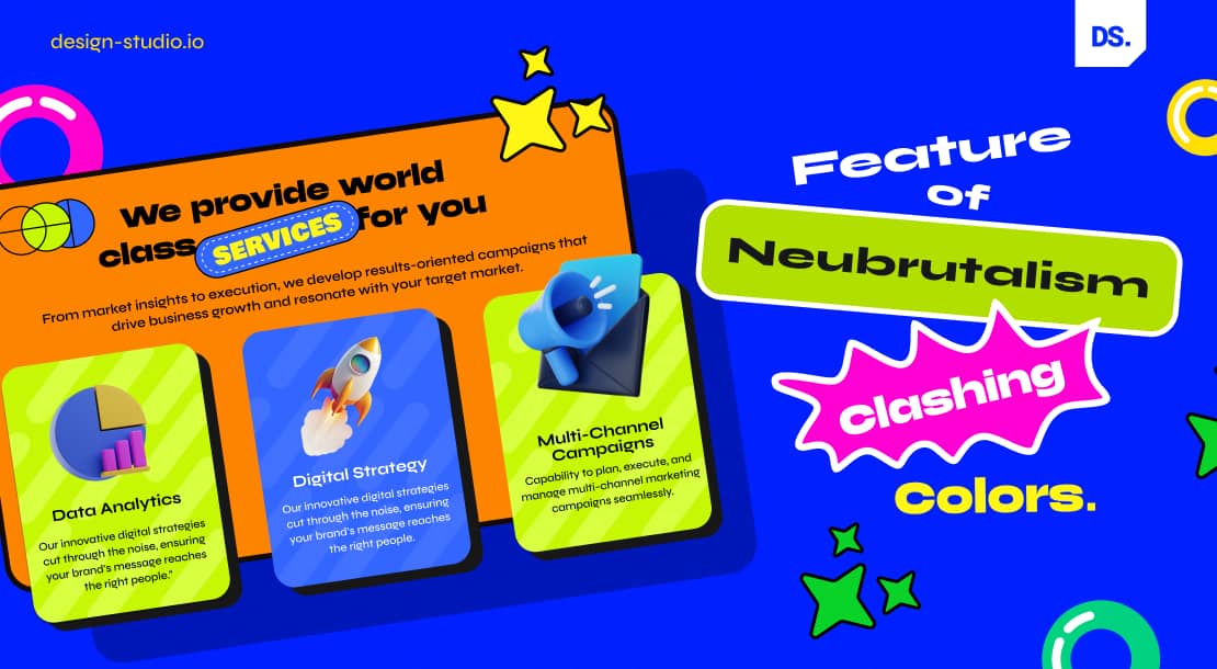
Neubrutalists will not shy away from making controversial color-related decisions like merging pure black (#000000) with vibrant hues like neon yellow (#FFFF00) or fiery orange (#FFA500). That is a practice that most other web designers avoid because they do not want to risk straining the users’ eyes. But, neubrutalism is never afraid to stand out, even if it means causing mild inconvenience for users.
Flat Color Backgrounds
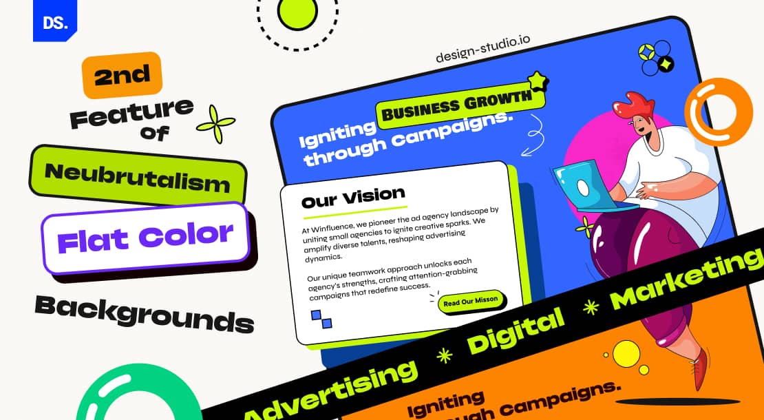
Neubrutalism favors the use of flat color backgrounds because they set the perfect, clutter-free stage for the chaos that is about to follow. The flat color aesthetic serves as the perfect background for bold, legible typography, contrasting brand colors, and visually striking design elements. These elements take center stage and appear to ‘pop out’ on the screen. This approach highlights the importance of color psychology in web design, as the choice of flat colors and high contrast creates visual impact and influences how users perceive and interact with the design. That is why neubrutalism in web design is often likened to the ‘pop art’ graphic design aesthetic of the 60s.
No Shadows
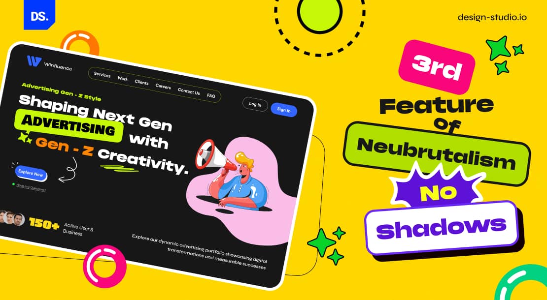
To create the pop-art effect, neubrutalists make many subtle design decisions. Instead of barely visible borders (common in most web designs), they place thick, dark, and well-defined outlines around the design elements. So, instead of soft shadows, users see solid black rectangles around every major design element.
Conservative Typography
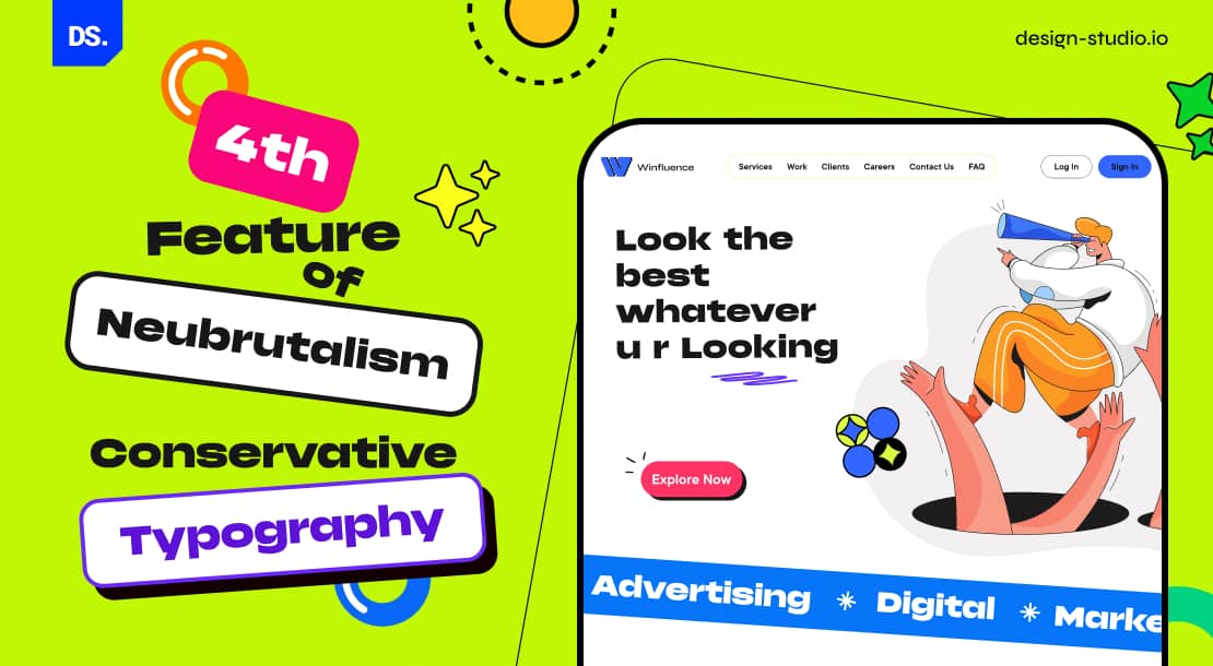
While it is fair to call most aspects of neubrutalist ‘unconventional,’ when it comes to typography, it is a whole different story. Unlike the “cool” fonts used in modern minimalism or classic brutalism, neubrutalism typically opts for safer, easy-to-read fonts. Yes, web designers may stretch or convolute the fonts in weird ways. But, maximum readability is their main goal and they achieve it by making weird backgrounds/colors meet legible, geometrically lucid text.
Computer-Window Pattern
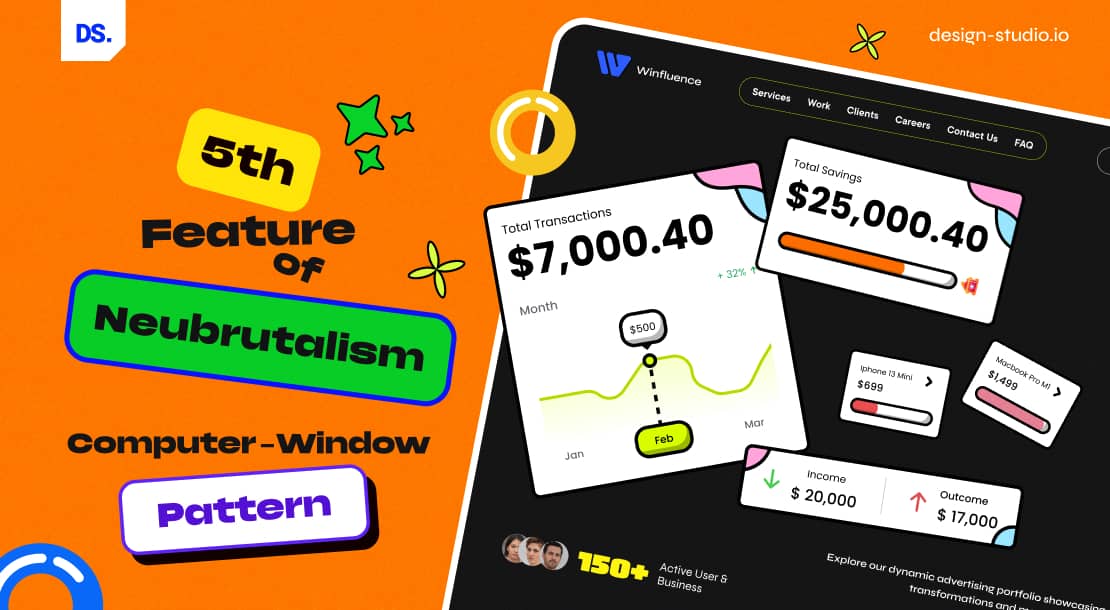
Neubrutalism often incorporates elements of computer windows, such as minimize/maximize buttons. This adds a touch of nostalgia to the viewing experience because users feel like they’re browsing on the classic Windows 7 or Mac interface.
Illustrations and Animations
Illustrations and animations never went along with minimalism or brutalism. But, neubrutalism makes it work. Neubrutalism places modern graphics and animations on flat colors. These contrasting hues breathe life into the design, creating an aesthetic that’s near-impossible to look away from. Many web designers will deliberately choose slightly off-kilter illustrations/graphics to make their work even more eye-catching.
Other ways of achieving this goal include making new-age graphics overlap HD photos and then making all the design elements mobile. As users scroll through the graphics, they get to see a captivating parallax effect. Without such effects, the aesthetic appeal of neubrutalist websites would be a lot lower.
It’s clear from these characteristics that neubrutalism gives designers something that other web design styles/trends typically don’t: the chance to experiment and make unconventional design choices. That’s why several brands, design agencies, and individual web designers across the world have adopted this design style with open arms.
Real-World Examples of Neubrutalism
Here are some real-world examples of neubrutalism in web design:
Atomby Shopify Theme by Whiley Mai: Flat colors in the background. Bold headings. A contrasting color palette. This Shopify theme nails the neubrutalism web design vibe with its edgy and minimalist interface.

(Source)
Adobe Figma: No shadows in its imagery. Well-defined, dark-black lines outline each design element, making them ‘pop-out.’ The deliberate clash of vibrant hues, like orange and yellow commands attention. All of these features make Figma’s website a prime example of neubrutalist web design.

(Source)
Gumroad: Gumroad is a platform where independent creators, artists, musicians, and other digital content creators sell their work/products directly to consumers. What better way to attract such users than a super-neubrutalist web design? Muted, clashing colors devoid of gradients. Visually striking illustrations & graphics. Design elements with bold black outlines. Easy-to-read, conventional typography. If you visit the Gumroad website, you’ll even see a bunch of animations pop up.

(Source)
Final Take
Neubrutalism is a design style that champions functionality over form. That’s why it will always be more than just a passing web design trend. Web designers love the relaxed rules of neubrutalism regarding composition/shapes/colors because it enables them to push their boundaries of expression. For brands, the allure is in the promise of websites that not only stand out but also prioritize user-friendly legibility, navigation, and functionality.
As this web design trend evolves, more creative boundaries will be pushed, and hopefully, the Internet will soon be flooded with a wave of innovative and engaging websites that challenge the status quo and redefine the web design landscape. For more in-depth guidance on incorporating neubrutalism into your web design, connect with Design Studio’s UI UX experienced web designers now!
comments
Add comment