
15 Proven Web Design Best Practices to Enhance UX in 2025
The idea of launching a website, only to discover it is outdated or delivers a clunky user experience, haunts every design team. Thankfully, you can easily avoid this pitfall by following an established set of best practices for website design backed by years of research and testing. Here are the top 15 web design best practices to create websites and app’s that consistently convert visitors into loyal users.
15 Web Design Best Practices To Follow
We have compiled a foundational set of 15 best practices for web design and actionable website design tips and insights to turbo-charge your design learning journey and help you create a website that instantly resonates with your audience. Let us get started!
1. User-Centric Design
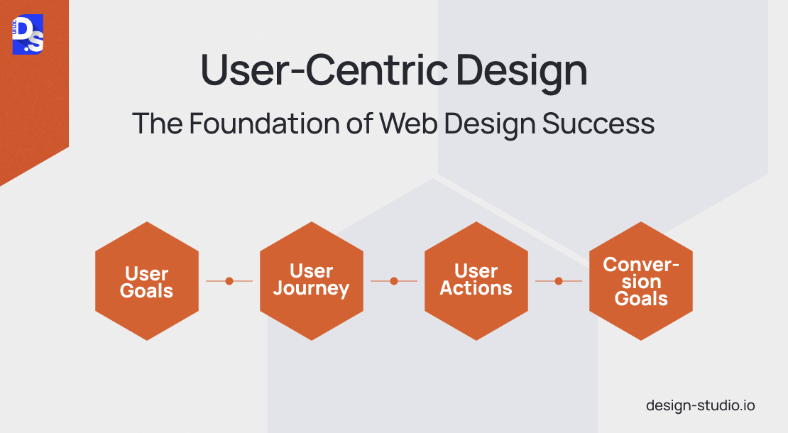
The foundation of any successful website lies in user-centric design. Start building this foundation by defining your website’s core objective – are you targeting potential clients, investors, or employees? What are their goals when visiting your site? Are they seeking product information, price comparisons, or job opportunities?
Use this 4-pillar framework to answer these critical questions:
- User Goals: What information do visitors seek?
- User Journey: Where do they navigate within the site?
- User Actions: What tasks do they aim to accomplish?
- Conversion Goals: What purchases or actions do you hope to encourage?
By answering these questions, you have a clear picture of who your potential users are and how they interact with your design. Use this understanding to create user-centric web design layouts with clear navigation and clean interfaces that effectively communicate the website’s intent.
2. Prioritize Speed with a Simple Design

While aesthetics does play a key role, website visitors typically aren’t here to only admire your website’s intricate design. Their goals are focused on finding specific information or completing a desired action. Unnecessary design elements – those lacking functional purpose – only hinder this process, creating clutter and frustration. From a usability and user experience (UX) standpoint, simplicity is your ally. Here’s how you embrace this principle:
- Color Palette: Limit your color scheme. Industry guidelines suggest a maximum of five core colors for optimal impact.
- Typography: Opt for clean fonts and minimize the use of artistic or script styles. Maintain a consistent color scheme for text, ensuring high contrast against the background. Use a maximum of three typefaces in three distinct sizes.
- Graphics: Integrate graphics strategically. Only use visuals that directly support user tasks. Avoid gratuitous use of decorative graphics.
By following these guidelines, you can cut down your site’s load speed by at least a couple of seconds. Will those seconds make a huge difference? According to a study, B2B sites that load in 1 second or less have 3-times higher conversion rates than sites that take up to 5 seconds to load. Fast-loading websites always secure more conversions.
3. Visual Hierarchy

Large blocks of text can leave users overwhelmed and disengaged. An easy way to combat this is by implementing a clear visual hierarchy. Visual hierarchy is an age-old design principle that states that it is possible to guide the user’s focus through strategic use of text, image size, scaling, emphasis, and other design tricks.
Think of it as putting a visual spotlight on certain sections of your website through design – the more critical the info, the brighter the spotlight should shine. Here are some easy ways you can put the ‘spotlight’ on the most important sections of your website.
- Use color, contrast, scale, and size to highlight important elements, directing users’ attention to what matters the most.
- Break down text-heavy content into digestible chunks, ordered and formatted by importance.
- Avoid overwhelming users with excessive images, graphics, or text.
- Maintain a balance between neutral tones and pops of color to prevent visual overload.
- Highlight crucial information using contrasting colors, font sizes, or distinct headings.
- Strategically use whitespace to guide users and draw their attention to specific information or elements.
- Heatmaps can reveal areas where user attention wanes; use this data to increase the size and contrast of neglected elements on the page.
A cluttered UI where every element is vying for attention is counterproductive. A clear visual hierarchy forms the foundation for a smooth user experience.
4. Optimize User Paths and Journeys

Every path users take on your website, from browsing products to signing up for a service, should be crystal clear and intuitive. User journey mapping is a powerful tool that helps visualize and optimize these pathways. Here’s how to assess the clarity of your user journey:
- Homepage Clarity: Does the homepage instantly communicate the website’s purpose and value proposition?
- Navigation Simplicity: Is the navigation bar user-friendly and easy to understand, allowing visitors to find what they need quickly?
- Essential CTAs: Are crucial buttons, forms, and contact information readily apparent?
- First-Timers: Can a first-time visitor grasp the website’s design and functionality intuitively?
- Task Guidance: Does the design provide the necessary guidance for users to complete specific tasks, such as signing up for a free trial or making a purchase?
Do not proceed with the design until you can answer all of these questions with a resounding “yes”.
5. Draw on tried-and-tested design patterns

While the urge to craft a wholly unique website design is understandable, straying too far from established conventions can confuse users and lead to them abandoning your site. Here’s how to strike a balance between creative expression and user familiarity during the design phase:
- First impressions matter; users usually decide to stay or bounce within seconds. A clear value proposition can significantly boost time-on-page and conversion rates. Craft a clear “hero” section featuring a compelling headline that succinctly communicates the problems your business solves.
- Position primary navigation menus in expected locations – the top or left corner of your webpage. This consistency aligns with user expectations and facilitates effortless navigation.
- Use recognizable icons only, like a shopping cart for an eCommerce site. These familiar visual cues offer a familiar language that transcends language barriers and simplifies user interactions. Also, use buttons that change color on hover. This visual feedback assures users that clicking will trigger an action.
- Consistently position your logo at the top left or center of the website. Ensure it links back to the homepage, providing users with a clear and consistent path back to the starting point.
- For common webpages like “About Us” or “Contact Us,” use established layouts. This consistency fosters a sense of familiarity and reduces the cognitive load on users who already understand these web pages.
- Do not forget to consider the web design conventions within your industry. For instance, eCommerce websites generally follow established design patterns that users have come to expect over the years. If you run an eCommerce site, you should stick to those conventions.
By adhering to these design patterns, you can create a website that feels both familiar and innovative.
6. Maintain Content Hierarchy
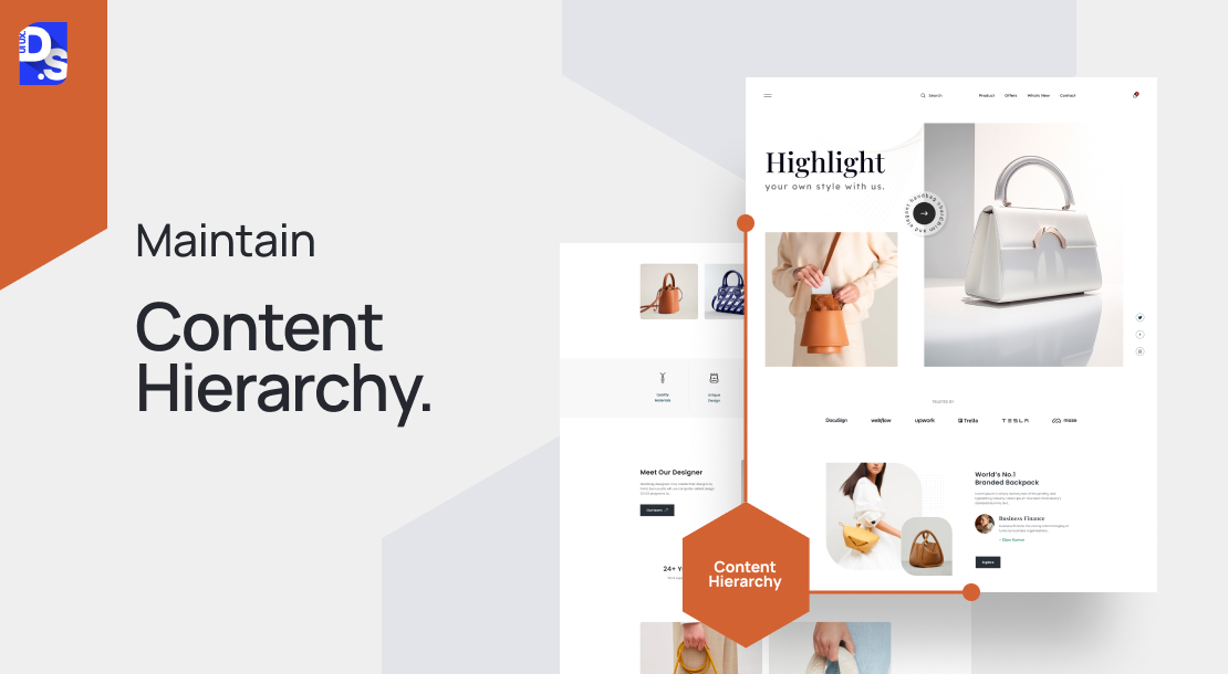
Most visitors won’t meticulously read every word on a page. Instead, they follow established reading patterns, often scanning content in an “F” shape. This means the first few lines of text, along with the beginnings of subsequent paragraphs, hold the most visual weight. To cater to these reading patterns and ensure users find the information they need quickly, prioritize content hierarchy:
- Top Billing: Place crucial information at the top of each webpage. This could be a clear value proposition, a captivating headline, or a concise summary of your offerings.
- Visual Cues: Utilize formatting to highlight important details. Bold keywords, bullet points, and subheadings all act as visual cues, guiding users towards key information.
- Varied Sentence Structure: Avoid monotony! Vary sentence structure to maintain reader engagement. This makes your content more visually appealing and easier to digest.
Dense blocks of text discourage user interaction. By strategically placing key information and employing visual elements to guide user attention, you can ensure your website content is not only informative, but also engaging.
7. Embrace Continuous User Experience

Do not wait until the launch to gather user feedback. Integrate A/B testing and user testing throughout the design process to validate your ideas and ensure they resonate with your target audience. For example, test two landing pages with identical layouts but varying calls to action (CTAs). By analyzing which performs better, you can continuously optimize your website’s main landing page for maximum engagement. These testing processes should not end at launch.
Regularly assess performance and user experience, especially after implementing new features or updates. This proactive approach will help identify and address UX-disrupting bugs before they cause customer churn.
8. Navigability

A well-organized website is fundamental to user satisfaction and conversion. If users cannot find the information they need quickly and easily, they abandon ship, leaving your conversion goals adrift. Follow these website design best practices to ensure that your website’s navigation is a user-friendly map, not a confusing maze:
- Menu Clarity: Design a navigation menu that is easy to locate on both desktop and mobile. Keep it clean and concise, avoiding excessive detail. A clear, well-structured menu empowers users to locate their area of interest effortlessly and guides them along a desired user journey.
- Meaningful Labels: Use clear, descriptive menu categories and menu names directly relevant to your website content.
- Meet User Expectations: Add established sections like “About Us,” “Contact Us,” etc. to your menu so users can instinctively understand what to expect from each section.
- Universal Search: Integrate a search bar to empower users to locate specific information from any page on your site.
- Navigation Footer: Include a navigation footer; eliminate the need for users to constantly scroll back to the top of the page.
- Breadcrumb Trails: Implement breadcrumbs to visually track user journeys. Breadcrumbs allow users to retrace their steps with ease.
- Contextual Linking: Embed links within your website copy; use descriptive anchor text to accurately reflect the linked content.
- Transparent Pricing: Make pricing information readily apparent.
Create a website that always delivers satisfying user experiences by implementing these navigation ux best practices.
9. Credibility
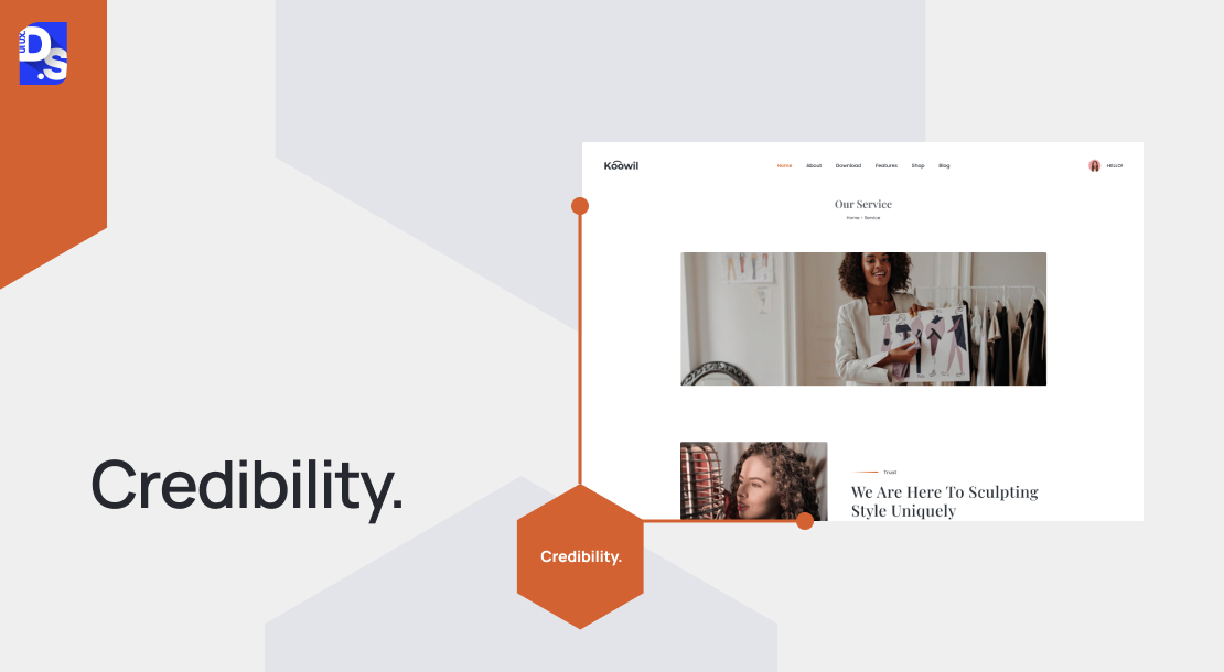
Clearly communicate your value proposition – what products/services you offer – on the homepage. Do not bury this crucial information; dedicate prominent homepage space to explain the benefits you provide. This upfront approach will demonstrate your confidence in what your brand has to offer. It will also lend to your site’s credibility.
Another big credibility booster is pricing transparency. Avoid forcing users to jump through hoops to find your pricing information. Display prices openly on a dedicated, easily accessible page that’s accessible from the main menu. Then, users won’t have to contact you solely to inquire about pricing. These steps will position your business as transparent and trustworthy.
10. Branding Consistency
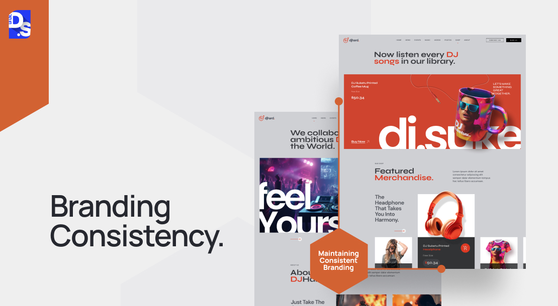
A strategic move to build brand recognition and trust with your customers. Carefully select colors that evoke the emotions you want to associate with your brand. Limit yourself to a core color palette of three. Then, apply those colors consistently across your website.
Every element your visitor encounters, from text lines to graphic elements, should align with your established brand guidelines. Color choices, fonts, and imagery should all contribute to a clear, well-established brand identity. The more consistent your visual language, the faster visitors will develop brand familiarity.
11. Visuals

Achieving a visual equilibrium between text and imagery is paramount in website design. Strategic use of visuals can significantly enhance the informativeness, engagement, and memorability of your content. Compelling visuals can also capture user attention, break up text-heavy content for improved scannability, and even allow customers to envision themselves using your products in their daily lives.
Here’s how you can effectively use visuals to their full potential on your website:
- Prioritize Visuals Early: Start selecting images for your site during the wireframe stage of your design process. This will help you plan the layout and ensure the visuals complement the content and overall user experience.
- Authenticity: Strive for high-quality photos that showcase your products, team, or workspace. Avoid generic stock imagery whenever possible.
- Responsive Design: Ensure all images are responsive, meaning they display flawlessly across various devices.
- Optimize for Speed: Compress images to prevent them from hindering website loading times.
- SEO and Accessibility: Implement alt-text for images, enhancing both SEO (Search Engine Optimization) and accessibility for users with visual impairments.
- Animation with Caution: Animations can be valuable for instructional purposes; but use them sparingly to avoid impacting page load speed and photosensitivity.
For businesses with seasonal offerings, we recommend using rotating visuals that showcase the most up-to-date products or services.
12. CTAs

The ultimate goal of web design is to prompt users to take action, whether it is downloading a lead magnet, subscribing to your newsletter, or making a purchase. Strategically placed calls-to-action (CTAs) are essential for guiding users towards these desired actions. Follow these best practices to create effective CTAs:
- High Visibility: Avoid burying your CTAs within seas of text. Use whitespace to create a visual spotlight and draw user attention.
- Page-Specific CTAs: Guide users efficiently by including a relevant CTA on each page. Users should not have to navigate back to the homepage to go ahead with conversion.
- Consistency: Maintain consistent CTAs for the same actions across your website to avoid user confusion and frustration.
Do not forget to tailor the CTA message to each page’s content. For instance, a homepage CTA should entice users with a “Free Trial” offer, while a blog post CTA could encourage them to “Subscribe for a Free Newsletter.”
13. Responsive
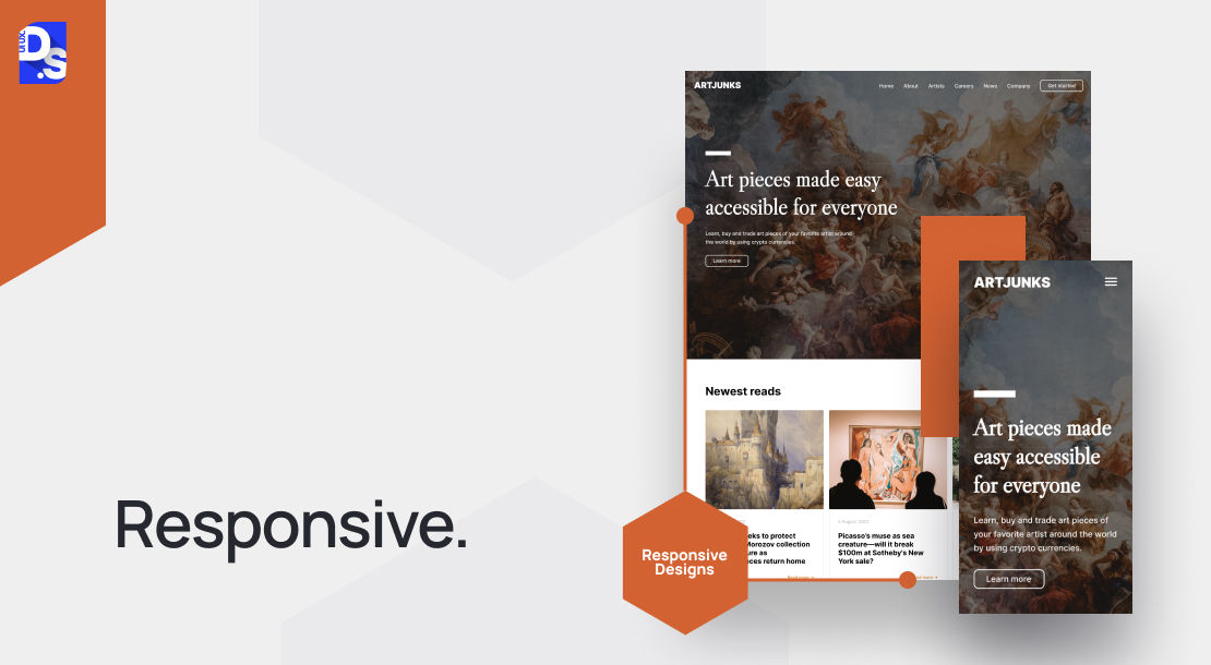
Over half of your website traffic likely stems from mobile devices. If navigating your site on mobile phones proves to be cumbersome, users will quickly become frustrated and abandon your site. Here are the most rewarding design practices to boost your website’s responsiveness:
- Simplified Menus & Search: Use clear and concise menus, with a simple search bar to streamline navigation, especially on small-screens.
- Bold CTAs: Ensure clear visibility for calls to action (CTAs) with buttons large enough for easy tapping with a thumb.
- Readability: Avoid large text blocks and opt for fonts that render clearly on small screens.
- Cross-Browser Compatibility: Perform rigorous testing across various browsers to ensure a consistent user experience.
The benefits of responsive design extend beyond traffic and UX. Google’s mobile-first indexing approach means websites lacking mobile optimization are more likely to suffer in search rankings. By embracing responsive design, you can instantly improve your site’s SEO visibility.
14. Less is More
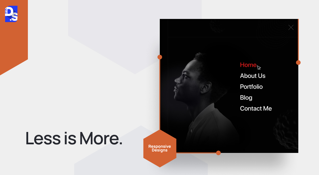
Hick’s Law, a cornerstone of UX design, dictates that complexity breeds indecision. When faced with an overwhelming array of choices, users take longer to make decisions and are more likely to abandon the task altogether. This might translate to frustrated visitors who might bounce or make unintended selections, like deserting their online shopping carts.
The solution? Limit user options. Instead of overwhelming users with multiple options upfront, break down the decision-making process into smaller, more manageable steps:
- Present a limited set of choices at a time, then reveal more options as needed
- Reduce the number of main navigation links
- Group related options under expandable menus
By simplifying the user experience, you encourage visitors to engage more deeply with whatever options they are given.
15. Craft Compelling Copy
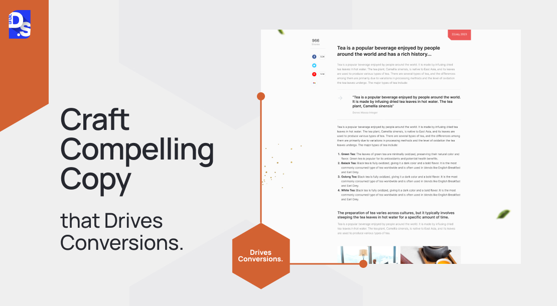
Effective copywriting informs, engages, and subtly nudges users throughout their buyer’s journey – from initial awareness to the final purchase decision. Here’s how to write such copy that compels action:
- Cut to the Chase: Ditch lengthy introductions and get straight to the point. Users crave immediate value – deliver it swiftly.
- Use Action Verbs: Clearly communicate the benefits users gain by taking action. Leverage strong verbs like ‘optimize,’ ‘streamline,’ or ‘boost’ to paint a picture of positive outcomes.
- Embrace Active Voice: Active voice injects confidence and clarity into your writing. Avoid phrases that create uncertainty.
- Spark Curiosity: Strategic use of questions like ‘Why?’ ‘How?’ and ‘What?’ compels readers to actively seek answers.
- Prioritize Readability: Keep sentences and paragraphs concise; use clear and simple language for optimal readability.
Never lose sight of your end goal while writing. Your compelling copy should naturally lead users to clicking on CTAs.
What Do You Mean by Website Design Best Practices?
In the ever-evolving world of web design, adhering to best practices is not just about following a rulebook. It is about crafting user-centric experiences that consistently help users achieve their goals and engage with your brand. While organizations like the World Wide Web Consortium (W3C) have established technical website design standards (think HTML, CSS, and accessibility) these standards do not cover the creative or user-centric aspects of website design.
So, what exactly qualifies as a “best practice” in website design? Here, the focus shifts from technicalities to user expectations and usability. We have all encountered websites that feel intuitive and effortless to navigate, while others leave us feeling frustrated and lost. Website design best practices equip the designer to bridge this gap.
By following these established practices, you can create websites that are enjoyable to interact with. These practices are backed by years of research and testing and they also help you address questions like:
- What web design elements are absolutely essential for delivering a cohesive user experience?
- Are there elements that should be avoided altogether?
- How can we achieve a balance between aesthetics and functionality for a seamless design?
By embracing the best practices that are discussed here and answering these questions, you can create websites that consistently deliver world-class experiences.
Conclusion
So, you got the tools to build a website that is both user-friendly and great at generating revenue. Visitors will love it, and your results will show it. At Design Studio, we have created many such result-driven websites. Need a website refresh or a brand new one built from scratch? We’ve got your back.
comments
Add comment