
12 Inspiring Web Application UI Design Examples
Web app design is a much more nuanced discipline than traditional website design. You have to combine web design, UI and UX design to create digital experiences that compete with websites and native mobile apps.
Thankfully, there are many real-world examples of well-designed web applications that serve as inspiration and learning opportunities for designers and developers. Here, we will discuss 12 inspiring web app design examples and provide commentary on the design factors that contribute to their success.
Understanding Web Apps
Unlike traditional applications that are bound to specific operating systems or devices, web apps reside on the Internet. Users can access them from anywhere, via any device or web browser, with a working internet connection.
This inherent, cross-platform nature of these apps also guarantees seamless user experiences. Well-designed web apps can intelligently adapt to the user’s device and its capabilities and provide consistent and optimized experiences.
For tech-savvy users, web apps represent convenience. Users do not need to worry about compatibility issues or manual updates, as all that heavy lifting is done on the server side.
They always get to access the latest versions of their preferred web apps online. But, for designers, crafting a web app presents a way bigger challenge compared to traditional website design.
What is Web App Design?
Web app design is the process of planning and creating the look, feel, and functionality of a web application. It combines the disciplines of user interface (UI) design and user experience (UX) design to deliver an effective and engaging product.
While web application design shares its foundational technologies – HTML, CSS, and JavaScript – with its broader cousin, web design, it has a distinct focus.
Web apps need to be highly functional and interactive to compete with established desktop applications and native mobile apps for user attention and engagement.
To transform a concept into a sophisticated, user-centric web app, a professional web app design agency divides the design process into multiple stages:
- Discovery and research
- Defining project goals
- Identifying target audience segments
- Creating user personas
- Planning sitemaps and user flows
- UI Design
- Developing a consistent style guide
- Sketching wireframes
- UX Design
- Designing high-fidelity prototypes
- Conducting usability, responsive design, and cross-browser compatibility testing
- Launch, ongoing support, and post-launch maintenance
12 Web Application Design Examples
Let us explore these UI/UX design guidelines by assessing real-world examples in detail. Once we are done analyzing them, we’ll recap all the key UI and UX design lessons learned that you need to apply to your work.
These web app design inspirations will help you design outstanding web apps of your own.
1. Figma

For design teams around the world, Figma is a familiar name. This collaborative design platform currently empowers 4+ million designers to create, prototype, and share design projects directly in their web browsers. But what makes it such a stellar example of web app design?
A Designer’s Dream Interface
Figma’s interface is a designer’s dream. It is clean, intuitive, and adapts like a chameleon to any device. Essential design tools are neatly organized in a modular layout, making them instantly accessible, even for newbies.
Consistency reigns supreme – clear icons, well-chosen typography, and a thoughtful color scheme ensure a user-friendly experience that feels natural on every page and screen.
The real magic lies in Figma’s flawlessly-designed real-time collaboration features. Thanks to how easy it is to use these features: multiple designers can team up to work on a project simultaneously on the web app.
User Experience (UX) Built for Productivity
Figma’s core mission? Boosting designer productivity. And it delivers in spades thanks to exceptional UX design. Smart features like auto-layouts and AI-powered design guides streamline the workflow, eliminating unnecessary steps.
No matter the device – desktop or mobile – Figma offers a seamless cross-device experience, ensuring designers always have their projects at their fingertips. This deep understanding of how modern design teams operate shines through in every interaction.
Lessons for Web App Designers
From setting clear goals (designer productivity on steroids) to catering to the specific needs of a specific audience, Figma’s design team offers a masterclass in web app creation.
Their commitment to simplicity, modularity, and intelligent features underscores a crucial lesson: the more complex your web app, the more intuitive and simple its interface needs to be.
2. Taskade

Taskade is not your average project management tool. This ambitious web app tackles common problems faced by remote teams with a visually stunning and user-friendly web app.
A Feast for the Eyes, a Breeze to Use
Taskade’s design strikes a perfect balance between aesthetics and usability. On the main interface, beautiful, hand-drawn illustrations come alive with subtle animations, subtly directing users on what they need to do.
There is a helpful video player that showcases the product in action, helping new users understand what the web app is all about.
Taskade’s design team cleverly uses user interface (UI) components like tabs to present features in a clear and organized manner. They’ve also mastered the art of visual contrast.
Every major design element in this web app is presented in bright colors that ‘pop’ against generous whitespace in the app’s background.
Branded and eye-catching buttons are strategically placed throughout the interface. They feel intuitive and guide users towards desired actions.
Finally, a dedicated download section at the bottom ensures users can effortlessly find the perfect Taskade version for their device.
Strong Focus on Usability
Taskade’s success goes beyond its stunning visuals. The user experience (UX) is equally impressive, offering a delightful blend of usability and trendy features.
Taskade understands the importance of remote work, making it effortless for users to organize their workflow and collaborate seamlessly with colleagues.
Lessons for Web App Designers
Do not be coy if you need to make a lasting first impression with captivating visuals and animations. Taskade’s vibrant illustrations and prominent video player instantly grab attention and showcase the product’s value.
Don’t be afraid of a vibrant color palette either; pair it with ample white space for balance.
Combine beauty with functionality. Use intuitive UI components like tabs to structure features and information. Taskade’s tabbed interface guides users through functionalities without overwhelming them.
3. Zapier
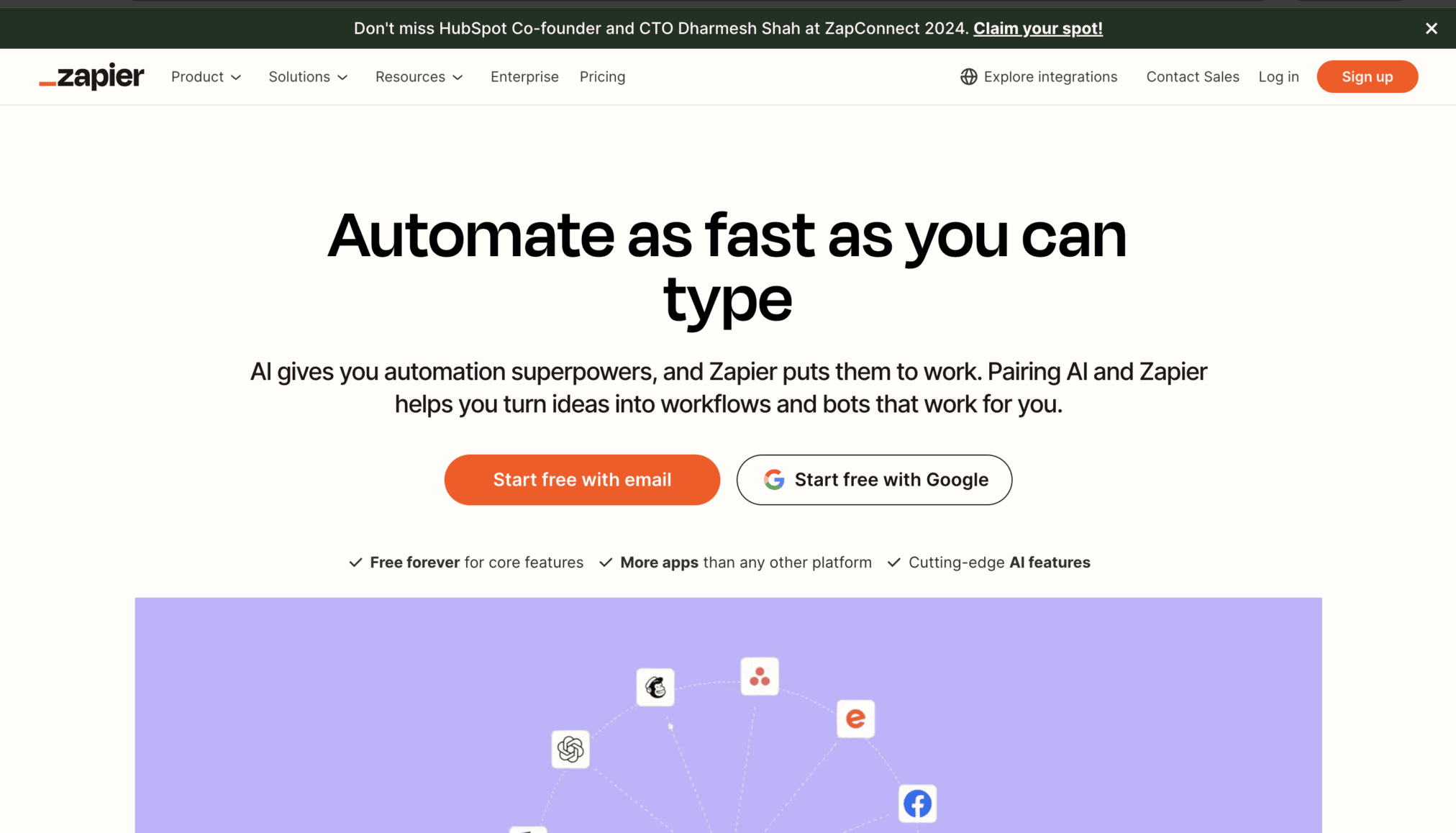
In the ever-growing world of productivity tools, Zapier stands out as the undisputed automation champion. Why? Zapier’s commitment to an uncluttered interface, even with a super-complicated feature set, is a testament to the transformative power of good design.
Effortless Navigation
Zapier’s interface is the epitome of clean lines and intuitive design. The navigation flows like a well-worn path, with clear visual cues guiding users through every feature and function.
Even when you are browsing through the web app’s extensive toolbox, the interface will never feel like a cluttered mess. The design team has masterfully balanced user-friendliness with robust functionality, ensuring anyone can become an automation whiz with minimal effort.
Designed to Automate
Automation is not just a feature for Zapier – it is the very foundation of its design philosophy. Every element, from the overall layout to the subtle micro-interactions, is meticulously crafted to streamline automation processes.
Take the drag-and-drop workflow builder, for example. This intuitive tool exemplifies how Zapier’s design team had one clear goal with the web app: to make automation creation as effortless as possible.
Lessons for Web App Designers
Zapier’s design team has wisely avoided the urge to bombard users with unnecessary info. Instead, their focus is on relentlessly refining the tools that truly matter and making them as intuitive as possible.
This laser-sharp focus on intuitively giving users exactly what they need and expect, serves as a valuable lesson for aspiring web app designers. Want your web app to be packed with features and yet user-centric? Then prioritize simplicity and usability over feature bloat. It is one of the most important app design best practices that designers should know.
4. Rappi-Pay

Forget boring payment apps! Rappi-Pay proves that innovative design and captivating storytelling can transform a mundane product into a user magnet. Their secret weapon? A multi-layered UI experience that weaves a delightful narrative around the app itself.
UX with a Twist
Rappi-Pay does not just present features; it weaves a narrative. The product itself becomes the protagonist, drawing users into a story that highlights its benefits. This immersive experience makes interacting with the app not just functional, but truly memorable.
Immersive Onboarding
Right after opening Rappi-Pay, you will be greeted by charming 3D scenes, brought to life with subtle animations and beautiful graphics. As you browse, go through a carefully crafted story. By the time you are through with the first initial waves of multimedia content, you’ll clearly understand the app’s value proposition.
Lessons for Web App Designers
Learn from Rappi-Pay’s narrative-driven approach: use 3D scenes, animations, and graphics, to weave a cohesive visual story alongside the content. Ensure your visual elements and content work seamlessly together on every screen to communicate your app’s value clearly.
5. Vimcar

Vimcar, a fleet management leader, roars into new territories with a web app designed for one thing: user success. Their secret weapon? Deep user understanding and data-driven design.
Homepage Design
Vimcar’s homepage anticipates your questions. Clear, informative messaging instantly explains their offerings and setup process, leaving no room for confusion about the platform’s value. They address key business pain points head-on, showcasing how Vimcar empowers companies to streamline fleet operations.
Visual Onboarding
A handy infographic visually walks users through the setup process, ensuring a smooth and stress-free onboarding experience.
Lessons for Web App Designers
Anticipate questions and provide clear guidance on your homepage. Do not know what your target users think? Conduct user research to identify their pain points and the way they prefer to interact with apps similar to yours. Continue monitoring and improving your user experience based on data.
6. Notion

This AI-powered web app notion is a document editor, project management tool, and writing assistant, all wrapped in a sleek and adaptable design.
Modular Design
What makes Notion a web app design champion is its modular design. The app is packed with customizable building blocks that users can arrange and rearrange to fit their specific workflow needs.
This level of flexibility empowers users to create a workspace that perfectly reflects their unique way of working. Whether you are managing projects, creating documents, or taking notes, Notion offers a customizable and collaborative workspace that’s optimized to boost productivity.
Focus on Clarity
Minimalism reigns supreme in Notion’s interface. A consistent visual hierarchy ensures intuitive navigation, with clear distinctions between content blocks and functionalities. This focus on clarity eliminates clutter and keeps users focused on the task at hand.
Lessons for Web App Designers
Prioritize a clean and consistent visual hierarchy. Users should instinctively understand how to navigate your app, without feeling overwhelmed by clutter. If your web app allows users to customize their workstations, taking a modular approach like Notion is a great idea.
7. Trello

This web app trello uses a Kanban-style interface – think boards, lists, and cards – to empower individuals and teams to organize tasks, projects, and workflows collaboratively.
Simplicity
Trello champions user-friendliness. The interface is clean, intuitive, and laser-focused on functionality – perfect for individuals and teams seeking an efficient collaboration tool. Whether you’re a solo freelancer or a large organization, customizable boards, cards, and lists will let you micro-modify the app to suit your specific needs.
Constantly Evolving
Trello prioritizes user feedback: a fact that is evident in the routine design updates and new feature releases. This commitment to user feedback has kept the web app’s design relevant for over a decade.
Lessons for Web App Designers
Do not underestimate the power of simplicity. Don’t refrain from giving your users control. Trello’s customizable elements empower users to tailor the app to their workflow, enhancing the overall user experience.
Trello’s success also stems from its unwavering focus on refining its core project management functionality. So, continuously gather user feedback regarding your app’s core design features and use it to inform your updates.
8. Zencastr

Zencastr is a podcasting tool. It empowers creators (regardless of experience) to record and edit studio-quality podcasts directly via their browsers. Since this web app is designed for podcasting newbies, it serves as a great example of introducing users to new concepts and functionalities without overwhelming them.
UI for Everyone
Zencastr’s design is all about accessibility. The recording interface clearly labels everything – from start recording buttons to chat functions – ensuring even novices feel comfortable navigating the platform. A prominent “back-to-dashboard” option is always within reach, preventing users from getting lost in the recording flow.
UX Flow
Zencastr prioritizes a seamless user experience. It assumes minimal technical knowledge, especially when it comes to audio and video tools. The onboarding process is quick yet effective, guiding users through recording with clear buttons and informative panels.
Lessons for Web App Designers
Zencastr’s interface demonstrates how to guide new users through complex tasks with minimal confusion: prioritize clear labeling and intuitive design. Use clear buttons, informative panels, and intuitive navigation to prevent new users from feeling lost.
Design with the assumption that the audience has minimal technical expertise. But, do not bombard them with instructions.
9. Airtable

Airtable is a revolutionary web app that merges the familiar grid layout of web apps with the muscle of complex, spreadsheet-based databases.
Visually Appealing Interface
Airtable’s interface was a breath of fresh air in the spreadsheet app sector. It ditched the sterile spreadsheet look for a visually engaging, responsive design that feels equally at home on desktops and mobile devices.
Drag-and-Drop Data Magic
Forget clunky MS Excel formulas; Airtable empowers users to effortlessly create, sort, filter, and view data in various formats – grids, calendars, and even Kanban-style boards. Powerful filtering and sorting tools make finding and organizing information a breeze.
Lessons for Web App Designers
A user-friendly and visually stimulating interface will always keep users engaged, even when the app is all about managing complex datasets. Weaving familiar design elements (spreadsheets, drag-and-drop functionality) into the app’s design leads to a comfortable user experience, just as Hick’s law, one of the most important laws of UX design, suggests.
10. Skyscanner

Skyscanner isn’t messing around. This online travel agency prioritizes one thing: getting you the best deals on flights, hotels, and car rentals, fast. Their secret weapon? A web app designed with a laser focus on simplicity and user efficiency.
Interface for Action
A crystal-clear top menu in the Skyscanner’s minimalist UI lets users book flights, switch currencies on the fly, toggle between different currencies, and more. There’s a prominent search bar, always front and center, urging users to embark on their travel adventures.
Mobile-First
Skyscanner went ‘mobile-first’ quite a long time back. Skyscanner’s web app will seamlessly adapt to your mobile device. Unlike the desktop version, the mobile browser app has no background images, tons of white space, and a smaller top menu. Booking your next adventure from your phone? Piece of cake.
Lessons for Web App Designers
Unlike many unsuccessful web apps, Skyscanner understands its core function – helping you find amazing travel deals. Their interface reflects this focus, ensuring booking flights, hotels, and car rentals is a breeze. Your web app’s design should have a similar degree of focus.
11. ideaBuddy
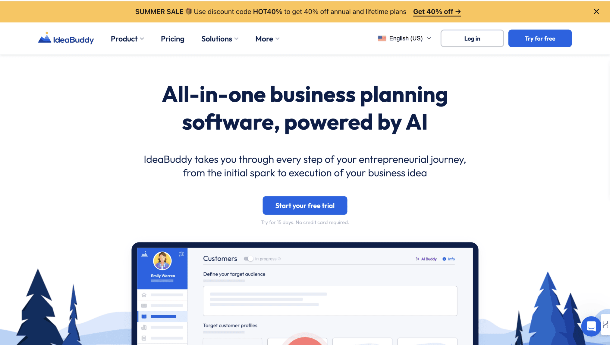
ideaBuddy is an AI-powered business planning web app that helps you transform business ideas into successful business ventures. Heard of similar apps before? Here’s why ideaBuddy makes into this list while the others don’t.
User Comfort First
IdeaBuddy prioritizes user comfort and intuitive navigation. Familiar design patterns help users feel at ease and readily locate the information they need. The clean layout and clear visual hierarchy guide users through the content and features seamlessly.
Awesome Landing Page
The web app’s landing page welcomes visitors with a carousel housed within an iPad-styled frame – a traditional web design pattern that instantly conveys the app’s purpose. IdeaBuddy does not shy away from tried-and-true UI components like card-style carousels, listicles, and alternating stripe layouts.
But here’s the twist: these elements are infused with modern touches like trendy human illustrations. This clever combination creates a comfortable and visually appealing experience that feels anything but dated.
Lessons for Web App Designers
Familiar UI elements can be revitalized with contemporary, top UI/UX trends! IdeaBuddy proves that classic patterns can be refreshed and elevated, striking a balance between comfort and innovation.
12. Typeform

This web-based form builder ditches dull, data-collecting drudgery for visually captivating and engaging experiences. Millions flock to Typeform for a reason – its design shines.
UI Design Wins
Cleanliness reigns supreme in Typeform’s interface. Their forms are a study in simplicity and responsiveness, adapting flawlessly to any device. A consistent visual language (typography, color schemes, icons) – ties everything together, creating a cohesive experience.
UX Design Magic
Typeform ditches the traditional form submission approach, opting for an interactive and conversational experience instead. Their forms feel more like a dialogue, with smooth transitions and engaging elements that keep users hooked.
Lessons for Web App Designers
Make information retrieval conversational: Take a cue from Typeform and create forms that feel like a dialogue, not a chore. Maintain a consistent visual language with typography, color schemes, and icons. This strengthens brand recognition and improves user navigation.
Now, let’s clarify some terms and concepts.
What is Web App User Interface (UI) Design?
A web app user interface (UI) includes all the visual elements that users interact with on the app, such as buttons, menus, micro-interactions, and the overall layout.
To compete with native apps for user adoption, web app designers have to create simple, intuitive, and responsive user interfaces that enable users to accomplish their tasks with minimal effort and time.
This is easier said than done because designing such effective web applications requires expertise in web technologies such as HTML, CSS, JavaScript, and various web frameworks or libraries (e.g., React, Angular, Vue.js).
Designers also have to consider factors like cross-browser compatibility, dynamic content-loading, etc., while designing web app interfaces.
What is Web App User Experience (UX) Design?
Web app UX design focuses on enhancing the overall experience and satisfaction a user has when interacting with a web app. It involves:
- Understanding user needs, goals, and pain points through UX research
- Mapping out user flows and interactions, making each interaction intuitive
- Iterating on every design decision (color scheme, positioning of elements, responsiveness, etc.) based on usability testing
- Optimizing each interaction from onboarding to subscription for accessibility and engagement
While good UI design makes a web app visually appealing and its interface interactive, good UX design is what gets users instantly engaged and keeps them coming back for more.
What Makes a Strong Web App Design
Dissecting Our Web App Design Inspirations
As you can see from the examples, there is no one way to design a web app because user needs vary and are sometimes unpredictable. So, understanding your target users’ needs should be your priority. Here are some other key takeaways from the web app all-stars:
- Keep it Simple, Especially with Complex Web Apps: Take a page from Figma’s playbook. If your app boasts a ton of features, make sure the interface is clean and intuitive. A user should not need a decoder ring to figure out how to use it.
- First Impressions: Just like Taskade, grab users’ attention with captivating visuals and animations. Do not be afraid of bold colors but balance them out with plenty of white space for a clean look. Remember, beauty and functionality can go hand-in-hand.
- Focus on What Users Need, Not What You Want: Channel your inner Zapier and prioritize core functionalities. Do not bombard users with unnecessary info. Make the features you have as intuitive as possible: users should be able to find what they need quickly and easily.
- Visual Harmony: Maintain a consistent visual language with typography, color schemes, and icons to enhance brand recognition and make navigation a breeze.
- Responsive Design is a Must: Your app should adapt like a chameleon! Optimize for various screen sizes (mobile, tablet, desktop) and monitor core vitals for smooth performance.
- Tell a Story with Your Design: Learn from Rappi-Pay’s immersive approach. Use visuals like 3D scenes and animations to create a cohesive narrative alongside your content. Every screen should work together seamlessly to communicate your app’s value proposition.
- Read Your Users’ Minds: Be like Vimcar’s design team and anticipate your users’ questions. Conduct user research to understand their pain points and how they typically interact with similar apps.
- Guide the Way: Help users find their way. Implement a clear top menu, and strategically placed buttons, and leverage user experience testing tools to refine the navigation flow.
- Cleanliness is Key: Notion reminds us that a clear and consistent visual hierarchy is crucial. Users should be able to navigate your app instinctively, without feeling overwhelmed by clutter. Consider a modular approach like Notion’s if your app allows for customization.
- Customization: Trello proves that a simple design can be incredibly effective. Do not underestimate the power of clean layouts and intuitive features. But remember, simplicity does not mean sacrificing user control. Like Trello, empower users to personalize their experience for maximum impact.
- Creative with a Dose of Familiarity: Do not be afraid to innovate (like many of the web apps we discussed) but make it user-friendly. Strike a balance between novelty and intuitive design – users want to be surprised, not bemused.
- Make Forms Fun: Typeform shows us that data collection can be engaging. Ditch the boring old forms and create a conversational experience with smooth transitions and interactive elements.
Conclusion
Now, armed with these design gems, you are well on your way to crafting a web app that users will love! Want more in-depth analyses of web app design? Let’s chat about some of our latest projects and how we craft user centric digital experiences that keep users engaged and coming back for more!
comments
Add comment