
Stop Making These 12 UX Design Mistakes in 2025 & Beyond!
The digital world can be a ruthless place. Just ask Citibank – a single UX design mistake nearly cost them $900 million in 2020. The crux of the issue stemmed from Citibank’s reliance on an outdated, complex loan management system – Flexcube. The software’s interface was a total nightmare to navigate, creating the perfect conditions for human error.
The Importance of Avoiding UX Design Mistakes
Here’s what happened: one of Citibank’s employees was supposed to make a $7.8 million interest payment, but they accidentally sent the full $900 million loan amount instead. What’s even crazier is that this mistake slipped through THREE levels of internal review at Citibank.
The reviewers were just as stumped by Flexcube’s clunky design, riddled with UX design mistakes, stumped both reviewers and the employee who made the initial blunder. In the end, Citigroup was able to recoup about $500 million of its own money that it accidentally wired after over 2 years of litigation and millions spent in legal fees.
This incident alone underscores the critical need to proactively address UX design mistakes before they spiral out of control. But, this is not the only example of just how costly mistakes in UX can be for businesses.
- Poorly designed interfaces always result in frustrated customers, abandoned transactions, and lost revenue
- Confusing navigation and information architecture in UX always hinder user productivity and satisfaction
- Accessibility issues can exclude large segments of the user base and irrevocably damage brand reputation
- Inconsistent or unresponsive design can erode trust and credibility
In fact, the more intricate and feature-packed software, website, or mobile app is, the higher the risk of costly mistakes. Thankfully, by training your mind to spot common ux design mistakes in crafting user experience, you can take proactive steps and avoid expensive blunders like Citibank.
12 Common UX Design Mistakes
In this article, we’ll explore the 12 common UX design mistakes that businesses need to be hyper-vigilant about in 2025. Here’s our ranking of the common errors from most severe to least severe.
For each mistake, there are actionable strategies on how to overcome them. Use these insights to deliver exceptional and ‘error-free’ experiences that set your products apart from the competition.
1. Skipping User Research
When it comes to building successful products, user research is the bedrock. Just ask Marks & Spencer (M&S) – they learned this the hard way during a disastrous website redesign that resulted in a decline in sales by 8.1%. By relying solely on assumptions instead of user insights, M&S ended up with a site that looked great but failed to meet the needs of its target audience.
One glaring example was the confusing size filter. Users expected to see product options narrow down when they selected a size, but instead, the site displayed all items with a barely noticeable note about out-of-stock products. This inconsistency left shoppers frustrated and highlighted the importance of putting users at the heart of the design process.

So, how do you avoid making the same mistakes as M&S and invest in design features/ideas that users genuinely want? It all comes down to gathering data and insights through user research. This can take many forms:
User Research
Whether it is crafting targeted surveys, conducting in-depth interviews, or observing user behavior through usability testing and in-app tracking, a variety of methods exist. Choose the techniques that best suit your budget and timeline to gather rich data that informs every design decision.
Build User Personas
Transform the collected data into actionable insights by crafting user personas. These detailed profiles represent your target audience, bringing their needs, behaviors, and goals to life. With user personas by your side, you’ll never lose sight of who you’re designing for throughout the entire process.
Empathy Maps
Take user personas to the next level with empathy maps. These visual tools map out user journeys, exploring their thoughts, feelings, and pain points at every touchpoint. By stepping into your users’ shoes, you can identify opportunities to address their needs and craft a truly user-centric experience.
Another highly effective strategy is building a Minimum Viable Product (MVP) and testing it with real users. This form of testing allows you to validate UX assumptions and gather feedback before sinking too many resources into bad design ideas. With MVP testing you can make as many tweaks as you want to your design until you’re 100% satisfied about its effectiveness.
By putting these practices (in-depth user research and MVP testing) into action, you’ll be well on your way to creating experiences that drive success for both your customers and your business.
2. User Interface Overload
Simplifying the user experience (UX) is a cornerstone of successful digital product design. However, many organizations fall prey to the allure of ‘feature-bloat’: overloading interfaces with an excess of functionalities. This seemingly well-intentioned approach to cater to diverse user needs often backfires, leading to confusion, frustration, and user abandonment.

Pop-ups serve as a prime example of this UX mistake:
- While strategically employed pop-ups can effectively deliver important messages, overuse disrupts user flow and detracts from the overall experience.
- To mitigate this risk, you must prioritize displaying only the most relevant and timely pop-up messages. These messages must align with specific user contexts and activities.
- Strategic delays before pop-up appearances can also minimize disruption.
- Other formats like slide-outs or top banners can also offer less intrusive and visually appealing solutions.
The core principle for designing pop-ups and other interface elements is the same: simplicity is key. Resist the urge to pack your interfaces with features. By prioritizing simplicity, relevance, and context, you can curate user-centric experiences that engage, delight, and retain users.
Progressive disclosure is a design technique that can help you achieve this. It involves gradually revealing advanced features and options only when necessary, rather than overwhelming users with a cluttered interface upfront. This approach ensures that users focus on the essential functionalities, without feeling overwhelmed or confused by an overabundance of options.
By applying the principles of progressive disclosure and reducing cognitive load, you can create digital experiences that are efficient and delightful for users, not overwhelming.
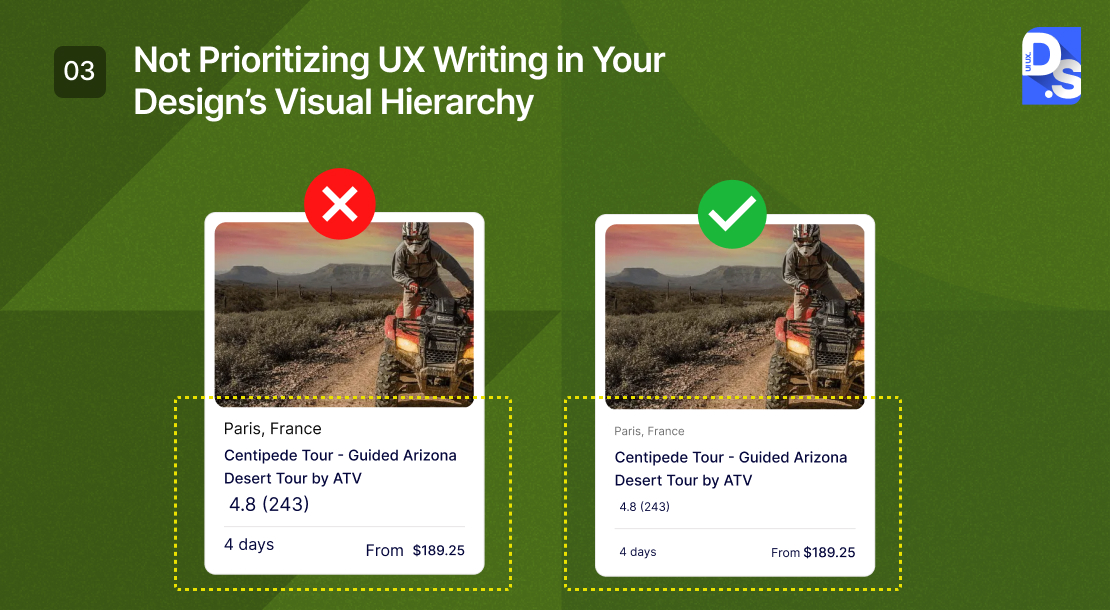
3. Not Prioritizing UX Writing
If you are not prioritizing UX writing and visual hierarchy in your digital product design, you are making a big mistake. These two elements must work hand-in-hand to create experiences that are not only functional, but also clear, engaging, and downright empowering for your users.
Let us start with UX writing, the art and science of crafting clear and engaging copy within interfaces. Effective UX writing can guide users, educate them on your product’s features, and motivate them to take action. But a poor copy? That is a recipe for confusion and frustration. To make sure your UX writing is on point, follow these UX writing tips:
- Use everyday language users understand. Focus on empowering and encouraging users through word choice.
- Infuse UX writing with personality to connect with users on an emotional level. Avoid robotic language.
- Do not make UX writing an afterthought. Integrate it throughout the design process to ensure seamless cohesion with the design’s visual hierarchy.
Now, let us talk about visual hierarchy. Visual hierarchy in UX refers to the arrangement of design elements to guide user attention towards the most important information. UX copy needs to be a part of the hierarchy from the start.
Let us say you are designing the checkout flow for an e-commerce website. You want users to focus on the order summary, payment options, and that primary “Complete Purchase” button, right? Well, the wording on that button is just as crucial as its placement. Check out the difference between these two versions of the same CTA:
- Visually prominent, but underwhelming UX writing: “Submit Order”
- Visually prominent and empowering: “Complete My Purchase Now”
While both buttons are visually prominent, the second option uses more engaging, action-oriented language. By doing so, it subtly transforms a mundane transaction into a positive and action-oriented experience.
Studying good UX writing examples can help designers understand the importance of word choice.
By prioritizing UX writing within the visual hierarchy, you create experiences that are not just functional, but also clear, compelling, and confidence-boosting for your users.
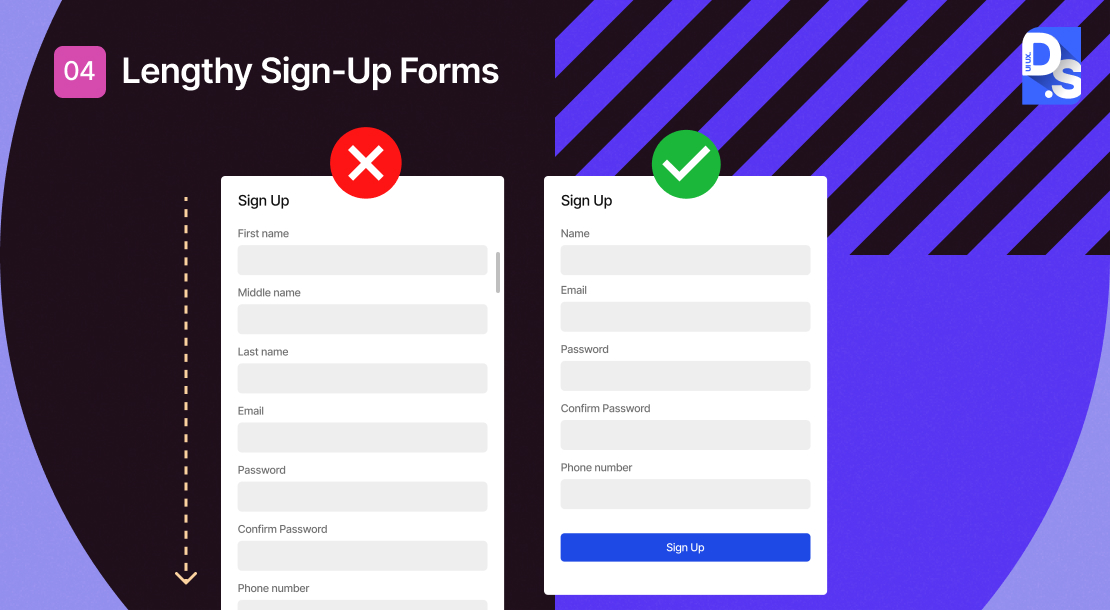
4. Lengthy Forms
Let’s face it – no one enjoys jumping through hoops to start using a new product. Lengthy, complicated sign-up forms are a notorious conversion killer, often leading frustrated users to abandon the process altogether. This missed opportunity can seriously stunt your growth.
The key is to prioritize collecting only the essential info upfront. You can always gather additional details from users later on. The goal is to get them ‘through the door’ with minimal friction. A prime example of this comes from a major eCommerce site.
The initial checkout process on this site required mandatory account creation, which led to a major drop-off in conversions. But when they simply allowed for guest checkout, they saw a 45% increase in purchasing customers.
That translated to a whopping $300 million revenue boost in just one year! So, what can you do to streamline your sign-up process and reap similar rewards? Here are some top tips:
- Focus on Essentials: Only request the must-have info upfront. You can always circle back for more details later.
- Clarity is King: Keep those field labels clear and concise, so users know exactly what’s required.
- Guest Checkout: Make guest checkout the default option to eliminate unnecessary barriers.
By implementing these practices, you can create sign-up processes that convert visitors into loyal customers. Remember, when it comes to user acquisition, less is often more. Simplify, simplify, simplify – your conversion metrics will thank you.
5. Failing to Iterate
In the fast-paced world of digital products, stagnation is the kiss of death. What’s cutting-edge today can be old news tomorrow. That is why the biggest blunder a product can make is not iterating and improving. If you ignore user feedback and market trends, you are setting yourself up for a short lifetime of user frustration and abandonment.
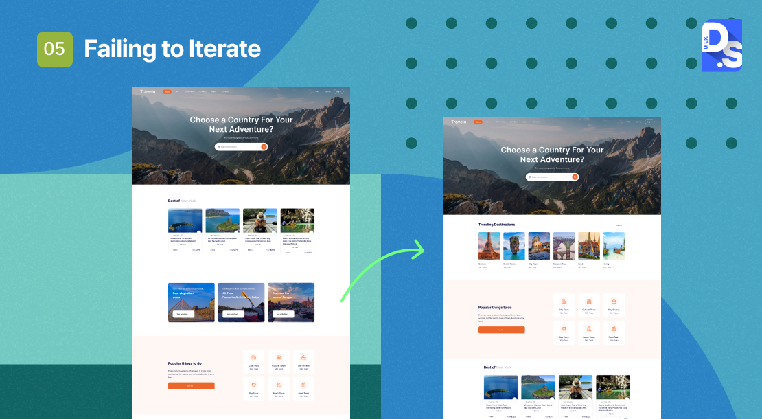
The key to avoiding this fate? Prototyping and wireframing design ideas for in-house testing before you finalize them. Actively seeking and incorporating user feedback. Using surveys, A/B testing, in-app feedback mechanisms, and even social media listening to collect feedback.
Once you amass a goldmine of insights, do not let that valuable feedback gather dust; analyze it, identify areas for improvement, and get to work.
6. Neglecting Responsive Design
Modern users expect a seamless experience across all their devices. They should not have to zoom in and out, scroll endlessly, or play hide-and-seek with information just because they are on a mobile device. Responsive design, guided by responsive design best practices, is all about ensuring your product’s user interface (UI) adapts seamlessly across various screen sizes and devices. Learn about the importance of responsive design and make it a top priority.

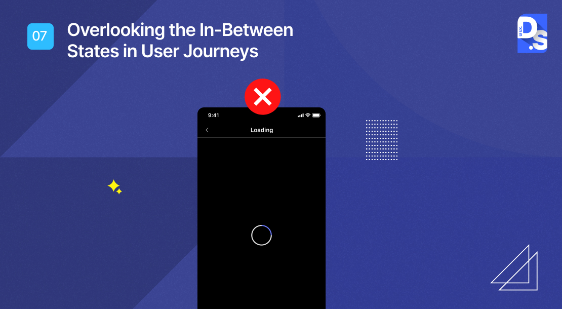
7. Overlooking the In-Between States in User Journeys
Your UX design plans should not be restricted to the main user flows. Top UX designers understand that seamless UX journeys consist of not just the beginning and end, but also the critical yet underrated ‘in-between’ states.
For example, when a user is waiting for a page to load or a transaction to complete – these transitional moments can significantly impact their overall perception and satisfaction with the product. Here’s how to excel in designing for these in-between states:
Map Out Full Journeys
Plan for all interactions and microinteractions in UX. Start with a comprehensive user experience map, detailing all stages – from onboarding to completion, and everything in between. This holistic view will help you identify in-between states that need extra attention.
For each of these ‘states’ or pages, provide clear feedback, progress indicators, instructions, or even a touch of brand personality with a clever message or eye-catching graphic.
Embrace the Unexpected
Anticipate deviations from the ideal path. What happens if a user forgets a form field, or encounters a system error? Design for these contingencies to ensure a smooth user experience even when things go awry.
When errors occur, ensure your error messages are user-friendly. Make them clear, helpful, and empathetic. Guide users through the issue and offer a path forward to resolve it.
Design for Empty States
Empty states, those screens devoid of content, are prime opportunities to shine. Do not leave them blank and boring! Use them to provide helpful guidance, clear instructions, or even a touch of brand personality.
Consistency
Maintain a consistent look, feel, and tone throughout your product, even in unexpected situations. This consistency will instill a sense of familiarity with your users.
By mastering the design of in-between states, you elevate user experience to a whole new level. Your design will not divert users’ attention – even when the unexpected arises.
8. Not Providing Feedback
Imagine this: you’re filling out an online form, carefully entering all your info, and then you hit submit. But… nothing happens. No confirmation message, no loading spinner, just a blank stare back from your screen. Talk about a UX nightmare! Users crave that reassuring feedback that where their actions are being acknowledged and processed. So, don’t leave them hanging!
- When a user completes a task, give them a little celebration. A simple “Success! Your order has been placed” message paired with a checkmark icon goes a long way.
- When mistakes happen, craft clear, informative error messages that pinpoint the issue and offer actionable solutions. Instead of a generic “Error: Invalid Input,” guide users with something like “Please enter a valid email ID. It should look like [email protected].”

Feedback does not have to be all static messages. Get interactive with it! Allow users to hover over buttons or form fields to reveal helpful tooltips that explain what information is required. This proactive approach will empower your users and minimize the potential for confusion.
9. No Design System
Imagine stumbling across a website where the buttons change color on every page, the fonts fluctuate between playful and formal, and the layout structures jump from minimalist to cluttered. Talk about a confusing and unprofessional user experience (UX)! This lack of design cohesion is precisely why establishing a solid design system is crucial for any digital product.
A design system acts as a central hub for all your product’s design elements. It functions like a style guide, outlining:
- A core color palette
- A set of approved fonts
- Specific design principles for spacing, margins, and hierarchy.
- Pre-built UI elements like buttons, forms, and navigation bars that users are already familiar with

Your design system should also define how users interact with your product’s elements. This includes hover states, animation styles, and microinteractions to create a predictable and intuitive user experience. Designers and developers can work way more efficiently by having one such single source of truth for all design elements.
10. Not Crafting a Stellar Onboarding Experience
Onboarding – it is the make-or-break moment when new users first dive into your product. Get it right, and you have got a surefire way to hook them for the long haul. But get it wrong, and you can kiss those potential customers goodbye. Unfortunately, many UX designers make the mistake of assuming their product is a breeze to use.
They end up neglecting the importance of a well-designed onboarding process. So, how do you avoid this pitfall and turn onboarding into a launchpad for success? It all comes down to understanding your customer journey and designing a targeted, engaging onboarding flow.
- First, map out that customer journey. Dig into how users naturally interact with your product – what are their goals and pain points at each stage? This intel is crucial for crafting onboarding flows that resonate.
- Next, leverage your product analytics. These insights will show you which features users struggle with and how well they are adopting your core functionality. Use this data to design onboarding flows that cater to specific user needs and journey stages.
- Now for the fun part – engaging and educating your new users. Onboarding should not be a passive experience. Greet them with a warm welcome, guide them through key features with interactive walkthroughs, and offer contextual tooltips to answer their questions.

Oh, and do not forget those completion-driven checklists – nothing beats that sense of accomplishment! By following this recipe, you can transform onboarding from a dreaded hurdle into a springboard for user success. It’s an investment that pays off big time in user satisfaction and long-term product adoption.
11. Blindly Following Every Design Trend
While staying up-to-date with design trends is valuable, blindly following them can be detrimental to your product’s unique user experience (UX). Just like fashion cycles, design trends have a shelf life. Take flat design, as an example. This minimalist offshoot of skeuomorphism, characterized by a lack of 3D visual elements, was all the rage in the early 2010s.
However, it quickly fell out of favor due to the UX issues it presented, such as confusing users about which elements were clickable and which were not. Some other ‘fallen trends’ include:
- Hamburger Menus: While touted as space-saving, these menus often resulted in lower content discoverability and user engagement.
- Parallax Scrolling: Initially praised for its visual appeal, it became overused, leading to slow loading times and user disorientation.
- Infinite Scrolling: Effective for content-heavy platforms like social media, this format proved less successful for e-commerce and task-oriented websites where users value a more structured layout.

So, how do we avoid the trend trap? By focusing on the impact, the trend will have on the user. Before considering any trend, ask your team:
- Does the trend enhance user navigation, reducing friction and simplifying use?
- Does it improve visual appeal and create a positive first impression?
- Does it make UX writing clearer and easier to understand?
By prioritizing these genuine user needs over fleeting trends, you will ensure that your product remains relevant, engaging, and effective, regardless of the latest design manias.
12. Keyword Stuffing
Overstuffing keywords can lead to pages competing for the same terms, confusing search engines and hurting your overall ranking potential. Not a good look. Plus, keyword-dense content often reads like a robot wrote it. Confusing jargon and unnatural sentence structures might impress the algorithms, but they will have your human visitors running for the hills.

Always craft clear content that prioritizes user comprehension. Weave in those keywords organically, without sacrificing the flow. Deliver valuable, informative content that addresses user needs and pain points. Become a trusted resource, not just a keyword repository.
Conclusion
As a product manager, you need to have a keen eye for common UX mistakes. These things can make or break your product, so stay on top of them. The key is being proactive – stay ahead of the curve, keep identifying & tackling those issues head-on, and watch your product soar to new heights.
This expertise is what defines Design Studio as a UI/UX Design Agency, and it has helped us deliver exceptional user experiences that drive real results for our clients!
comments
Add comment