
10 Effective Principles of Mobile App UI/UX Design
An app’s ability to provide a frictionless and engaging user journey determines its user base and ultimate success. In other words, the main difference between a successful and widely adopted mobile app and a poorly designed app with negligible downloads is more often than not the quality of its user experience (UX).
Here, we have summarized the fundamental mobile app design principles that underpin successful mobile app design. We will also provide practical and actionable UX design recommendations that you can apply to your design projects. But first, let us highlight the importance of following established design principles.
Importance of Following Mobile UX Design Principles
The global mobile app landscape, now a colossal $500-billion market, is undergoing a period of hyper-growth. As of Q1 2024, the Apple App Store boasted over 1.8+ million apps available for download.
The Google Play Store offers an even larger selection, exceeding 3.55+ million apps. With a rapidly growing number of mobile apps vying for user attention, poorly designed apps that fail to deliver high-quality user experiences are in a position to get lost in the crowd.
Today’s users are accustomed to using well-designed apps that are easy to navigate, aesthetically pleasing, and offer mesmerizing interaction flows.
Only by following industry-established mobile UX design principles can brands and development teams navigate this hyper-competitive landscape and ensure their creations rise above the noise and meet heightened user expectations.
Let us take a closer look at these mobile app design principles:
Mobile App Design Principles
1. Improve Usability

Usability forms the bedrock of a successful mobile app. It encompasses five critical attributes that contribute to seamless user experiences:
- Learnability: This metric assesses how easily users can grasp basic tasks upon first encountering the app. Intuitive design minimizes the users’ learning curve and fosters rapid app adoption.
- Efficiency: This factor measures the speed with which users complete desired actions within the app. Optimized workflows, user journeys, and interaction patterns ensure users achieve their goals swiftly.
- Memorability: This assesses how well users recall the app’s interaction patterns after some time away. Consistent use of UI elements and a logical information architecture promotes easy recall for users returning to the app.
- Error Recovery: This evaluates how frequently errors occur, their severity, and how effectively users can recover from mistakes within the app.
- Satisfaction: This appraises the overall user experience regarding task completion, enjoyment, user perception, and their desire for ongoing engagement.
By prioritizing user-centric design principles, mobile apps become problem-solving tools that directly speak to user needs. Plus, by following established mobile app design best practices, app designers can make their creations more accessible.
Users develop mental models when interacting with apps; they prefer new apps to work in the same way as the other apps they already know. Adhering to established design patterns means meeting their expectations and reducing their learning curve.
For example, we are all familiar with app screens that say “Getting Started” or “Search Results.” These standardized elements reduce the need for extensive user explanation. Users can leverage their existing experience with apps to interact intuitively with these familiar screens.
By focusing on core usability components and adopting established best app design practices, you can craft a mobile app experience that is intuitive, efficient at addressing user pain points, and ultimately, successful.
2. Minimize Cognitive Load

The term ‘Cognitive Load’ refers to the amount of mental effort required to use an app. The human brain has a limited capacity for processing information. When mobile apps bombard users with excessive info or complex tasks, it can lead to cognitive overload. This results in user frustration and app abandonment. Here’s how app designers can minimize cognitive load and deliver frustration-free user experiences:
Declutter the Interface
Visual clutter is a major enemy of our cognitive capabilities. Every element you add to the app’s interface – CTA buttons, images, text, etc., contributes to its visual complexity. A cluttered interface overwhelms users and disrupts their attention. User attention is a precious resource. To allocate it strategically, declutter effectively:
- Present users with only the info they need to complete the tasks at hand
- Keep the number of interactive elements to a minimum
- Prioritize a clean and minimalistic interactive design to put users at ease
- Avoid information overload upfront; reveal additional info or options gradually as users interact with the app
Break Tasks into Bite-Sized Chunks
Complex tasks with numerous steps can feel daunting for users. Breaking down complex tasks with numerous steps into smaller, more manageable subtasks is vital for keeping users engaged. This principle is especially crucial in mobile app design, where a limited screen demands a focus on simplicity.
Minimize User Input
Typing on small mobile screens is an error-prone process that can lead to user frustration. To minimize user input, take the following steps:
- Leverage features like address autocomplete
- Implement real-time field validation to identify input errors immediately
- Format and correct user input automatically to reduce errors and keep users focused
- Keep entry/sign-up forms as short as possible, requesting only the essential info from users
- Display customized keyboards based on the data being shared (e.g., numeric keyboards for phone numbers)
By taking these steps, you will avoid overwhelming your users.
3. Intuitive Navigation
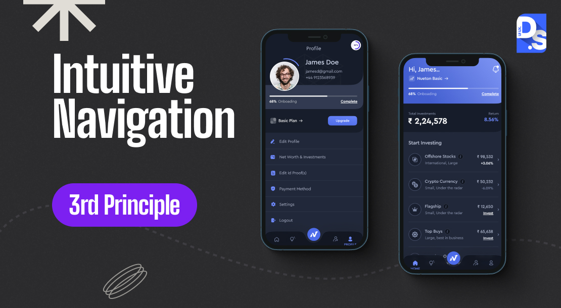
Mobile navigation should feel intuitive and immediately understandable to users. As soon as they open your app, users should recognize the navigation patterns, icons, menus, layouts, and other key elements that will eventually help them reach their expected destinations.
- Recognizability: Familiar design patterns, such as a “home icon” or a “chat bubble” for texting, reinforce intuitive navigation. Every navigation element within the app, be it an icon or menu, should be instantly recognizable by users.
- Consistency: Navigation controls should always be located in the same place within the app. Users should always know where to find core navigation elements, regardless of their current location within the app. For example, tab bars prominently display core navigation options and provide access to several key app sections at once. Placing an ever-present tab bar at the bottom of your app screen will flatten the information hierarchy (IA), reducing the number of navigational steps users need to take to reach desired destinations.
- Visibility: Users should always be aware of their present position within the app’s navigational structure. This can be achieved through clear visual cues (like breadcrumbs) or clear signs of the user’s current location within the navigation hierarchy.
By empowering users with these navigational perks and a constant awareness of their location within the app, you will encourage them to navigate with confidence.
4. Seamless Experiences Across Devices

Modern users access apps via various devices (desktop, mobile, tablet). How well they think of your brand will depend on the quality of their experiences across these devices. Imagine a user first using your mobile app and then transitioning to your website or desktop application. This transition should feel effortless and intuitive.
How to achieve this?
By applying the principle of design consistency. The consistent use of design elements and styles across your mobile app, website, and desktop application will help you establish a recognizable design language throughout your product ecosystem.
By maintaining consistent visual elements (buttons, labels, color combos) and functional interactions across your app, you will ensure that your users do not need to re-learn how to navigate each time they switch devices. It decreases cognitive load and forms a sense of familiarity in users’ minds. There are three types of design consistency you should maintain:
- Visual Consistency: This refers to using the same fonts, typefaces, color combos, buttons, labels, etc., across all screens. Maintaining a consistent visual language fosters user familiarity and creates a sense of belonging within the app.
- Functional Consistency: Users should expect all buttons, menus, links, and other interactive elements to function predictably. Functional consistency reduces the learning curve.
- External Consistency: Maintain consistent design language across your website, web app, and other digital products.
When designing for a specific platform (Android or iOS), make sure all icons, typefaces, functional elements (input fields, checkboxes, switches), and UI elements have a native feel. Adhere to Apple’s Human Interface Guidelines or Google’s Material Design Guidelines when designing for either platform to give your app a native look and feel. Users expect your app to have this look and feel or else, they will feel they are using something sub-standard.
5. Finger-Friendly Interface

Apps are designed for fingers, and fingers are far less precise than mouse cursors. Research conducted by the MIT Touch Lab has concluded that the average fingertip size falls between 10-14mm. Based on the data, all interactive elements (buttons, icons) in your design should be a minimum size of 10mm x 10mm.
Beyond size, tap-target placement also plays a big role in user experience. We must consider how users hold their devices – often one-handed with their thumbs controlling interactions, while placing the tap targets. This is the thumb zone i.e., the area of the screen that is comfortably reached by the thumb. Prioritize tap target placement within this zone.
6. Notification Design

Imagine receiving a personalized true crime documentary recommendation from Netflix, perfectly aligned with your viewing habits: this exemplifies the value that well-crafted notifications can provide. Notifications are a key part of your app. They should serve a clear goal in your design and be used to contribute to a positive user experience.
Just as Netflix can leverage user data to make targeted content recommendations, you can tailor your notifications to your user base’s interests and behavior. By personalizing notifications, you can transform them from mere interruptions into delightful interactions that encourage engagement.
Of course, nobody enjoys being bombarded with notifications. So, limit the total number of notifications sent in a day as well as in an hour. Avoid sending notifications at inconvenient hours. Set the notification timing depending on the industry of the app. For instance, while meal times are ideal for food delivery app notifications, the timing before and after working hours is best for social media app notifications.
7. Speed
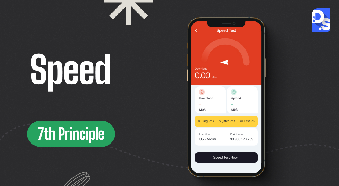
Speed is critical on mobile devices; even a millisecond delay can negatively impact conversions. Slow mobile experiences not only frustrate users but also drive them towards your competitors. Here’s what you can do to make your app fast-loading:
- Use tools to compress images without sacrificing their quality
- Streamline your app’s code by removing unnecessary characters and comments
- Implement caching strategies to store frequently accessed data locally on the user’s device
- Enable basic offline functionality for essential app features
- This allows users to interact with the app even when internet connectivity is limited
- Embrace Progressive Web App (PWA) technology; PWAs offer offline functionality, allowing users to access app features and content even without Internet connections
By implementing these smart strategies, you can convert your mobile app into a speed demon.
8. Optimize Content
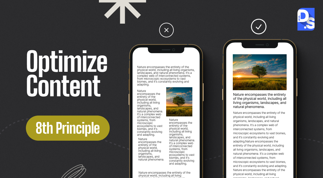
All content on your app should be meticulously optimized for mobile consumption. Here are some general guidelines on how to do that:
Maintain Legibility:
This ensures users can effortlessly distinguish individual characters within the text.
- Avoid using fonts smaller than 16px (or 11 points)
- If you cannot settle on a font, opt for default typefaces and fonts: Roboto for Google Android and San Francisco for Apple iOS
- Ensure adequate contrast between your text and the background color
- Follow the W3C’s web content accessibility guidelines for text and image contrast ratio suggestions
Maintain Readability:
Make your content comprehensible and effortless to navigate through.
- Use all caps only for cases like acronyms, list section header labels, etc.
- Create easily digestible text blocks; aim for 30-50 characters per line on mobile screens
- Provide visual breathing room by maintaining adequate spaces between lines and margins
Optimizing Images and Video Content for Mobile:
Ensure your app’s images are optimized for mobile resolution. Images should be displayed in their correct aspect ratio to prevent distortion. For optimal presentation on modern-day screens, consider creating images sized at 375 x 812 pixels, the most popular smartphone screen resolution. Mobile users overwhelmingly consume video content in portrait mode (vertical orientation). Optimize your app’s video content to deliver a seamless viewing experience in this mode.
9. Focus on Fulfilling User Goals

Mobile users typically have specific, short-term goals in mind when interacting with an app. They expect to complete their tasks quickly and with minimal interaction, be it setting an alarm, checking email, or replying to a message. That is why it is vital to streamline user workflows, minimize unnecessary steps, and focus on helping users achieve their main goals efficiently.
- Identify the essential tasks users come to your app for and ensure they are easily accessible and prominently displayed
- Do not bury app functionalities within complex menus
- Do not request unnecessary logins for basic actions
No matter how many hurdles and friction points you remove from the user journey, the reality of mobile usage is that it is usually packed with distractions and interruptions. To combat user frustration in such situations, make your app remember user progress and context, even after brief closures. Prioritize user progress retention to ensure that even interrupted sessions remain frustration-free in the long run.
10. Biometric Design
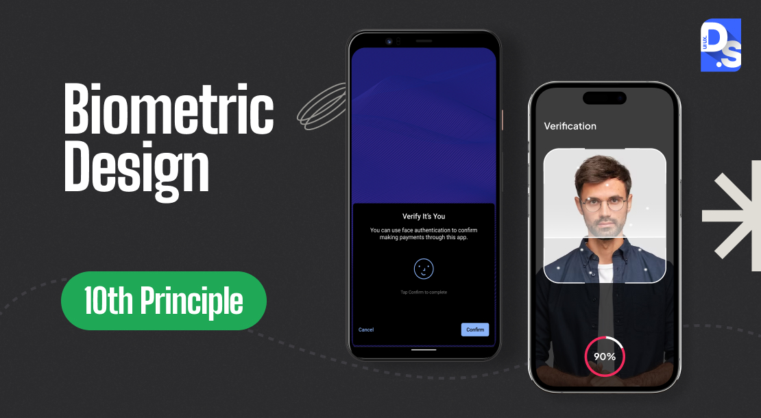
Mobile devices are equipped with various sensors that can enhance UX. Cameras simplify data entry (e.g., credit card number scanning). Biometric authentication systems minimize login steps with fingerprint or facial recognition. Built-in location services provide context-aware experiences (e.g., auto-filling delivery address). By integrating these biometric sensor functionalities into your app’s design, you can deliver more intuitive and user-centric mobile experiences.
11. Research, Test, Revise
The final piece of the puzzle is revision. By meticulously gathering user data through surveys, A/B testing, app store comments, competitor analysis, etc., you will gain invaluable insights into your user base’s needs and pain points. Then, use the data points, feedback, and market research data to refine the app’s design, ensuring it is user-friendly, technically sound, and on par with the latest mobile app UI/UX trends. This iterative process of research, testing, and revision will empower you to create an app design that consistently resonates with users and their evolving needs.
Summary
The mobile app design principles discussed here are not just theoretical; they have a tangible impact on the usability, user adoption, and long-term business success of mobile apps. Understanding and implementing best practices for mobile app design is crucial for creating a seamless and engaging user experience. If you’re looking for mobile app design services that follow industry standards, contact Design Studio- A UI and UX design agency for more detailed guidance.
comments
Add comment