
What is Neumorphism UI: The Future of Design Trends?
Recently, the term Neumorphism UI has become a buzzword in the design community. But what is it, and why does it capture the interest of designers and users? This article delves into the origin, key features, benefits, and drawbacks of Neumorphism UI. We’ll also examine its potential longevity in the realm of design.
Neumorphism UI, or soft UI, adopts a unique approach by using gentle shadows, highlights, and subdued colors to create a sense of depth, making elements appear as though they’re part of the background, thus providing a tactile sensation. This design style is a modern twist on skeuomorphism—which aims to replicate real-world objects digitally—but Neumorphism stands out by not mimicking reality, offering a fresh, unique perspective in UI design.
The trend took off in 2019 when designer Alexander Plyuto showcased a concept that reimagined skeuomorphism in a modern context on Dribbble. The design quickly gained traction, inspiring many designers to experiment with Neumorphism UI, leading to the creation of eye-catching, realistic interfaces. Its popularity grew as designers and users alike were drawn to its minimalist, user-friendly aesthetic.
Essence and Evolution of Neumorphism
Understanding Neumorphism
Neumorphism merges skeuomorphism and flat design, crafting user interfaces that are soft and almost 3D in appearance. Skeuomorphism replicates real-world objects like buttons and switches in a design, whereas flat design streamlines and flattens UI elements, emphasizing bright colors and typography. Neumorphism weaves these styles together through a contemporary design approach, creating a unique and modern look.
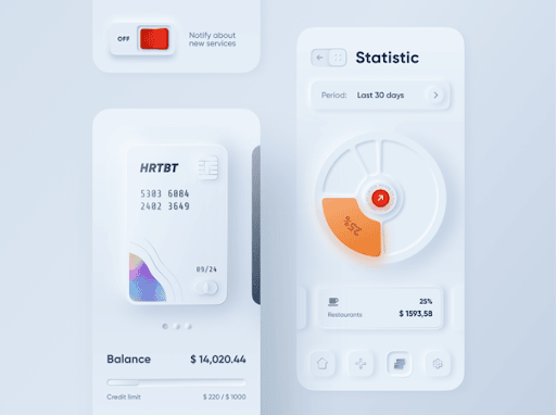
Neumorphism is a design trend that blends skeuomorphism with flat design to create a soft, minimalist, and realistic visual style. Buttons and other design elements in neumorphic UI designs sit on top of the background surface in a raised form. Since neumorphic elements appear slightly elevated from the background surface, they feature shadows and textures.
The Origins of Neumorphism
The neumorphism trend took off in 2019, sparked by designer Alexander Plyuto’s viral Dribbble post. This post showcased how modern apps might look if skeuomorphism remained prevalent. The design caught on quickly, inspiring designers worldwide to explore neumorphism. This led to the creation of striking, realistic interfaces across various platforms, making neumorphism a favored design aesthetic noted for its Soft and light appearance, as well as its ability to enhance user experience.
Characteristics of Neumorphic Design
Neumorphic design is easily distinguished by several key characteristics:
- A minimalist color scheme with low contrast, featuring soft, pastel, or neutral shades.
- User interface elements that blend seamlessly into their backgrounds, achieved through rounded corners and smooth curves.
- A careful application of light and shadow that adds depth and dimension, offering a tactile sensation.
- An exquisite and surreal aesthetic that pushes the limits of conventional design.
Neumorphism in Action: Real-World Examples
Implementations in Popular Apps
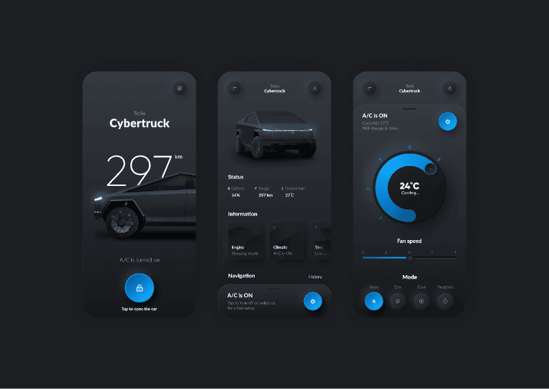
Several well-known applications, including Tesla, Spotify, Nike, and Braun, have adopted the neumorphism UI to enhance their user interfaces. These applications demonstrate the potential of neumorphism UI in crafting realistic, sophisticated interfaces across various products and platforms.
Tesla’s app, for instance, employs neumorphism UI to visually represent information about the car, like its status, battery level, and temperature in an intuitive way.
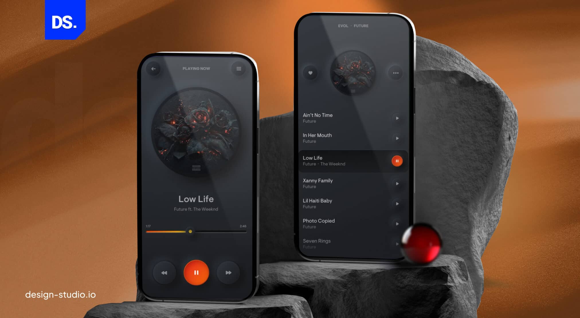
Spotify has revamped its app using neumorphism UI techniques, resulting in a stylish, modern music player with user-friendly buttons and sliders.

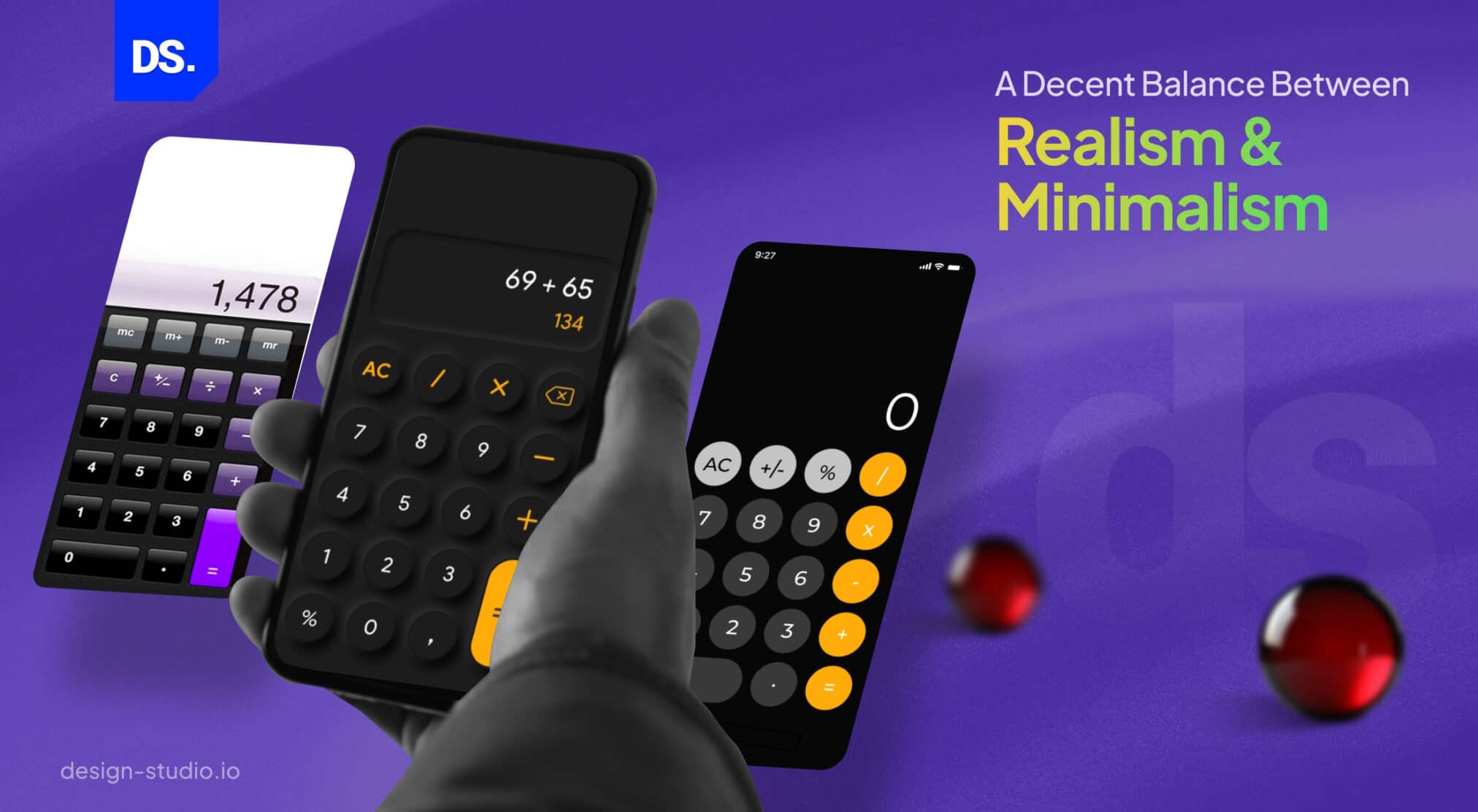
Nike’s e-commerce application utilizes neumorphism UI principles to beautifully present shoes, accentuating details and textures with delicate shadows and highlights. Similarly, Braun’s calculator app draws inspiration from the classic Braun ET66 calculator, featuring smooth curves and buttons, thanks to neumorphism UI.
Benefits for User Experience
Using neumorphism UI can significantly enhance user experience, offering benefits such as:
- A comforting sense of familiarity, enabling users to interact with UI elements that mimic the appearance and feel of real-world objects.
- A perception of depth and dimensionality, giving UI elements a 3D effect that stands out or recedes into the background, offering a tactile and engaging user experience.
- An aesthetically pleasing and elegant design, marked by soft and subtle UI elements that stand in contrast to the bright and flat designs typical of other styles.
Challenges and Limitations
However, employing neumorphism UI comes with its set of challenges and limitations, including:
- Potential issues with contrast and accessibility, as the low color contrast of UI elements against their backgrounds can make them difficult to discern, particularly for users with visual impairments.
- Challenges related to scalability and consistency, due to the complexity of creating neumorphic effects with precise shadows and highlights, which may be hard to maintain and adapt across varying devices and screen resolutions.
- The risk of becoming overly familiar and less impactful, as repeated use of neumorphic elements may lead to them losing their unique appeal, rendering the design monotonous and uninteresting.
Critical Analysis: Is Neumorphism the Future?
Pros and Cons of Neumorphic Design
Neumorphic design brings with it advantages and disadvantages, influenced by the context and objectives of its use. The advantages include:
- A unique and innovative look that distinguishes it from other design philosophies.
- A sense of realism and tactility, which can improve user engagement and satisfaction.
- Support for minimalism, prioritizing both content and functionality.
On the flip side, the disadvantages are:
- Potential reduction in usability and accessibility due to its subtle visual distinctions.
- Challenges in consistent implementation and maintenance across diverse devices and screen sizes.
- Risk of becoming common and losing its original appeal.
Neumorphism and Accessibility
A serious critique of neumorphism centers on its implications for accessibility. Accessibility involves designing products and environments to be usable by people with various disabilities. Concerns include:
- Low color contrast: The reliance on soft gradients and shadows for a three-dimensional effect can lead to insufficient contrast between elements and the background, complicating visibility for users with visual impairments.
- Limited affordances: Neumorphism might obscure the functions of elements, making them less obvious and thereby less usable.
- Ambiguous hierarchy: The arrangement of elements that indicates their importance might be less clear, making it difficult for users to navigate and understand the interface.
The Role of Neumorphism in Future Design Trends
The trajectory of neumorphism in user interface design is under scrutiny. While its distinctive appearance has captured interest, concerns about accessibility and practicality raise questions about its future. Potential outlooks include:
- An evolution of neumorphism: It is expected to assimilate features from other design styles, such as material design or dark mode, to address its weaknesses and play to its strengths. It’s likely to become more vibrant, with added colors, animations, and interactivity for richer and more varied user interfaces.
- A gradual fade from prominence: As accessibility and consistency take precedence for users and designers alike, neumorphism might lose its appeal. Emerging design trends could overshadow it, rendering it less relevant.
- A continued niche presence: Neumorphism could maintain a specialized role for certain applications wanting to evoke a realistic and tactile sensation. It might also exist alongside a variety of other design styles, offering a broader spectrum of choices for users and designers.
Conclusion
Neumorphism UI masterfully blends elements from skeuomorphism with flat design principles, creating user interfaces that are pleasantly soft and visually rich with near-3D effects. This design style offers several advantages and disadvantages, which vary based on the designer’s objectives and viewpoints. Among its benefits, neumorphism UI delivers a sense of realism and tangibility, boasts a minimalist and sophisticated flair, and introduces a novel and cutting-edge appearance.
On the flip side, this design approach can pose challenges to usability and accessibility, prove complex in terms of implementation and maintenance, and risks becoming overly popular and clichéd. The destiny of neumorphism UI within the realm of UI design spurs ongoing discussions. Its trajectory could lead to adaptation, decline, or the possibility of existing harmoniously alongside other UI/UX design trends.
If your curiosity about neumorphism UI is piqued, dive into some of the resources and examples we’ve spotlighted in this discussion. Embrace the opportunity to get hands-on with neumorphism UI through various online tools and platforms designed for experimentation. Neumorphism UI is more than just a trend – it’s an invitation to both designers and users to explore and be inspired.
However, if you’re still not satisfied after exploring neumorphism, you can also consider designing a user interface using glassmorphism. This approach offers a sleek and modern aesthetic that can bring a different level of sophistication to your projects. We as a dedicated UI/UX Design Agency hope our insights have enriched your understanding and appreciation of these intriguing design approaches.
comments
Add comment