
Inspiring Mobile App UI/UX Design Examples in 2025
Discover how market-leading apps like Sephora, Robinhood, Headspace, Airbnb, and others deliver intuitive, user-friendly experiences in this definitive list of the best mobile app design examples.
An app with a seamless and intuitive design will likely engage and satisfy users. It has increased potential to drive business growth more effectively. An app with a poorly planned design may frustrate and disengage users, to the point where your business loses, without gaining any opportunities.
There are around 2.3 million apps on the Google Play Store and around 2 million on the Apple App Store. Not all of them are successful.
The ones that are, meet the sky-high expectations of modern mobile app users.
These apps have immaculate designs, are easy to master, and offer a variety of perks like fast loading times, eye-catching visuals, and more.
Making these uber-successful apps your own mobile app’s UI design inspiration is like taking a shortcut to app store success.
Learn from these successful mobile app design examples > apply them to your own app’s design > meet your users’ needs and surpass their expectations. Sounds easy right?
That’s what this blog post is here to do: highlight the most critical mobile app design best practices that are followed by the market-leading apps of the following segments:
- eCommerce Apps
- Social Media Apps
- Productivity Apps
- Finance Apps
- Health and Fitness Apps
- Travel Apps
Before we dive into these mobile app design examples, let us outline the most important mobile app design principles that you’ll always have to follow – regardless of what type of app you are designing.
Key Principles of Mobile App Design
Mobile app designers have to ground their work in some fundamental principles to create viable designs that meet today’s high standards:
User-Centered Design
User-Centered Design (UCD) is the process of designing apps from the user’s perspective. This means involving users throughout the design process. User feedback should be integrated into the workflows continuously, not just at the beginning/end of design.
This ongoing feedback helps designers understand user reactions to their mobile app design ideas and they can make necessary adjustments quickly. It also helps them design for users in the specific contexts and surroundings in which they use the app.
Minimalist Design
Adopting a minimalist design approach means simplifying the app’s user experience (UX) by removing extra elements that do not contribute to its core functionalities. It means making it easy for users to complete tasks within the app without experiencing cognitive overload.
For instance, in task management apps, giving users easy access to features like creating or editing tasks should be the designer’s priority. Similarly, designers must review and refine all design elements and content within their apps and include only essential elements that contribute to (not distract) user goals.
Visual Hierarchy
Creating a visual hierarchy in an app’s design is the art of structuring all the content and visual elements on the interface in a way that guides users’ attention naturally. Designers basically lead users through logical flows of content by prioritizing information based on its importance.
Through this intuitive content organization and the effective use of visual cues, designers can make users focus on the more important sections of the app. This involves using varying font sizes, strategic placement of specific design elements, and arranging content for easy scanning.
Color Psychology
In mobile app design, color psychology serves as a strategic tool for influencing user perception. It’s a well-established fact that the human brain is wired to react subconsciously to color. Red evokes excitement and passion. Blue has a calming effect.
Mobile app designers must understand how different color combinations trigger psychological, or behavioral responses among users. They must use this knowledge (color psychology) to craft impactful app designs that subconsciously evoke specific emotions among users.
Mobile App Design Inspiration: A Curated Collection
You can see all of these principles play out in the following examples:
Category 1: E-Commerce Apps

Unlike most apps, e-commerce apps have to SELL to succeed. That’s why, e-commerce app design is all about enhancing shopper experiences and driving sales.
Creating a well-structured sales funnel that guides users from product introduction to purchase is vital in e-commerce app design. Designers should focus on 4 key stages within this funnel:
- Education: Provide informative content about products, including descriptions and benefits, to help users make informed decisions.
- Comparison: Incorporate features like comparison charts that allow users to evaluate products side by side, enhancing their ability to choose the best option.
- Engagement: Use visually appealing call-to-action buttons and promotional offers to encourage users to progress through the funnel toward making a purchase.
- Checkout: Modern users expect quick transactions. Simple steps like streamlining the checkout process by pre-filling user info can significantly reduce abandonment rates.
Here are two e-commerce app designs that embody all the principles we have discussed so far:
1. Gucci Mobile App
The Gucci Mobile App offers a unique blend of luxury shopping and interactive features. This blend is designed to enhance user experience and engagement.
User-Centered Design (UCD) is evident in the Gucci app through its focus on personalization and interactivity. The app tailors product recommendations based on the user’s preferences and browsing history, ensuring that the shopping experience feels customized.
Features like the Virtual Try-On utilize augmented reality (AR) to allow users to visualize how products will look on them. The homepage prominently features HD images of current collections. Colors are carefully chosen to align with seasonal collections or specific campaigns. The Gucci app also excels at maximizing user interface interactability by placing critical navigation elements within easy reach.
Effective sales funnel planning is also integral to the Gucci app’s design. Here’s how the app guides users through various stages of their shopping journey:
- Users are introduced to new products through visually striking banners and notifications.
- Detailed product descriptions and high-resolution images educate users about items, highlighting features and benefits.
- Interactive elements such as virtual try-ons and personalized recommendations engage users further.
- The checkout process is streamlined for efficiency, allowing users to complete transactions quickly with minimal input required.
2. Sephora Mobile App
The Sephora app exemplifies innovative and ‘trendy’ e-commerce app design. Here are some of the most eye-catching, innovative design features in this app:
- It uses user data to provide tailored product recommendations and offers.
- It uses augmented reality (AR) to allow users to virtually apply makeup products.
- The app integrates the Sephora Beauty Insider loyalty program and allows users to track rewards, redeem points, and access exclusive offers directly through the app.
- Users can scan product barcodes for detailed information and customer reviews while shopping in-store.
Despite following the latest app design trends, Sephora’s design is still very user-centered and minimalist. The app has no visual clutter and a simple bottom navigation bar that gives users easy access to key sections without overwhelming them with options.
Users are introduced to new products through engaging visuals and notifications. The app provides extensive product information, reviews, and virtual try-on features that help users evaluate options. Personalized recommendations and loyalty program integration keep users engaged with the brand. The streamlined checkout process ensures that transactions are quick and efficient.
Category 2: Social Media Apps

Social media app design focuses on creating engaging user-friendly experiences that foster connections among users. Here are two social media mobile app design examples that meet these objectives and deserve your attention.
1. Pinterest
Pinterest is a unique social media platform that focuses on visual discovery and sharing of ideas. Its design features are quite unique.
Pinterest’s interface is predominantly image-based. Hence, the app can pack feeds full of visually appealing content to keep users engaged. Users can “pin” images to their personal boards within seconds. This feature encourages users to constantly return to their customized collections of ideas and inspirations.
The search bar is prominently placed at the top. Users can easily find specific content or ideas in the visually rich search results which are presented in grid layouts. This clean, grid-based layout allows images to take center stage without distractions from excessive text or buttons. This simplicity aids in maintaining user focus on the content itself.
Larger images are used for trending or popular content, while smaller thumbnails represent less prominent pins. This organization helps users quickly identify what’s most relevant or engaging.
2. Messenger
Messenger is a widely used social media app that facilitates instant messaging and communication. It connects users through text, voice, and video calls, and it is designed to enable meaningful conversations and community-building.
The app is designed for ease of use. The main interface features a bottom navigation bar with clearly labeled icons for Chats, People, Discover, and Settings. This makes it easy for users to access different sections without confusion. All icons are simple and easily recognizable.
The chat list is the focal point of the home screen, displaying ongoing conversations in a clear layout. Unread messages are highlighted with bold text or colored indicators. Visual cues such as badges on the app icon and within the interface alert users to new messages or activities. The predominant blue color scheme evokes feelings of trust and calmness, aligning with the app’s goal of making users feel secure while using the platform.
Category 3: Productivity Apps
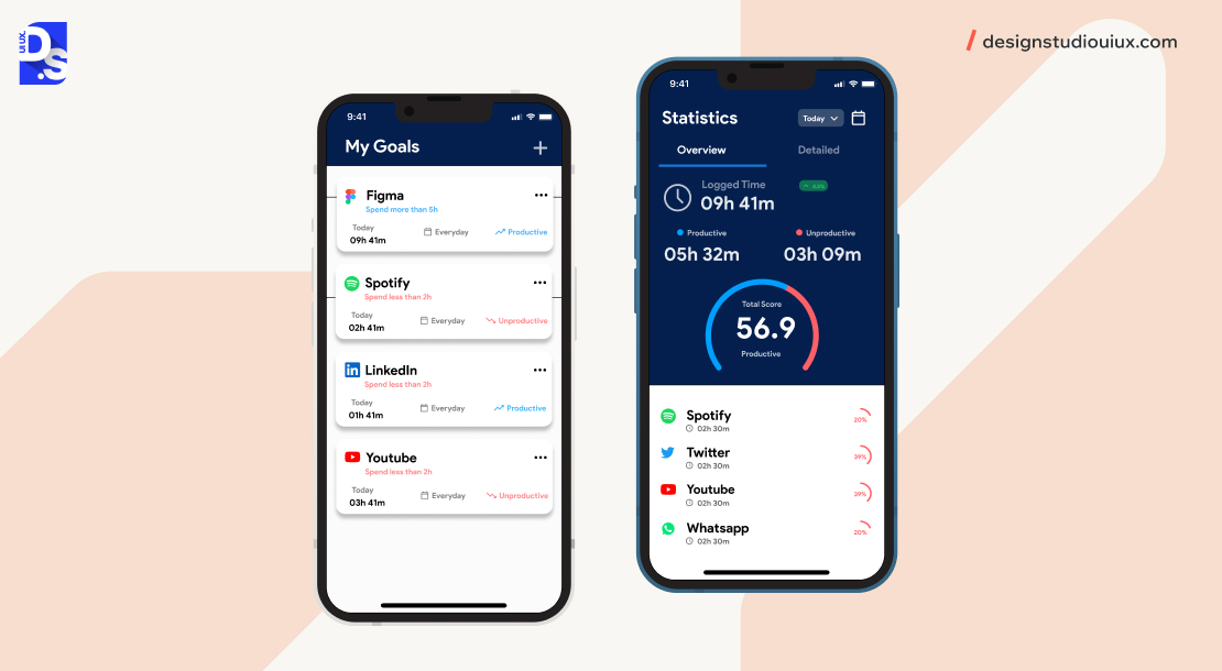
Productivity app design begins with a deep understanding of the target audience through surveys, interviews, etc. Once designers know specific user goals and preferences, they can empathize with the users to create design solutions that enable quick and efficient task completion.
Clutter-free interfaces, minimizing steps required to complete tasks, gamification, intuitive navigation patterns, and effective use of visual hierarchy are also key elements of productivity app design. In these two examples, we see these principles come into play.
1. Todoist
Todoist is a leading productivity app. It combines a functionality-based UX design with an aesthetically pleasing interface. Tasks in the app are visually differentiated based on priority levels. The layout organizes information logically, with projects clearly listed on the left sidebar and tasks displayed prominently in the main area.
Users can personalize their experience by selecting themes and background images for their task lists. Tasks can be organized into projects and sub-projects. Todoist supports team collaboration by allowing users to share projects and assign tasks to team members.
The branding emphasizes straightforwardness with slogans like “Capture everything” and “Achieve more.” The app’s navigation is equally straightforward. Users can quickly learn how to navigate its features without extensive training.
A predominantly white background provides a calm workspace that reduces distractions. The use of red for priority levels draws attention and signifies urgency. This color combo encourages users to address high-priority tasks promptly.
2. Toggl Track
Toggl Track (Toggl.com) is a powerful time-tracking app designed to help users monitor their productivity efficiently. It offers an intuitive start/stop button for tracking time, making it easy for users to log their activities without complicated setup processes.
The interface is clean and straightforward, allowing users to focus on their tasks without distractions. Key functions are easily accessible through a well-organized layout. Toggl’s standout design feature is its effective use of microinteractions.
When users start or stop tracking time, subtle animations provide immediate feedback, confirming that their action has been registered. Notifications about idle time are designed to be unobtrusive yet effective. Visual indicators show progress toward daily or weekly goals.
Category 4: Finance Apps
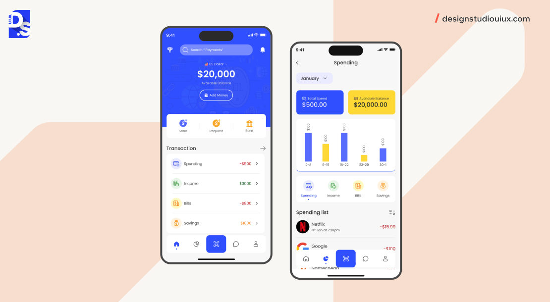
The designs of finance apps should inspire user trust and simplify complex, financial tasks. Here are two apps that excel in these regards:
1. Mint
Mint is a popular personal finance management app designed to simplify complex financial data for users. The app connects with over 17k financial institutions and gives users easy access to all their accounts via one intuitive interface.
Mint automatically categorizes transactions (groceries, and utilities) based on user spending patterns. It uses graphs and charts to present financial data visually so that users can grasp their financial situation at a glance. All key functions are easily accessible through a straightforward menu structure. Users receive immediate feedback (subtle animations) on all their actions.
2. Robinhood
Robinhood has transformed the trading industry with its bold, minimalist design. Robinhood’s interface is characterized by a clean layout that emphasizes essential information. The app employs swipe gestures and straightforward icons for navigation- this makes it easy for users to move between app sections (portfolios, market data, account settings)
Financial data is presented through visually appealing charts and graphs. Important actions like buying or selling stocks are highlighted with bold buttons. The data is organized logically, with easy-to-read fonts and color-coded information. Animations provide instant feedback whenever users place trades.
Category 5: Health and Fitness Apps
The design of health and fitness apps is all about motivating users and facilitating their journeys toward better health in a fun, gamified, and data-based way.
Here are two health apps that get these details right:
1. Strava
Strava has made a huge impact on the fitness industry with its well-designed social features and gamification elements. Its social feed allows users to share their workouts and achievements with friends. All other key features on the app are easily accessible through well-organized menus.
The app features leaderboards that allow users to compare their performance against friends and other Strava athletes. Strava also hosts regular challenges that encourage users to achieve specific fitness goals. Visual cues show progress toward goals or challenges in real time.
Important data such as pace, distance, and elevation gain are highlighted prominently during workouts. When users receive kudos from friends or complete challenges, subtle animations provide immediate feedback. Upon completing significant milestones (e.g., personal bests), the app displays celebratory animations.
Users can also create or join clubs and teams within the app. This social aspect enhances motivation as users support each other in reaching their fitness objectives.
2. Headspace
Headspace’s serene design creates an app environment conducive to its mindfulness practices. It features a soothing interface with soft colors and gentle animations that promote relaxation. Users can easily navigate through different app categories (stress relief, sleep improvement, etc.) and track their meditation progress over time.
By reducing visual noise, Headspace allows users to focus on their meditation experience without distractions. Important actions, such as starting a meditation session or accessing sleep resources, are visually emphasized.
Soft blues, greens, and pastel color backgrounds evoke feelings of calmness and relaxation; gentle accent colors are used for buttons and notifications. Calming sound effects accompany interactions (like starting or finishing a session), creating an immersive experience that enhances relaxation.
Category 6: Travel Apps
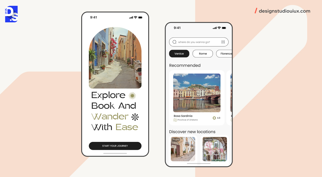
Travel apps should be designed in ways that make travel planning and management fun. Here’s our review of the designs of two travel apps that achieve this tough objective:
1. Airbnb
Airbnb was the first popular travel app that digitized the way people book accommodations and made the process fun. It did so through immersive, storytelling-based design.
The app employs HD images and videos to showcase listings so that users can visualize their potential stays. It prominently displays user reviews and ratings for each listing, providing social proof that builds trust among guests.
Airbnb also offers a section for local experiences led by hosts – this feature encourages users to engage with their destination beyond just booking a place to stay. The use of warm colors like coral and soft beige across the app evokes feelings of comfort and hospitality.
With these design choices, Airbnb can position itself as the perfect platform to connect international travelers with local hosts.
2. Skyscanner
Skyscanner is a powerful travel app that simplifies searching for flights, hotels, and car rentals. Its efficient search functionality and clear, concise interface make it a go-to tool for travelers looking for the best deals.
It allows users to search for flights across multiple airlines and travel providers simultaneously. The app’s “everywhere” search feature and robust filtering options enable users to easily refine their searches based on criteria such as price, duration, number of stops, and departure times. Once users find their desired flight or accommodation, they can book directly through the app or get redirected to the provider’s website.
Overall, the app’s clutter-free layouts, focused navigation, and easy-to-use search functions make it the ideal travel app.
Mobile App Design Tools and Resources
Need more mobile app design inspirations? Well, the best mobile app design ideas will come from you! Use design tools like:
- Figma to create unique designs, prototypes, and components by using its extensive library of templates and plugins and its built-in vector editing capabilities and prototyping tools
- Adobe XD to create artboards for different screen sizes and design interfaces with animations and transitions
- Sketch to experiment with UI design ideas
Once you create your own, unique designs, consider uploading them to:
- Dribbble where app designers from across the world share their work
- Behance where creatives showcase their app design portfolios and case studies
- Pinterest where you can search for mobile app UI design inspirations by entering relevant keywords
You can also find countless mobile app design examples and ideas on these platforms.
Conclusion
Hopefully, this ultimate collection of mobile app design examples inspires you to give your app the design edge it needs to stand out in 2025.
Before starting your project, it’s essential to understand the cost to design an app and plan your budget wisely.
Make sure to follow all the key mobile app design principles we have outlined – minimalism, visual hierarchy, user-centered design, etc. while creating your app’s design. For a comprehensive approach, refer to our mobile app design guide to ensure a seamless user experience.
If you need cost-related instructions on designing your app, contact Design Studio! Our mobile app design services is open to customer queries and requests 24/7.
We’ll give you a detailed cost estimate for free and guide you on our mobile app design process. Contact us now!
comments
Add comment