
11 Best & Inspiring Minimalist Web Design Examples in 2025
What is Minimalist Website Design?
Minimalist web design is a philosophy that removes non-essential design elements from a website to focus on its core functionalities and aesthetics. Its goal is to tell a sharply directed story through strategic design decisions rather than offering the user many choices.
Minimalism is not a new design trend. In the art world, the minimalist movement of the 1960s and ‘70s was a reaction against the overly self-expressive era of abstract expressionism. Similarly, the recent explosion in minimalism is a reaction against the excessively interactive apps and websites that we all use. It attempts to balance out the hustle and bustle of these flashy platforms with the website equivalent of a peaceful cafe or a quiet library.
Flashy digital platforms will continue to invade our phones and workplaces for the foreseeable future. To counter this, minimalist web design will continue to be as popular as it is today.
Here, we will look at some of the most impactful minimalist web design examples of the past decade. If you want your website to adopt this powerful and popular design approach – you will get a healthy dose of minimalist web design inspiration to get started.
In the next section, we’ll look at minimalist web design examples that get this balance right.
Examples of Minimalist Web Design
Here are 12 websites with exceptional minimalist website design.
1. Apple
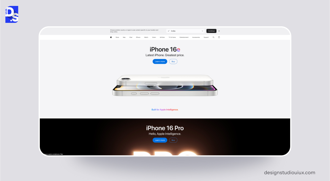
Apple’s website exemplifies minimalist design, mirroring its brand’s core values of innovation and sophistication. The site focuses on visually driven product storytelling, using a clean and simplified layout.
The site employs several strategies to maintain a clean aesthetic. Flat icons and concise menus reduce clutter. Navigation bars and technical specifications are tucked away in collapsible menus to keep the main interface uncluttered. High-resolution product visuals dominate the screen, underscoring the quality and design of Apple’s products.
The website also uses the SLIP method effectively. Products are categorized logically, labeled clearly, and prominently displayed with full-screen imagery. Generous use of whitespace around text and images creates a gallery-like browsing experience, allowing products to stand out. The site predominantly uses white backgrounds, strategically incorporating product colors (like the various iPhone finishes) to draw attention. Clean, sans-serif fonts (SF Pro) ensure excellent readability and contribute to the website’s modern feel.
Apple’s use of auto-play videos in the hero sections immerses users without overwhelming them – a testament to skillful minimal motion design. Introducing subtle micro-interactions, like hover effects on product tiles improves user engagement without adding clutter.
2. Dropbox

Dropbox’s website embodies functional minimalism, focusing on clarity and ease of use for its file-sharing service. The website uses abstract illustrations to simplify complex cloud storage concepts. Advanced features are nested under the ‘Solutions’ menus. Bold CTAs such as ‘Sign up for free’ are strategically placed to attract user attention.
The website effectively sorts and labels use cases (e.g., “For teams”) for quick scanning. Ample spacing between sections helps prevent visual fatigue. A restrained blue-and-white color scheme evokes trust, with yellow accents used to guide user attention. Rounded sans-serif fonts (Sharp Sans) give the site an approachable feel
The intuitive hierarchy enables users to quickly understand Dropbox’s value proposition. The website could however benefit from warmer imagery or subtle animations or illustrations like floating folders.
3. Squarespace

Squarespace’s website showcases its design tools through a minimalist aesthetic that blends elegance with persuasive marketing. Template previews use thumbnails to avoid clutter. Pricing details are consolidated under a single menu. Stunning website examples effectively showcase the website-building platform’s capabilities.
Features are categorized clearly (e.g., ‘Websites,’ ‘Commerce’), with CTAs like ‘Get Started’ taking precedence. Large margins around text blocks enhance readability. Muted grays and blacks are offset by vibrant accents from demo sites. A mix of serif (Freight Text) and sans-serif (Avenir) fonts strikes a balance between creativity and professionalism.
Overall, this site is visually rich without being excessive; demo sites offer emotional inspiration. Guided storytelling leads users seamlessly through the site’s benefits.
4. Nordic Design

Nordic Design’s website combines minimalism with Scandinavian aesthetics. Flat icons replace text labels in sidebars, and social media links and archives are minimized in footer menus. Articles are categorized by topic (e.g., ‘Architecture,’ ‘Interiors’), with headlines in bold sans-serif fonts. Margins around images and text evoke the spaciousness of Nordic interiors. Earthy neutrals like beige and gray, along with black accents, embody Scandinavian minimalism
Coming to typography, there are clean, geometric fonts (e.g., Futura) that reinforce a sense of modernity. The serene navigation complements the calming themes of the content, while grid layouts adapt gracefully to smaller screens.
Overall, the site achieves emotional resonance through imagery of nature and light, creating a “digital hygge” experience.
5. MADE

MADE’s website uses minimalism to showcase its furniture. It blends large visuals with subtle interactivity. Product filters are condensed into toggle menus, and customer reviews are accessible via clickable icons. Full-screen product images with parallax scrolling enhance the visual experience. Collections (‘New In,’ ‘Living Room’) are labeled clearly, and CTAs like ‘Shop Now’ are prominently displayed.
Negative space frames furniture pieces, creating an art exhibit-like presentation. Neutral backdrops (white, and gray) allow the vibrant colors of the furniture to stand out. Modern sans-serif fonts (e.g., Neue Haas Grotesk) complement the brand’s contemporary style. Animations, such as fading text, add dynamism without creating clutter.
Overall, the site offers intuitive exploration. It allows users to easily shop and “window shop.”
6. Helvetica Now
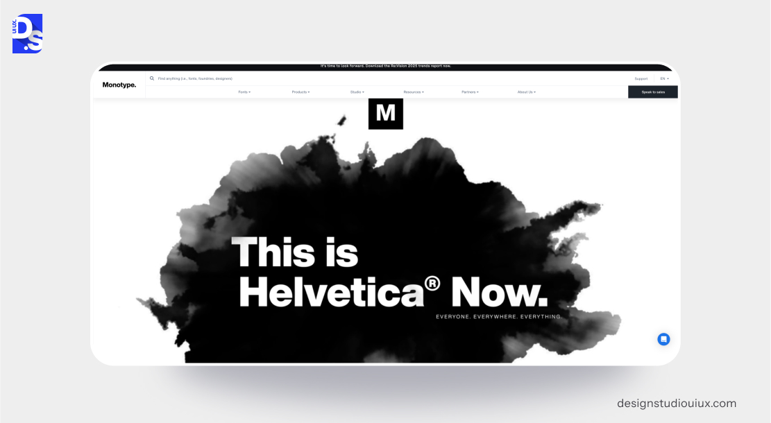
The microsite dedicated to Helvetica Now exemplifies minimalist typography. The site embraces simplicity by reducing navigation to a single hamburger menu – all technical specifications are hidden behind expandable tabs.
Font styles are neatly sorted by weight and intended use. The site exclusively uses Helvetica Now, which reinforces the self-referential nature of the design. Extensive negative space is used to frame individual glyphs, presenting them almost as museum pieces. The site employs a monochromatic color scheme (black, white, and gray) to prevent distractions
The overall aesthetic is intellectual rather than overtly emotional, appealing to typography purists. The “Type Tester” tool effectively transforms the site into a functional demo, merging marketing with practical utility.
7. Bose
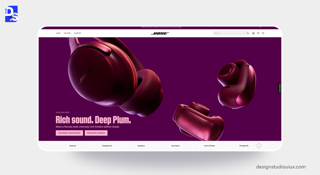
Bose uses minimalist web design to effectively focus attention on its premium audio products. Streamlined icons and labels are used in the navigation bars and product categories. Detailed product specifications are placed within collapsible menus. Large, high-resolution images of audio products dominate the visual space.
Products are neatly categorized with clear labels. Generous spacing around products and text enhances focus. The site features predominantly white backgrounds with accents of black and product-specific colors to draw attention. Modern, sans-serif fonts (including Bose’s custom typeface) ensure clarity and sophistication.
The use of interactive 360-degree product views on the site provides an immersive experience without adding visual clutter. This mixture of images and a minimalist layout creates a premium and engaging feel.
8. Tesla
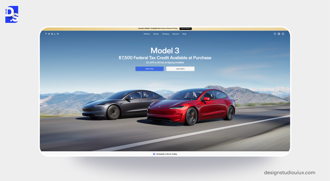
Tesla’s website exemplifies minimalism by emphasizing its innovative products with smooth navigation and a spacious design. The site features simplified navigation with only essential links. Additional details and specifications are hidden behind expandable sections.
High-impact visuals of Tesla’s vehicles are prominently featured. All products are categorized and showcased with full-width images to capture attention. There is generous spacing around all visuals and text blocks. The site primarily uses white, with strategic applications of black and red for contrast. Clean, sans-serif fonts ensure a modern and sleek aesthetic.
Immersive video backgrounds on landing pages showcase Tesla’s innovation. But, they do not overwhelm users. Adding subtle hover effects on vehicle images makes the site more engaging.
9. Muji
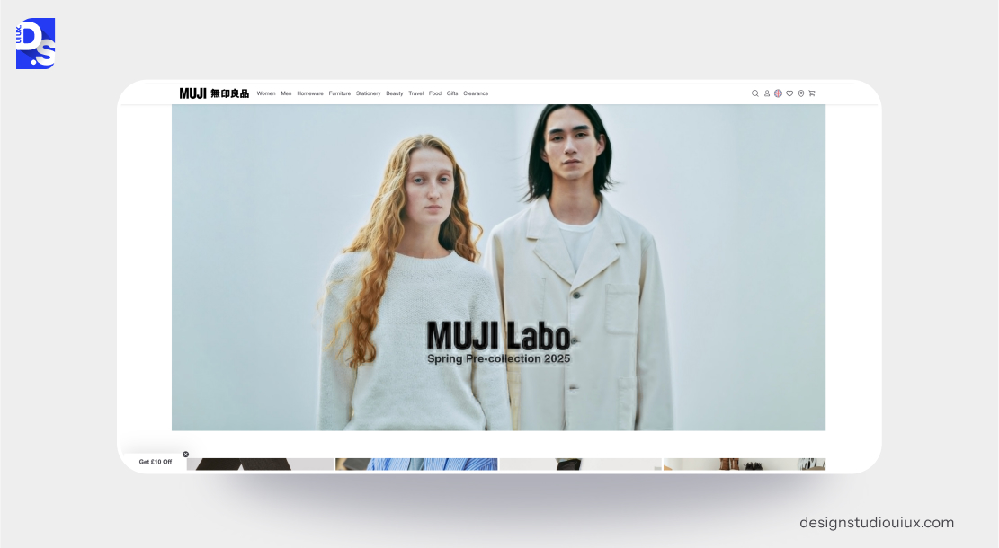
Muji’s website reflects the brand’s minimalist ethos through simple navigation, neutral colors, and functional design. Simplified icons and labels reduce visual clutter. High-quality images of Muji’s products dominate the visual space.
Products are neatly categorized. Generous spacing around products and text enhances readability. The use of neutral colors with subtle accent hues reflects the brand’s understated aesthetic.
10. Framer

Framer’s website has a minimalist layout. With subtle animations and bold text, it offers a seamless experience that showcases its website-building services. The site highlights content by keeping icons and text to a minimum. High-quality visuals and animations are bold and only used to highlight key features of the platform. Features and use cases are organized into clear categories for effortless navigation.
Extra space around elements makes the layout feel neat and airy. Bright colors stand out against a white background, making important elements and CTAs more noticeable. Bold, sans-serif fonts (for example- Inter) are used to ensure readability and create a strong visual impact.
Simple animations and transitions in Framer enhance the design without losing its clean style.
11. Everlane
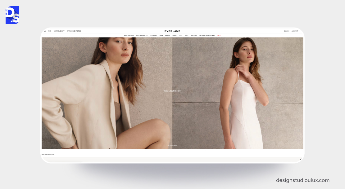
Everlane’s website employs a minimalist design philosophy to reflect the brand’s commitment to transparency and ethical practices. The website predominantly uses white, accented with muted tones to create a subtle, sophisticated feel. Clean, sans-serif fonts (e.g., Helvetica) ensure readability and align with the brand’s minimalist aesthetic.
Optimized images ensure fast load times (crucial for eCommerce sites). The brand’s transparent pricing strategy and ethical storytelling are integrated seamlessly into the site’s design.
Any eCommerce site that wants to go minimalistic should take inspiration from Everlane.
Key Principles of Minimalist Web Design
Before we start discussing specific minimalist website design examples, let us look at the fundamental principles of this web design philosophy.
Simplicity: Thoughtful Reduction
The simplest way to achieve simplicity is through thoughtful reduction. The concept of simplicity in minimalism is not just about removing multiple design elements from a website – it is about carefully choosing what to keep. It emphasizes the importance of retaining only those features that directly contribute to the user experience. To apply this principle, web designers use the SHE method.
- Shrink: Reduce visual bulk with flat icons.
- Hide: Place complex features in menus.
- Embody: Show quality with sharp visuals and easy-to-use interactions.
This careful curation ensures that every element in the website serves a clear purpose and that users focus only on what is important. It makes navigation straightforward and naturally intuitive.
Use of White Space: The Power of Context
Whitespace, or negative space, is the area around design elements not filled with content. In minimalist web design, whitespace is not empty space – it is a critical tool for framing all design elements (especially text content) to create visual breathing room. The spaciousness helps users concentrate on the essential elements without feeling overwhelmed.
Prioritize Content with SLIP
Content is at the forefront of minimalist design. Minimalist web designers use the SLIP method – Sort, Label, Integrate, and Prioritize to organize content effectively.
This approach involves sorting information into categories, labeling them clearly for easy identification, integrating related items for seamless navigation, and prioritizing key messages to ensure they stand out.
Limited Color Palette: Rhythm of Differences
Restrained color palettes are another hallmark of minimalist web design. By using fewer colors, designers can create a cohesive visual identity. Such simple, visual aesthetics naturally feel more sophisticated and professional than heavily cluttered websites. Strategic use of color can also guide user attention. For example, using a bold accent color against a muted background can draw focus to important calls to action.
Typography: Knowledge Through Clarity
Since minimalist sites have very few design elements, making the right typographic choices and following the right typography font trends are vital for making them look visually appealing. Thoughtful typography not only enhances aesthetics but also makes website content more accessible. Clear and legible fonts reduce the cognitive load on users.
Choosing certain typefaces can also convey specific brand values. For instance, The New York Times uses serif fonts in its headlines to give the site a sense of old-school credibility.
Benefits of Minimalist Web Design
Minimalism is one of the top web design trends of all time and only getting more and more popular in the digital domain- not just because it is built on solid, user-centric principles, but also because of the numerous real-world benefits it offers.
This design approach has the following benefits.
Faster Loading Speeds
Fewer elements mean fewer HTTP requests. Websites with minimalist designs mostly load faster as they require less bandwidth and processing power. This efficiency is crucial in today’s fast-paced digital environment where users expect instant access to information.
Enhanced User Experience
When designs are straightforward, users can navigate effortlessly without confusion or cognitive overload. Minimalist websites are great at fostering intuitive learning environments.
Mobile Friendliness
Following the SHE (Shrink, Hide, Embody) method makes sense in a world where over 60% of global Internet traffic comes from mobile phones. Minimalist websites naturally adapt well to smaller screens because they have fewer elements to resize and reorient.
Improved Aesthetic Appeal
Minimalist websites are definitely more pleasing to the eye than overly cluttered sites. But, is minimalist web design inherently beautiful? Depends on who you are asking and who the designers are because beauty is subjective.
From a rational standpoint, minimalist designs are typically easier and less expensive to produce. But, by emphasizing clarity and functionality, minimalist websites may lack the emotional depth that more decorative designs provide.
To create aesthetically appealing minimalist web designs, designers must strike a balance between simplicity and emotional expression. They must consider how their choices affect users’ feelings and experiences. They must thoughtfully incorporate elements that evoke emotion – color, texture, or unique shapes – to enhance the aesthetic appeal of their websites without compromising on core minimalist principles.
How to Achieve Minimalist Web Design
Want to follow these sites and make your website minimalist? Follow these steps to get started.
1. Use a Grid System for Balanced Layouts
Using a grid ensures that everything in your design is well-structured and neatly arranged. It creates a neat design that makes reading and navigating easier. With a grid, all pages on your website stay well-organized and aligned.
Recommended Tools:
- Figma offers robust grid layout features that allow for precise alignment and spacing
- Sketch also supports grid systems, making it easy to create balanced designs
2. Stick to a Limited Color Scheme and Font Family
Limiting your color palette to 2 or 3 complementary colors. Choose 1 or 2 font families. Use these elements consistently throughout the site.
3. Priotize User-Centric Navigation
Use clear labels and a straightforward menu layout. Hide less critical options in expandable sections. Ensure that users can easily find what they are looking for without unnecessary clicks.
4. Embrace Whitespace Strategically
Use whitespace effectively to separate key content sections and highlight important features.
5. Use High-Quality Visuals
Use professional images or custom illustrations in key areas of the site. Make sure these media files are optimized to maintain fast loading times.
6. Optimize for Speed
Constantly optimize your website’s design for speed by compressing images, minimizing HTTP requests, and using lightweight themes or frameworks. Use GTmetrix to constantly analyze your site’s speed and make routine optimizations.
7. Use Clear Calls to Action (CTAs)
All CTAs on your site should be easy to locate. Use contrasting colors and ample whitespace around CTAs to make them stand out without overwhelming the user.
8. Follow User-Centric Design Principles
Always keep the user experience at the forefront of your design decisions. Understand your audience’s needs and preferences, ensuring that every element serves a purpose and contributes positively to their journey on your site.
Conclusion
We live in a mobile-first era. And since mobile screens are inherently smaller, designers face the challenge of creating user-friendly website experiences without overwhelming users. They are naturally inclined to thoughtfully select content and prioritize essential website features. Given this, minimalism is the perfect web design philosophy of the era. It offers a wide range of practical benefits, is pioneered by many major brands (as we discussed above), and lets us present content effectively within the constraints of smaller screens.
We invite you to explore all the minimalist web design examples listed above. Then, we’d love to hear your thoughts! If you are serious about making your website minimalist, consider visiting our UI/UX design agency’s website for a free consultation.
At Design Studio, we provide world-class custom website design services to many leading brands. Many of these brands have minimalist aesthetics created by us.
Let’s connect and bring your vision to life!
comments
Add comment