
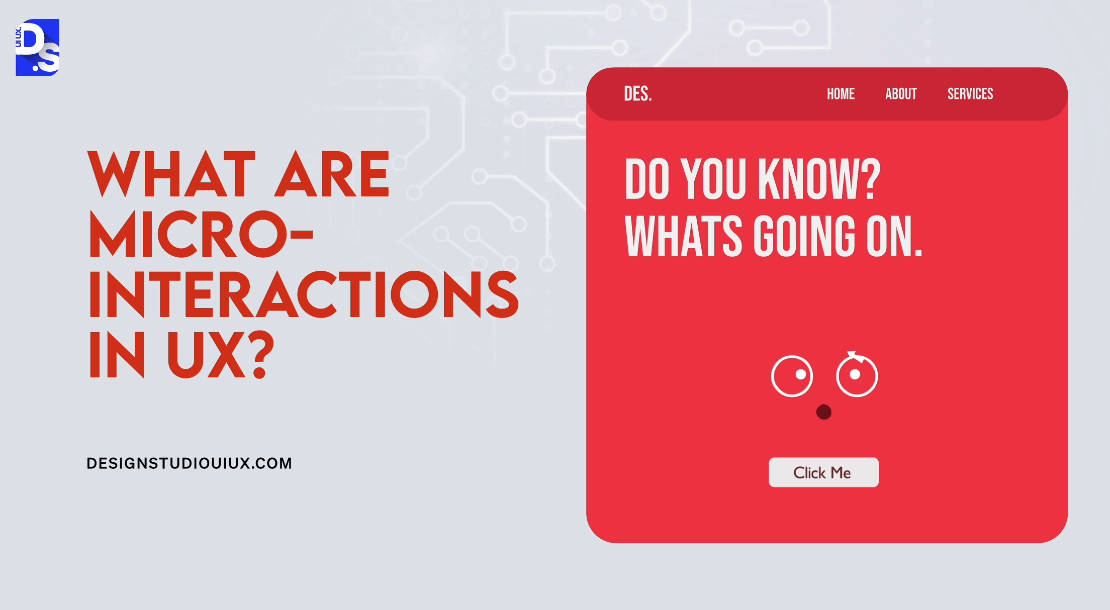
10 Micro Interactions Examples to Improve UX (2025)
Microinteractions in design are the subtle, functional, and interactive details of a digital product that make engaging with it easier and enjoyable. The “micro” in “microinteractions” suggests that it is a small aspect of a product’s design.
Small? Yes. Unimportant? Absolutely not!
What are Micro interactions?
Microinteractions are all the small, task-based features and interactions inside a digital product. Designers have to individually design each feature to make them more engaging and memorable.
Every time you engage in activities like syncing your data or devices, using tooltips during onboarding, picking a password, receiving a confirmation message, and so on, you are engaging in a micro interaction.
Micro interactions are usually designed with subtle animations:
- Eye-catching animations give users visual feedback
- This interesting visual feedback can turn dull interactions into feeling more human, intuitive, and engaging
A few well-designed micro interactions can drastically enhance a digital product’s UX. Take Instagram as one of the most interesting micro interactions examples. The popular image-sharing app is packed with microinteractions:
- Tapping the heart icon animates it to fill with color which serves as immediate visual feedback
- As users view stories, a progress bar fills up, indicating how many stories are left to be viewed
- When users save a post by tapping the bookmark icon, it animates briefly
- After sending a DM, users receive a brief animation indicating it has been sent successfully
- When users swipe left/right to navigate between posts smooth animations pop up enhancing the feel of fluidity in the navigation
Each of these interactions is ‘small’ compared to Instagram’s core features related to content sharing.
But, without these ‘small’ interactions coupled with single-purpose animations, using Instagram would not feel so intuitive and engaging.
Micro Interactions Examples That Improve UX
Let us learn more about designing microinteractions by studying some popular real-world microinteractions UX examples
Social Reaction Button
.gif)
Facebook. Instagram. X. All social media platforms have ‘reaction buttons’ that help them ‘like’ posts:
- The user clicks the thumbs-up icon to initiate the ‘like’ action
- Clicking the button registers the like, which updates the post’s engagement metrics
- The button visually changes (e.g., fills with color) and may display a count of total likes.
- The interaction persists until the user decides to unlike the post
This microinteraction simplifies expressing approval, making it quick and satisfying:
- It encourages user engagement
- Microinteraction fosters community interaction on social media platforms
- It provides immediate feedback and reinforces user actions effectively
Swiping to Select

Swiping to select is a microinteraction that allows users to answer simple yes or no questions within an app. It gives users a quick and intuitive way to express preferences.
Tinder uses this microinteraction very well. On it, users can swipe left or right to register no or yes depending on whether they like or dislike the profile suggested by the dating app
- The user initiates the interaction by swiping left/right on a potential match
- A left swipe indicates ‘no’ and a right swipe indicates ‘yes’
- Visual cues (animations, color changes), confirm the user’s choice after the swipe
- The interaction repeats for each new match, maintaining a consistent UX
The swipe gesture simplifies decision-making while making the interaction very engaging. When users feel empowered by their ability to quickly express preferences, they engage more.
Dynamic Loading Animation
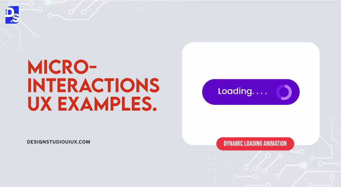
Dynamic loading animations transform dull wait times into informative and engaging experiences. They inform users about the loading status.
Figma’s interface is full of small, focused, and dynamic interactions that guide users through all functions and features. These microinteractions encourage users to wait without losing patience.
- The loading animation is triggered when a user initiates an action, such as exploring a new feature
- A progress bar shows progress until the feature completes loading
- Users receive visual feedback through a colorful progress bar that operates under context-aware rules
- The loading animation continues until the content is fully loaded
Designers should leverage dynamic, animated microinteractions to keep users informed and entertained during wait times.
Positive Feedback Animation
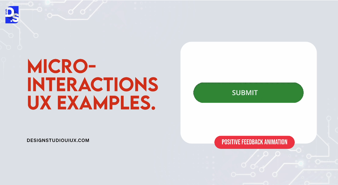
The feedbacks that celebrate small user accomplishments are joyful. They are even better when they are animated. For example, Mailchimp uses celebratory GIFs to share positive feedback whenever users complete important tasks.
- The microinteraction is triggered when a user schedules a newsletter to send it
- The “Rock on!” message and celebratory GIF appear upon successful newsletter scheduling
- Users see an encouraging message along with a fun, animated GIF that celebrates the action
- The microinteraction occurs only once per newsletter scheduling; it does not repeat unless the user schedules another newsletter
Celebratory, animated feedback is a type of microinteraction that can instantly enhance user satisfaction. Over time, it can even build user loyalty.
Voice-Activated Search

Audio feedback and input can elevate the quality of any interaction.
The Google Inbox app’s voice search feature is a prime example of such a microinteraction. It allows users to click on a small icon to find emails without typing.
- Users tap the microphone icon or say “Ok Google” to initiate a voice search
- The app listens for voice commands and processes them to retrieve relevant emails
- Users see a visual indicator that the app is listening; results appear instantly as the query is processed
- The expanded search bar remains active until the user selects a suggestion or taps outside the bar
Voice search in Google Inbox streamlines the process of finding emails, especially for users on the go or with accessibility needs.
Hover Over Animation Effect
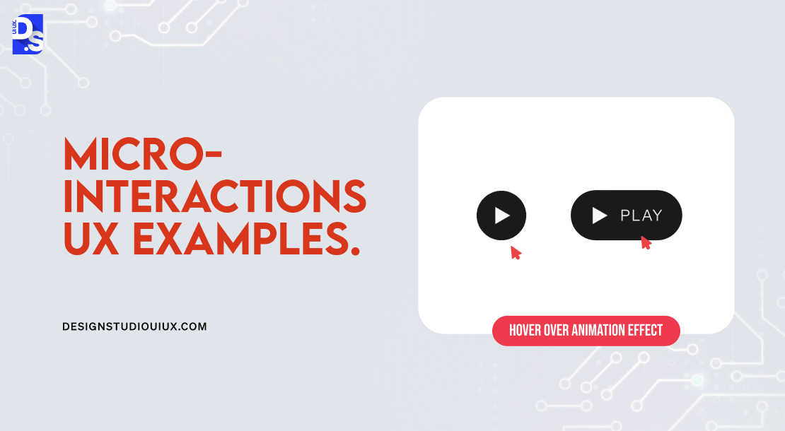
All users need clear visual cues to navigate through a product. Now picture this visual cue – animations that automatically activate when you hover the mouse over different design elements. Hootsuite uses this microinteraction very effectively:
- The mouse-over effect is triggered when users hover over a card on the Hootsuite homepage
- This rule dictates that the card slightly elevates to indicate it is clickable, signaling to users that further action is possible
- The visual feedback is immediate; the card’s movement informs users that they are about to interact with it
- This effect remains active as long as the user hovers over the card
This microinteraction instantly improves usability by clearly demonstrating which elements are clickable.
Encouragement Mechanism
.gif)
The ‘Raise Hand’ feature in video conferencing apps like Zoom and Google Meet allows participants to signal that they want to speak. This microinteraction enhances engagement during virtual meetings.
- The user clicks the ‘Raise Hand’ button to indicate their desire to speak during a meeting
- Once activated, the hand icon appears on the screen, signaling to the host and other participants that the user has raised their hand
- The appearance of the hand icon provides immediate visual confirmation that the action has been registered
- The hand icon remains visible until the user lowers their hand or the host acknowledges them
Username and Password Feedback on Websites
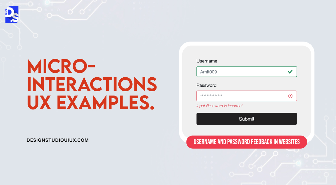
The small red messages indicating incorrect usernames or weak passwords provide users with immediate feedback during login processes. You’ll find this microinteraction on most websites that allow users to log in to existing accounts:
- The user submits their login credentials by clicking the ‘Login’ button
- If the username is incorrect or the password does not meet strength requirements, an error message is instantly triggered
- A small red message appears, clearly stating the issue appears (e.g., “Username is incorrect” or “Password needs to be stronger”)
- The error message remains visible until the user corrects their entry and resubmits the form
It is a common, ‘must-use’ microinteraction. It shares actionable feedback that guides users toward successful login attempts.
Gamification with Animation
Gamified elements are known for enhancing user engagement by making tasks like onboarding or daily check-ins fun and competitive. If you add game-like animated design elements every time users accomplish something, you can make UX even more fun. Asana does this very well:
- Animations are triggered whenever users complete specific tasks within the app
- The appearance of specific types of animation for completing specific types of tasks is fixed, consistent, and predictable
- For example, a magical unicorn soars across the screen providing instant visual feedback whenever a major task is completed
- The animations keep reinforcing positive in-app behavior through repetition
Gamification with animation makes microinteractions more fun. It increases user motivation to complete tasks.
File Upload Progress
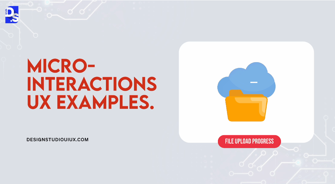
This microinteraction aims to simplify the UX by sharing clear visual feedback during the file upload process. That is why, it is present in almost every app that allows users to upload files.
Dropbox is the perfect example. This microinteraction in the app enhances transparency and reduces uncertainty:
- The microinteraction is triggered when a user initiates a file upload
- The progress bar fills as the file uploads, indicating the current upload status
- Users see real-time updates on the progress bar, along with a checkmark upon completion
- The progress bar stays visible until the upload is complete
This microinteraction reduces user anxiety about their files’ upload status. They appreciate knowing how long they need to wait.
How Do Microinteractions Improve the UX?
Microinteractions fit well into our crowded digital lives. We all need fast glances at notifications, casual reviews of messages, and the ability to skim through long onboarding processes. That way, they are perfect for modern users. Microinteractions also:
- Humanize each interaction
- Make the whole user experience more relatable and fun
- Provide real-time feedback to users
- Make UI interactions feel smoother
- Speed up onboarding
- Reduce cognitive load by simplifying complex features or tasks
- Remove friction points in the customer journey
- Prevent user errors
By incorporating playful animations, delightful sound effects, and subtle haptic feedback, designers can make their products all the more engaging. This way, microinteractions also help designers do better work.
Microinteractions force designers to focus on the minutest details of the user’s journey. They challenge designers to see how they can simplify and streamline features that could otherwise be strenuous for users.
That is why creating user-optimized microinteractions is a major aspect of user centered design.
How Do Microinteractions Work?

There are four stages in a microinteraction, as you can already see from the examples we shared.
- The trigger that initiates the microinteraction
- There are rules to define what happens once the microinteraction is triggered
- The feedback that the user will see during or right after the microinteraction is triggered
- Loops and modes that determine the underlying ‘meta’ rules of the microinteraction
Triggers initiate microinteractions and prompt further user engagement. They can be physical (like buttons), digital (like touch gestures), and user-initiated or system-initiated. For example, the iPhone’s Ringer/Silent switch is a physical, user-initiated trigger, while clicking, swiping, and scrolling on an app screen are examples of digital, user-initiated triggers.
Rules specify the actions that occur after a trigger is activated, guiding user expectations. Users need to grasp these rules to navigate interactions effectively. Clear communication about how rules function helps manage user expectations and improves the overall experience
Feedback provides information about the current state of a microinteraction right after a trigger is activated. Feedback can be visual (graphics), auditory (sounds), haptic (vibrations), or a mixture of any of the 3.
Loops refer to the cyclical nature of interactions where certain actions can repeat or persist until users meet a specific condition. A good example is a fitness tracker that records activity data in a loop throughout the day, updating in real time. Modes are distinct states within an application that change its functionality or behavior based on context or user input. For instance, A Do Not Disturb mode in a messaging app silences notifications until manually disabled.
How to Add Microinteractions to a Product’s Design?
Different designers have different approaches to integrating microinteractions into their designs:
- Some take them case-by-case, evaluating each microinteraction on an individual basis as they pop up throughout the design process
- Others view every aspect of their product as a series of microinteractions; they work on the series from the start
Regardless of what approach you choose, there are some general rules you must always follow:
1. Identify all potential microinteractions during the pre-design research phase in advance
2. Cultivate a deep understanding of user needs and challenges
3. Know what users aim to achieve during each interaction
4. Assess the context in which users engage with the product
5. Center the design process around user needs rather than technical features
6. Consider the structure of each microinteraction within the overall design framework
7. Keep each microinteraction focused on a specific purpose
8. Continuously test and refine all microinteractions based on user input
Do not be afraid to create signature moments, i.e., uniquely designed microinteractions that instantly differentiate the product. But, avoid adding unnecessary microinteractions that may dilute the UX quality. You should treat every microinteraction as an opportunity to delight users, and it is always good to gain insights from real-world microinteractions UX examples.
Designing Microinteractions: Best Practices
There are certain UI/UX design best practices that all professional designers follow. These are the professional-grade ‘best practices’ for designing microinteractions:
Give Immediate Feedback
Provide instant responses to user actions to validate their input. Quick feedback helps users understand system reactions; it prevents uncertainty. Instant positive feedback, like success messages, can instantly boost user satisfaction. For example, Google’s search auto-complete shows suggestions in real-time as users type.
Focus on Simplicity
Keep microinteractions simple to prevent overwhelming users. Simple designs are easier to remember and use. Offer clear and straightforward options to facilitate quick decision-making. Check out YouTube’s like/dislike buttons, which provide an easy way for users to rapidly express opinions.
Maintain Consistency
It’s great to use consistent design patterns to create a predictable environment for users. Familiar interactions speed up user tasks and minimize errors
Enhance the Sense of Direct Manipulation
Design microinteractions that feel tangible and responsive to user input. For example, use small visual effects that mimic the physical action of pressing down on a button. The use of such tangible and tactile design elements creates a sense of familiarity.
Be Purposeful
Clearly define the objectives of each microinteraction within the UX. Design microinteractions that blend smoothly with other elements of the product. Keep animations subtle and intuitive to maintain user focus on tasks.
Identify and Understand User Problems
Use surveys, interviews, UX audit, etc., to uncover user needs and major usability issues. The best results come from those microinteractions that directly address identified user problems. So, avoid complex animations that distract or confuse users. Perform user testing pre and post-launch to identify usability issues with microinteractions; refine their designs continuously.
Tools to Design Microinteractions
Here are some prototyping tools tailored for designing effective microinteractions:
- Use Xcode for iOS and Android Studio for Android applications
- Framer allows designers to create interactive prototypes that can simulate microinteractions effectively across both mobile and web platforms
- Use CSS Animation to create smooth, responsive animations directly in web applications
- Use After Effects to create detailed animations that can enhance microinteractions
- Utilize InVision and Marvel to design microinteractions that involve transitions between screens and modular components
- For more complex designs, consider using tools like Principle, Adobe Creative Cloud, Origami Studio, and ProtoPie
Conclusion
To conclude, microinteractions play a pivotal role in shaping user experiences within digital interfaces. They are not merely decorative elements; they serve as essential components that guide, inform, and engage users throughout their broader digital interactions.
By leveraging the brain’s natural tendencies for feedback and pleasure, designers can create experiences that resonate deeply with users. At Design Studio – UI/UX and Branding Design Company, that is exactly what our designers do.
Designing micro interactions is a huge part of our app design services. We use micro interactions to add a personal touch to our digital designs. It is these subtler details that make our users feel valued and understood.
comments
Add comment