
Landing Page UX Design Best Practices & Guide 2025
Your digital marketing campaign has done its job. The bait is out, the hook is set, and a hungry audience is circling your landing page. But will that excitement translate into conversions? This is where the quality of your landing page’s UX design becomes the difference-maker.
Landing page UX design is the process of designing web pages that are specifically focused on converting visitors into leads or customers. Landing pages are the final destination of all digital marketing campaigns. On these pages, every pixel, and every design element plays a crucial role, guiding the user journey with clear messaging, intuitive interactions, and a design narrative that compels users to take the next step and transform their fleeting interest into tangible results.
Landing page UX is the sum of everything users encounter or interact with on a landing page: the visuals, the messages, the ease of navigation, and ultimately, the overall feeling it evokes in their minds. If these encounters and interactions are positive, users will ‘convert’ and choose your brand, products, or services over others.
In other words, landing pages offer you the chance to capitalize on all the energy generated by your digital marketing efforts. By prioritizing their design, you can dramatically increase the chances of converting interested visitors into committed users. Since landing pages hold such immense power in the conversion process, designing high-converting landing pages is an essential skill that all designers must master.
So, what defines ‘great UX’ for your landing page visitors?
There is no definite answer to this question. The success of a landing page depends solely on users taking action so your target users must drive the landing page UX design strategy. However, some universal design guidelines can elevate any landing page. Here we will discuss these ‘landing page UX best practices.’ By following these best practices, you will be able to craft engaging user experiences on your landing pages and drive conversions.
Landing Page UX Best Practices 2025
1. Know Your Mission
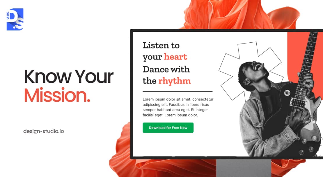
Landing pages come in all shapes/sizes. But, they share a common goal: converting inquiring visitors into valuable leads. To achieve this goal, your landing page needs to be tailored to meet the specific objectives and needs of your target audiences:
- Identify the actions you want visitors to take on the landing page. Every design decision should be optimized to facilitate these actions and push your target users toward conversion.
- Use persuasive copywriting to highlight the value proposition behind the offers on the landing page. Address users’ pain points and present information proving your offer is the perfect fit.
- Use impactful visuals that complement your landing page’s core message.
- Make your landing page’s design align perfectly with the digital marketing campaign that brought the users to the page. Design consistency across all digital marketing channels (including landing pages) is the key to avoiding confusion and building user trust.
- Never overwhelm with information. Integrate clear messaging, intuitive navigation, and prominent call-to-action buttons into your landing page’s design.
- The text on the call-to-action buttons should be clear, concise, and tempting. Use strong verbs like “Download for Free Now” or “Subscribe Today” to inform users exactly what you want them to do.
All types of landing pages should have these qualities. This includes lead magnet landing pages, product landing pages, and thank you landing pages. Whether you are asking users to buy something or expressing gratitude, make sure that your landing pages are designed to resonate with your audience’s preferences and needs.
2. Define Goals and Metrics
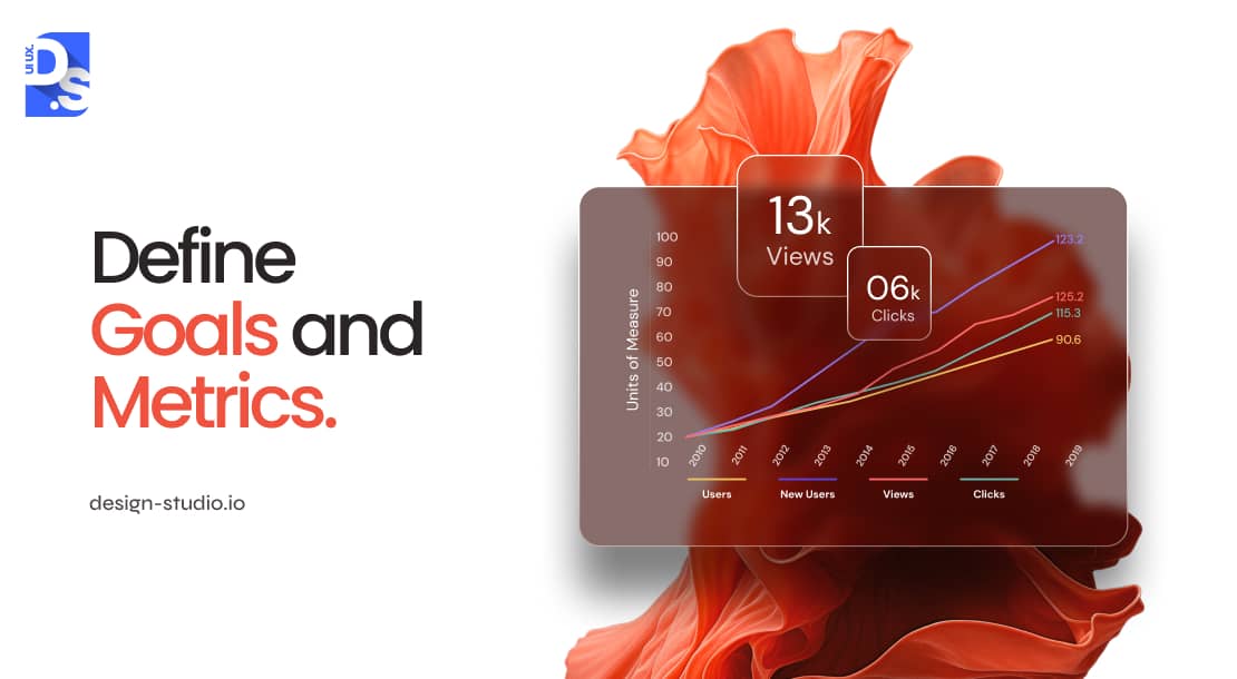
Would you construct a house without using a blueprint? No, right? Similarly, you should lay a strong foundation of well-defined conversion goals and measurable metrics before you pick up design tools. Set specific goals like the number of downloads, sign-ups, buys, etc. for your landing page. Then, use these objectives to give your design efforts a clear direction.
Tracking metrics like the landing page’s conversion rates (CR), click-through rates (CR), and bounce rates (BR) will tell you how effective the page’s UX design is at achieving its goals. Regularly analyzing this data will reveal what is working and what is not. Use this data to continuously optimize your landing page’s design.
3. Identify Visitor Needs
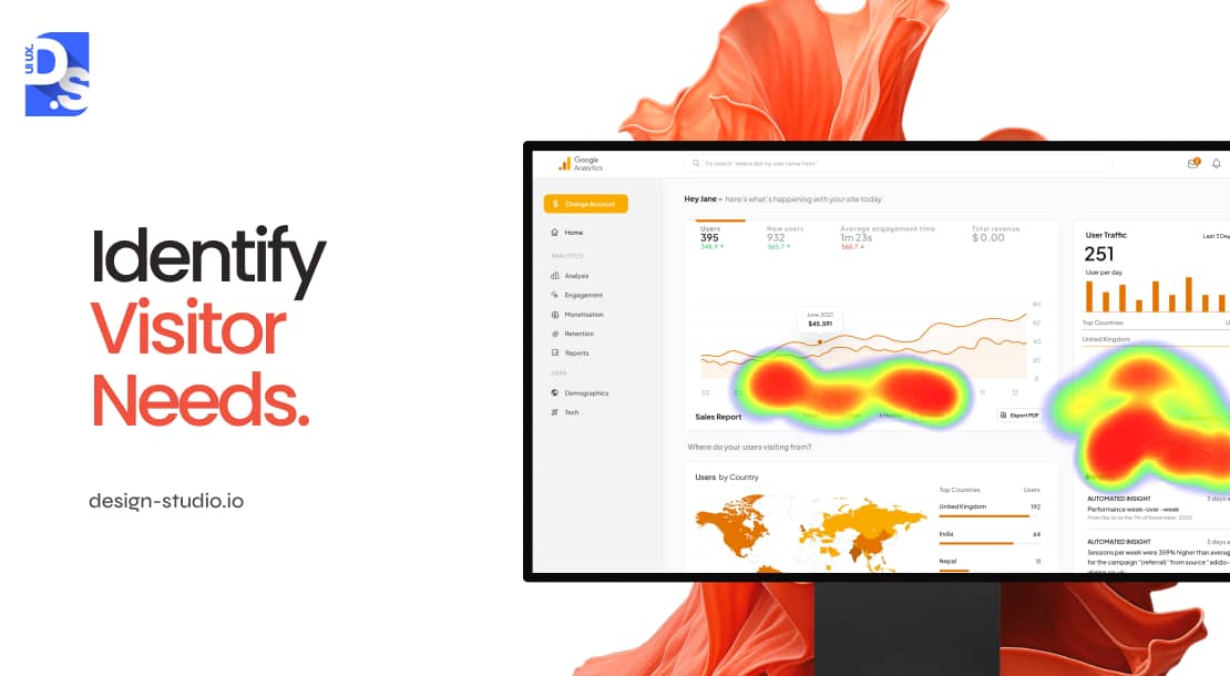
Strong intuition is one of the best qualities a designer can have. But, when it comes to optimizing your landing page’s UX for conversions, intuition isn’t enough and data is still king. Designers must collect user behavior data directly from their landing pages to determine the quality of their work. Using the following data collection tools is a vital aspect of web and mobile UX design best practices:
Google Analytics:
Google Analytics is free to use. It reveals important engagement data like bounce rate, time-on-page, page speed, and more, empowering designers to track their landing page conversions and measure campaign success.
Heatmaps:
Heatmaps reveal where visitors spend most of their time on landing pages. Designers must assess the heatmaps of their website landing pages to identify opportunities to improve page layouts and content placement.
Form Analytics:
Tracking user interactions with landing page forms is a good way to identify the areas where users face friction or confusion on the landing page. Improving form UX (the way that the landing page forms are designed) is a surefire way to increase conversion rates and reduce abandonment rates.
These tools empower designers to make data-driven decisions based on actual user behavior, not just intuition.
4. Message Matching Digital Marketing Campaigns
‘Message matching’ is the process of aligning the messaging, visual elements, and other design elements of your digital/non-digital marketing campaigns with the design elements on your corresponding landing pages. For example, HubSpot provides a free CRM solution.
Here is their Facebook ad for this product:

Now, check out the landing page that users are led to when they click on the Facebook ad:

Notice how the HubSpot logo is highlighted in both the Facebook ad and on the landing page? See how the fonts and the messages on the two are similar? This 1:1 correspondence helps create a cohesive UX for anyone who clicks on that ad. That’s why message matching is standard practice at top UI/UX design agencies that handle large-scale marketing campaigns.
For a large-scale marketing campaign, every piece of design an agency produces tends to have:
- Visual consistency in fonts, color schemes, logo placement, and other aesthetic features. This consistency helps foster a strong sense of brand familiarity and recognition.
- Similar messages are used on both the ads and the landing pages so that the brand’s core messages and value propositions are reinforced in the users’ minds.
- Use of consistent tone, voice, and highly similar CTA buttons throughout the ads and landing pages help maintain a seamless narrative.
Keep these details in mind when you’re designing landing pages. Or else, your target users may feel that they’re interacting with a different brand once they ‘land’ on your landing pages.
5. Establish a Clear Visual Hierarchy
A well-defined visual hierarchy lies at the heart of every high-quality landing page design. It makes landing pages feel intuitive and visually captivating while directing the visitors’ gaze and guiding their journey. Here are the main design elements that you should manipulate to create a strong visual hierarchy for your landing page:
| Design Element | How to Manipulate It | Impact on Landing Page Visitors |
| Size | Use larger-sized design elements for key information (e.g., CTA buttons) and smaller elements for supporting details. | Naturally draws the visitors’ attention to the most important sections of the landing page. |
| Contrast | Employ different color combinations, fonts of different sizes, and varying textures to differentiate the design elements on the page. | – Creates visual interest. – Clarifies the relationships between different design elements. – Makes the page easier to scan. |
| White Space | Incorporate space around all design elements to prevent clutter. Add white space around blocks of text to boost their legibility. | – Guides the visitor’s eye. – Makes the landing page design feel more coherent. |
| Alignment | Align elements consistently (left/right, center/grid, etc.) to create order and unity. | – Provides a sense of structure. – Makes the landing page appear polished and professional. |
| Directional Cues | Use subtle visual cues like arrows/lines to guide the user’s attention to specific sections of the landing page. | Enables users to follow the path towards conversion. |
After creating a basic visual hierarchy for your landing page, don’t forget to get feedback from your target users to ensure your hierarchy effectively guides their user experience towards conversion.
6. Landing Page Usability: Minimize Friction to Maximize Conversions
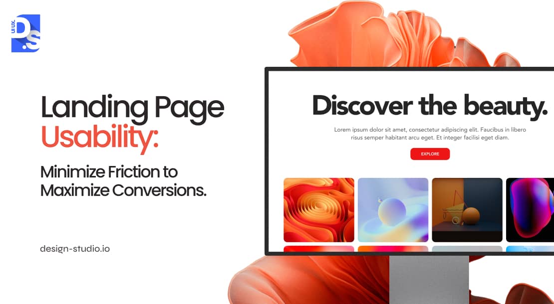
ne of the most popular UI/UX design trends of this century is minimalism and this trend translates perfectly into landing page UX design. Effective UX on landing pages hinges on usability, low clutter, clear functionality, and ease of use. Without these minimalistic qualities, even the most compelling landing pages are bound to fall flat.
Overburdening the attention of your landing page visitors with dysfunctional layouts or confusing design element placements will result in instant abandonment. Take the following steps to ensure your landing page designs don’t give your visitors cognitive overload:
Follow Jakob’s Law:
Jakob’s Law is a well-established law in UX design that pretty much all professional designers follow. This ‘law’ can be boiled down to two words: avoid unfamiliarity. The average Internet user does not like surprises and hates feeling like they are navigating uncharted territory.
Designers must leverage well-established landing design patterns (logo placement, navigation style, visual hierarchy, CTAs) that mirror the average user’s pre-existing mental models of interacting with landing pages. Consistency reduces cognitive load and gives visitors a sense of control. That is why so many popular landing pages look and function the same.
Mobile Responsiveness:
Make sure that your landing page adapts seamlessly to all screen sizes/devices because if it does not, visitors may feel cognitively burdened.
Ditch over-creativity and focus on user-centric design. Visitors who feel ‘in control’ on your landing page are more likely to ‘convert.’
7. Increase Page Load Speed
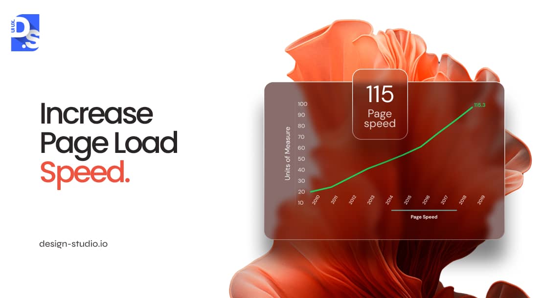
A slow-loading landing page is an unusable and unprofitable landing page. According to Google, if your landing page does not load within 1 to 3 seconds, its bounce rate will be at least 32%. That means 1 out of 3 visitors will abandon your landing page before it loads. Approx. 53% of mobile visits on landing pages are abandoned if pages take 3+ seconds to load.
To capture and retain visitor’s attention, your landing page needs to load faster than that. Test your landing page load speed with free tools like Google’s Page-Speed Insights or Pingdom. Before publishing the pages, make sure they pass their Web Vitals and Core Web Vitals tests (both desktop and mobile).
8. Mobile-Friendliness
If your landing page UX does not pass Google’s Mobile-Friendly Test, do not direct your mobile campaigns/ads to them. Landing pages that are not mobile-friendly, fast-loading, or don’t have features like pinch-to-zoom, non-intrusive pop-ups, and small, readable blocks of text have a 100% bounce rate on mobile websites.
9. Findability
Your landing page UX should strategically guide visitors toward conversion. This is the highest form of ‘success’ your landing page can achieve and it requires focused user attention. Oli Gardner, the founder of the digital marketing firm Unbounce, has formulated the perfect technique for securing user attention on landing pages. It’s called “attention ratio.”
According to Gardener, the number of clickable links on a landing page should be in a 1:1 ratio with the number of conversion goals or desired outcomes. In other words, if your landing page has one conversion goal (e.g., making a user download a PDF), it should feature only one primary clickable link.
Presenting users with multiple links may pull their attention away from your intended action. Designers must avoid placing distracting links like navigation or footer links on their landing pages. Including one or two social media links is fine, as long as they’re smaller in size than the main CTA buttons. Fewer choices minimize confusion and simplify the conversion process.
Here is Shopify’s landing page. The clean, distraction-free design offers only a singular path (the start free trial button) to conversion, By leveraging shopify store design services, brands can ensure that their landing pages are optimized for simplicity and efficiency, guiding users toward key actions like signing up or making a purchase.

There’s only one field that visitors need to fill out to be ‘converted.’
10. A/B Testing and Continuous Optimization
A/B testing (i.e., split-testing) in landing page UX design is comparing two differently designed versions of the same landing page to see which one performs better. It’s a way of testing design decisions and variations to see which one converts more visitors. To A/B test your landing page designs:
- Set clear goals (e.g., increase conversions, clicks, or some other goal) to guide your A/B tests.
- Create two versions of your page, differing only in the specific design elements you’re testing.
- Split traffic, sending two groups of users to each version randomly to avoid bias.
- Track key metrics and identify the major differences in the test results.
- Monitor key metrics like scroll-depth, conversions, clicks, etc., for each version.
- Analyze the data to declare which version of your landing page is the winner.
- Implement this design for all users.
Continuously test and iterate based on data-driven insights. Test frequently, track diligently, and declare ‘landing page UX design winners’ regularly!
11. Design with High Affordance
‘Affordance’ was once one of the fleeting mobile app design trends that come and go. But, in the last two decades, it has become a key part of landing page UX design. Affordance refers to the quality/property of a design element that clearly defines its use. It is like giving the CTA buttons on your landing page drop shadows to make it appear more clickable button.
For example, of the three ‘Submit’ buttons below, which appears more clickable?

The third one, right? That is because it is designed with high affordance. Affordance minimizes confusion, particularly for users with visual disabilities. So, make sure to visually differentiate all buttons, links, and clickable elements on your landing page with affordance.
Design Landing Pages That Shine
By following these 11 landing page UX best practices, we can create intuitive and impactful user experiences on your landing pages. To ensure a truly optimized user journey, consider a comprehensive UX Audit Service from Design Studio’s UI/UX designers. This will help identify any potential issues and areas for improvement, further enhancing your landing page’s effectiveness.
comments
Add comment