
Top 9 E-Commerce UX Best Practices and Tips in 2025
The term Ecommerce UX best practices refers to a set of guidelines, principles, and strategies businesses employ to optimize the user experience (UX) on their Ecommerce websites. These practices are designed to enhance usability, functionality, and overall satisfaction for online shoppers. When applied effectively, they lead to increased conversions, customer retention, and long-term business success.
Here, we will explore the world of Ecommerce UX design, exploring the best practices that help businesses transform unsure website visitors into loyal shoppers. Let us begin by exploring the very concept of Ecommerce user experience and its impact on business success.
What is Ecommerce UX Design and Why is It Important?
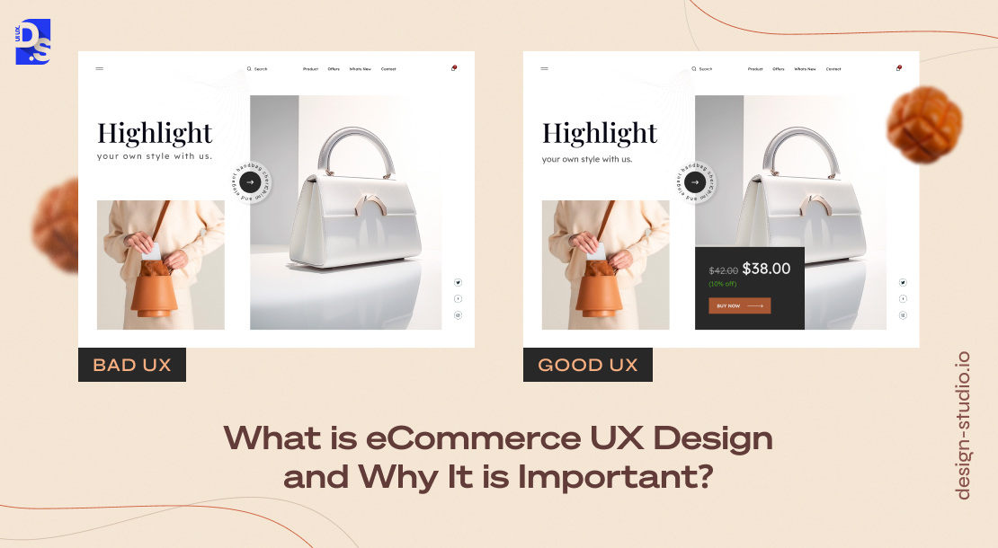
The global Ecommerce landscape is experiencing explosive growth, with sales projected to reach a staggering $6.3+ trillion in 2024. This surge in online shopping presents a significant opportunity for businesses but capitalizing on this potential is very hard, especially for websites that do not consistently deliver good experiences.
Despite hefty investments in mobile-first strategies, pay-per-click campaigns, and meticulously crafted website elements, the average e-commerce cart abandonment rate in 2023 remained at a staggering 70%. 7 out of 10 shoppers on your Ecommerce site will abandon their carts before checkout. This begs the question: why are customers abandoning their carts at such high rates?
To find the answer, ask yourself: Have you ever abandoned a website due to a poorly designed homepage, confusing layouts, or an overly complex navigation system? Chances are, you have. These are precisely the types of experiences that erode user engagement and lead to cart abandonment and this is where Ecommerce user experience design comes into play.
Ecommerce UX design aims to decrease user friction, eliminate all the obstacles that hinder user journeys, and ensure that customer needs are anticipated and met at every touchpoint. It involves designing a user-friendly website, optimizing its information architecture and navigation, and streamlining the user’s journey: from the moment they land on the site to the final checkout process.
The ‘UX’ of an Ecommerce store encompasses a wide range of factors that go beyond just the website’s functional and visual design. Here’s a breakdown of the key areas that contribute to seamless and successful Ecommerce UX design:
| Ecommerce UX Focus | Best Practices |
| Information Architecture and Navigation | – Easy navigation – Clear and logical categories/subcategories – Relevant search suggestions – Informative product pages with high-quality visuals, user reviews, and in-depth descriptions |
| User Interface and Usability | – Visually appealing and brand-consistent design – Responsiveness across all devices – Accessibility for users with disabilities |
| User Interaction and Flow | – Easy product browsing and filtering by category, brand, price, etc. – Smooth and efficient checkout process with no hidden fees – Simple account creation and management |
| Content and Communication | – Clear, concise, and informative product descriptions highlighting key benefits – Easy access to multiple customer support channels (live chat, email, phone) – Personalized product, service, or offer recommendations |
| Beyond the Ecommerce Store | – User-friendly order tracking – Personalized delivery updates – Straightforward return and exchange process – Post-purchase communication to maintain long-term customer relationships |
When Ecommerce brands fail to attract, retain, or convert shoppers, investors/analysts advise them to refine their sites’ UX design by following the best practices.
Ecommerce UX Design Best Practices
Now that we have a basic understanding of what Ecommerce UX design is all about, let us move on to the best practices. Here are 9 practices that can refine the UX of any Ecommerce store
Practice #1. Uncluttered and Optimized Homepages

It all starts with the homepage. When people visit Ecommerce stores, they usually have specific products in mind. If a store’s homepage is cluttered with brand information, promotions, and other types of content, they may fail to find the product(s) they are looking for. To avoid that risk, take the following steps:
Unique Value Proposition (UVP) Front-and-Center
- Highlight your best-selling, newsworthy products and your brand’s UVP on the homepage
- Add a concise tagline that captures your brand’s essence and product benefits
- Gather customer feedback to understand their motivations when they browse your homepage; tailor your design accordingly
Optimize the Search Functionality
- Feature a prominent search bar on the homepage
- Implement autocomplete functionalities to auto-refine user searches
- Apply search UX best practices to improve the accuracy and relevance of search outcomes, enhancing the overall user experience.
Use Product Visuals
- Include high-definition product and product-category images that represent your brand’s major offerings
- Add thumbnails on product links to give shoppers clear and concise overviews of your catalog
Personalization
- Leverage customer data to personalize product recommendations on the homepage
- Suggest relevant items based on previous purchases or browsing history
- Tailor ‘featured product’ suggestions based on seasonality or strategic marketing campaigns
Simple Navigation
- Design a simple and clear homepage navigation structure; use a similar navigation structure across the site to avoid confusing shoppers
- Use short but descriptive category and subcategory labels on the main menus
- Each navigation link should be checked for validity and load speed
Display Security Credibility
- Implement an SSL certificate to prevent browser warnings and ensure secure transactions
- Provide easy access to security information for maximum transparency
Minimalism has been one of the most popular Ecommerce design trends in recent years. That means most of your competing sites already have minimalistic homepages packed with whitespace and airy design elements.
So, the most important thing to NOT do when designing an Ecommerce store’s homepage is to overwhelm visitors with excessive elements like graphics, videos, or CTAs. Streamline your homepage design for clarity, minimalism, fast loading, simplicity, and ease of navigation.
Practice #2. Simple Yet Strategic Product Page Design
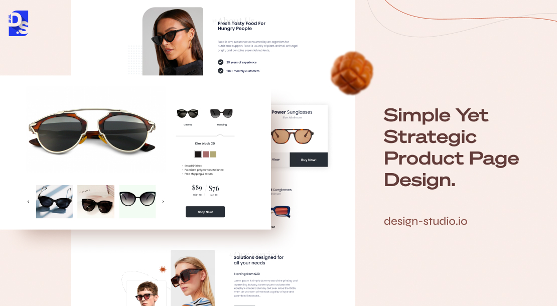
Unlike physical stores, Ecommerce stores cannot rely on the persuasive charm of a salesperson. Their product pages become their all-encompassing star sales pros, attracting visitors, making multiple positive impressions, and providing all the info they need to make purchase decisions. Let us dissect the building blocks of a successful product page:
Product Showcase
Use multiple high-resolution photos to showcase the product from various angles, giving users a virtual 3D experience. Zoom functionality should allow customers to get closer looks at product details and textures. Make sure the high-resolution photos do not compromise the page’s load speed.
Product Names
While creativity is great for marketing campaigns, overly cute or technical product titles can leave visitors confused. Shoppers need context to make informed decisions. Make sure the product names are either familiar to buyers; or their names should clearly communicate their utility.
Product Description
Avoid marketing jargon and focus on sharing factual product-related details. Answer the basic questions – what’s the product, what does it do, etc., in digestible bullet points and easy-to-read language.
Customer Confidence Builders
Reviews, ratings, and details like “number of satisfied buyers” add credibility to product pages. Add these social proof elements to build trust with shoppers. If you are in retail, include size guides for your products (e.g., clothing/footwear sizes) to eliminate sizing-related anxieties.
Action Stations
Make the “Add-To-Cart” or “Buy Now” buttons clear, prominent, and ever-present in the page’s top-right or left-side sections. Visitors should never have to hunt down these essential buttons.
Resist the urge to cram everything you know about the product onto a single page. Focus on clarity and prioritize the information that directly addresses customer queries. Conduct A/B testing to see which types of info and elements resonate most with your audience when browsing your site’s product pages.
Practice #3. Ensure Effortless Navigation

Custom Ecommerce web design is very popular nowadays. One of the main things experts do when they are designing or redesigning a custom Ecommerce website is to prioritize its navigation. Your store’s navigation should be so intuitive that even first-time visitors can find their way around effortlessly.
That means no confusing layouts or overly technical jargon. Shoppers should not have to struggle to switch between categories, filter products, or locate the search bar. Here’s how you can create such a navigation structure:
- Your top navigation menu is a prime spot for presenting clear options to browse your products/services by category, size, or type. You can also add a search tool or a personalized product selection tool to this section to further engage customers.
- If your store boasts a vast selection within a single category, consider using a left-column navigation panel in addition to the top navigation menu.
- Organize your product listings and categories in grids, depending on the number of categories you have. Grids make browsing more clear. They allow for quick visual comparisons of multiple products. This is ideal for products that can be easily understood through pictures.
- Desktop screens already offer a ton of space for product grids, which perfectly align with the way we naturally scan information (the F-pattern). To maximize their effectiveness on phone screens, keep the number of items per row between 2-4.
Users browsing on your site have another clear expectation: the back button should take them back exactly to the previous page they visited. They expect this from all pages in your store, including the checkout pages. Use JavaScript to intercept clicks on the back button and then navigate the user to the previous page.
Lastly, enable search from anywhere. In case users do not find what they are looking for just by browsing the site, search bars can help them find items based on their understanding of the product. Add a “sticky” search bar on every page of your site. Give it autocomplete functionalities to auto-refine user searches and help shoppers find products based on their attributes.
Practice #4. Simplify Account Creation

Lengthy registration processes filled with extra steps are a major turn-off. The more complex the account creation process on your eCommerce store, the higher the chance of cart abandonment.
Here are some major UX pitfalls to avoid when it comes to designing your store’s account creation pages:
Not Designing Guest Accounts
Streamline the sign-up process by adding a “guest account” option. A ‘guest account’ is a temporary profile that allows users to do everything registered users can do, without actually registering for a full account. This eliminates the need to create a username and password, streamlining the checkout process and reducing friction for one-time buyers.
Asking for Too Much Info
Super-simple sign-up procedures and guest checkout options will hinder your store’s ability to capture tons of customer information for future marketing campaigns. But, delivering smooth and barrier-free user experiences, especially to first-time shoppers, is way more important than collecting more and more data. After a while, most targeted marketing campaigns fail because users get tired of seeing ads, no matter how ‘personalized’ they are. But, positive first impressions stay in the minds of online shoppers for a long time.
Password Paralysis
Lengthy lists of password-related criteria lead to the creation of weak passwords that are often easily forgotten by users. To minimize the risk of such users abandoning their accounts, implement simple password requirements.
By prioritizing convenience over activities that many new-age shoppers deem to be ‘predatory marketing,’ you will keep impressing your customers.
Practice #5. Make Landing Pages Conversion Funnels

Most potential customers will arrive at your store via targeted advertising campaigns like Facebook ads or email ad campaigns. This is where a well-designed and conversion-optimized landing page comes in handy:
- Place the CTA button (like “Buy Now”) and the product price right on the first fold of the page
- Use short and catchy taglines to highlight your product/brand’s use cases and the benefits it delivers
- Add a few social proof elements like reviews and testimonials in one section of the landing page to nudge visitors towards conversion.
Simple design choices like this can help you create landing pages that not just intrigue or wow visitors, but also turn them into paying customers.
Practice #6. Write User-Centric Copy

Product descriptions, instructions, FAQs, etc., on your site should not be roadblocks to purchase. Great UX for eCommerce is all about keeping things clear, and concise, and getting the job done without being intrusive.
- Before writing, take some time to have a good grasp of your target audience. Use the kind of language your target audience understands and always avoid using technical jargon.
- Use direct, concise, and active language to tell users where clicking a link/button will take them. (“Start Shopping” instead of “Click Here”)
- Present crucial product/brand-related information in easily digestible formats (bullet points, text bubbles, pop-ups, etc.)
- Anticipate what info users might need and provide it upfront. (e.g., “We Provide Free Shopping at Your Location”)
- Provide clear signposts throughout the buying journey, letting users know about what part of the navigation structure they are currently in
- Pack the site with action-oriented CTAs
Maintain a consistent tone throughout all pages of the store. Use a wireframing tool to map out the layout of your UX copy. Visualize the user journey and then make sure your writing ensures a smooth and coherent flow of information.
Practice #7. Optimize the Checkout Flow

The checkout flow is the make-or-break moment for your Ecommerce store. It is the series of steps customers take to finalize their purchase; every step of this journey should be smooth, frictionless, and user-centric. To create such a checkout flow, first envision your customer’s journey. It will consist of more or less the following steps:
- Browsing products
- Adding products to their cart
- Entering billing information for secure payment
- Providing shipping details to ensure swift delivery
- Selecting a preferred shipping method
- Reviewing their order details (quantities, pricing, etc.) for accuracy
- Completing the payment
- Receiving order confirmation
To ensure every step of this journey nudges customers toward conversion, apply these practices:
- Display a clear CTA button (like “Buy Now” or “Add to Cart” as soon as customers begin their shopping process
- Offer guest checkout as an option to avoid registration barriers
- Request billing information only during the final steps of the shopping process
- Design intuitive forms to collect necessary billing details quickly and securely
- Include a checkbox that says “The shipping address is the same as the billing address,” pre-checked for convenience
- Present multiple shipping and payment
- Enable customers to review their order details before they finalize the purchase
- Prioritize fast loading times
- Offer clear value propositions, provide clear return policies, and avoid hidden fees
By taking these steps, you will address the most common cart abandonment triggers in advance. Keep monitoring, testing, and refining the checkout flow based on your site’s conversion-related analytics.
Practice #8. Focus on Mobile eCommerce UX
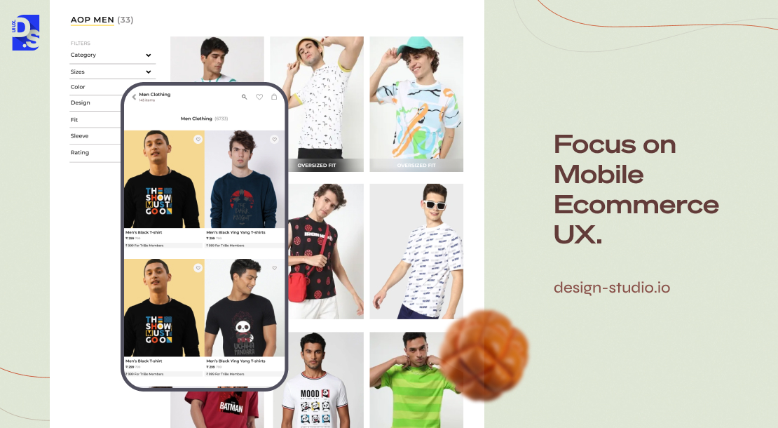
If your website is not responsive, making it responsive should be your immediate priority. Even better, make it mobile-first. With mobile ruling the eCommerce landscape, designing your store with smaller screens in mind is a logical decision. Interactions on mobiles are tap-based, the screens are smaller, and the navigation is usually hidden within concise hamburger menus.
Other characteristics of good mobile-first eCommerce UX include clear product information, easy navigation, and streamlined checkout processes. Understand the unique needs of your mobile shoppers and then execute the design from their POV.
Practice #9. Building Trust Through Support
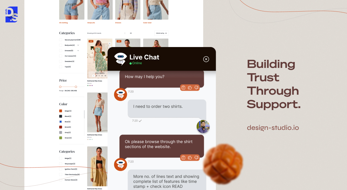
If live calls or live chat are not feasible options for your store, provide alternative and easily accessible customer support channels like chatbots or email. Knowing they can voluntarily reach a company representative fosters a huge sense of security among online shoppers.
Final Take
While traditional shopping offers the tactile experience of holding and examining products, eCommerce relies solely on good UX design to bridge that gap. By observing these eCommerce UX best practices, you can create a comfortable and familiar online environment for your shoppers. Once they start appreciating the fact that your store is optimized to address their needs, you will transform your online store into a profit-generating machine.
comments
Add comment