
Ecommerce Navigation UX Best Practices with Examples in 2025
Effective E-commerce navigation is critical for an online store’s success. If users can find, or naturally discover products on your E-commerce site with ease – you will sell more:
- Recent case studies have shown that intuitive site navigation can boost monthly conversion rates by at least 18.5%
- Website visitors spend up to 6.44 seconds staring at the main navigation menu
- In comparison, they only spend about 5.59 seconds reading the site’s written content
This disparity shows just how critical navigation is for an eCommerce site’s success:
Users do not want to see complex, hidden menus with indecipherable icons.
They want a well-designed navigation menu where products are logically categorized and the most popular categories are listed on top
We are going to explore all the major E-commerce navigation best practices you need to know to create such a well-designed, user-centric navigation system for your eCommerce site.
We’ll also share some relevant UX strategies, and practical Ecommerce navigation examples that you can directly apply to your site’s design.
What is Ecommerce Navigation and Why It Matters?
There are two ways to look at eCommerce navigation – from the shopper’s perspective and the designer’s (your) perspective:
The Shopper’s Perspective
From the shopper’s perspective, navigation refers to all the design elements – menus, tags, buttons, links, etc., that help them explore the online store
Checking out different tags on the menu, clicking links that take them to specific categories, looking up things on the search bar – these are all part of the Ecommerce navigation UX
A well-designed navigation system delivers good user experiences.
The site’s navigation system should make it easy for visitors to explore the store and find exactly the items they are looking for, regardless of how ‘complex’ the site is
The Designer’s Perspective
- From the designer’s POV, Ecommerce navigation refers to the system of menus, categories, search functionalities, links, pathways, and other elements that guide users through the store
- The better they design their navigation system, the better the UX
- Good UX means users will be able to explore the site seamlessly, find products, and complete purchases with ease
From both perspectives, a well-designed Ecommerce navigation system is critical to an online store’s success:
- Facilitating Product Discovery
Effective navigation is crucial for facilitating product discovery and helping easily locate the products they are interested in
- Facilitating Conversion
When users can navigate a site effortlessly, they’re more likely to engage with products and ultimately ‘convert;’ conversely, poor navigation always leads to high bounce rates
- Brand Boost
Users are less likely to feel lost, overwhelmed, or frustrated when navigating an eCommerce site with a logical structure and accessible info – great for inspiring return visits
- SEO Boost
A well-designed navigation system will give the site a clear structure which will directly help search engines index the site effectively and give it higher visibility in search results
Ecommerce Navigation Best Practices
Good navigation is beneficial for both shoppers and eCommerce websites. Let’s analyze the most important Ecommerce navigation best practices you need to follow to give your store good navigation:
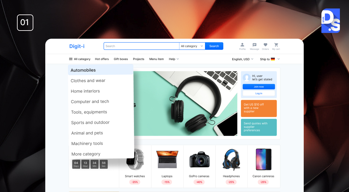
Simple, Clear, and Logical Navigation Structure

This best practice involves:
- Organizing your website’s content into easily understandable categories and subcategories
- Limiting the number of main navigation items
- Using straightforward labels that reflect the content accurately
Why It’s Important
- A logical structure helps users navigate without confusion
- It intuitively guides them to their desired products
- When customers can find what they need quickly, they’re more likely to stay and shop
- This simplicity also makes them less likely to abandon their shopping journey due to confusion or frustration
- A cluttered or confusing navigation system will deter customers from returning
Applying This eCommerce Navigation Best Practice to Your Store
Limit Main Menu Items
- Keep the number of primary categories to no more than 8
- Only include essential categories that reflect your main product offerings on the main menu
Use Clear Labels
- Choose short, descriptive labels for each category
- Avoid jargon
- Only use terms that your customers will understand at a glance
Organize with Subcategories
- Break down larger categories into relevant subcategories
- Use font size, color, and spacing to emphasize primary categories and their subcategories
Use Whitespace
- Ensure there is enough space between navigation items to prevent misclicks
- Use the right fonts and font sizes to make the category/subcategory names easier to scan
Amazon exemplifies simple, clear, and logical E-commerce navigation with its top-level menu that features only a few, essential broad categories. Major categories like “Electronics” easily expand into more specific subcategories with just a click.
Prioritize Product Categories

- This best practice involves creating a hierarchy of products and product pages and then grouping them logically
- Main categories should represent broad product types
- Subcategories should detail specific items within those broader product types
Why It’s Important
- Creating logical product categories simplifies navigation
- It helps customers easily and intuitively locate their desired products within the menu
- Clear categorization also aids in inventory management
- It also improves search engine optimization (SEO) by making it easier for search engines to index product pages
- These effects combine to make products more discoverable and increase the likelihood of sales
Applying This eCommerce Navigation Best Practice to Your Store
- Identify broad product types that reflect your offerings and create main categories accordingly
- Break down each main category into specific subcategories
- Use descriptive labels; make all category names clear, intuitive, and jargon-free
- Monitor search queries and browsing patterns to refine your categories based on what your target customers are searching
- Keep category names and structures uniform across the site for a predictable UX
- Review and revise your category names and structures based on inventory changes and user feedback
Prioritizing product categories is like one of those universal Ecommerce UX best practices that will only have positive effects.
One site that gets product categorization spot on is The Container Store. This website features 10 main categories, each with multiple relevant subcategories. The subcategories only appear when users click on the main categories.
Implement a Search Bar with Filters

- A well-designed search bar, complemented by advanced filters will allow users to quickly locate products
- Filters allow shoppers to narrow down search results based on specific product attributes such as price, brand, size, color
- This functionality can transform a basic search bar into an all-powerful tool for product discovery
Why It’s Important
- Integrating a search bar with filters allows customers to find exactly what they’re looking for without sifting through irrelevant products
- This streamlined search UX saves customers time, increases their satisfaction, and ultimately results in higher conversion rates
- Effective filtering can also enhance product discoverability and make shoppers ‘stumble upon’ items they have previously not seen
Applying This eCommerce Navigation Best Practice to Your Store
- Position the search bar at the top of your website for instant visibility
- Allow users to refine results by key attributes like price range, size, color, brand
- Display a manageable number of filters initially, with options to expand for more choices
- Implement predictive text suggestions as users type to reduce input errors
- Analyze search data to identify common queries and optimize your filters accordingly
- Filters should reflect current inventory and buying trends; remove filters that shoppers rarely use
Zalando has an awesome search bar with advanced filters that allow users to filter products by size, color, and brand. It makes their product catalog more findable and discoverable.
Implement Sticky Navigation

- Sticky navigation refers to a fixed menu that remains visible as users scroll down a page
- This design ensures that essential navigation elements are always accessible
- It allows users to navigate without having to scroll back to the top
- Sticky menus can be placed at the top-left or right of the screen
Why It’s Important
- Sticky navigation enhances UX by giving users constant access to key menu items
- With it, users can jump between sections without losing their place on the page
- Having a persistent menu can lower bounce rates, improve navigation speed, and increase conversions by keeping users ever-engaged with content
- Users may become annoyed and bounce if they have to scroll back up repeatedly to access the menu
Applying This eCommerce Navigation Best Practice to Your Store
- Identify which key elements (e.g., logo, main product categories) should remain visible in the sticky menu.
- Use CSS properties like position: sticky and top: 0 to keep the menu fixed during scrolling
- Test across devices to ensure that the sticky navigation works seamlessly on desktop and phone
- Design the sticky menu with contrasting colors to make it stand out against the page content
- Keep the number of items in the sticky menu limited to avoid clutter
- Use analytics tools to track how users engage with the sticky menu and make revisions based on their behavior
Walmart uses sticky navigation with a top menu always visible as users scroll. It gives customers access to various departments and promotions without friction or interruption.
Since Walmart popularized it, sticky navigation has been one of the more popular eCommerce design trends.
How to Enhance Ecommerce Navigation UX
Over 2 billion people have visited online stores in 2024, but the conversion rate is a meager 1.88% (as of May 2024).
Want a conversion rate that is higher than this small figure?
Then, your eCommerce site needs to do more than just remove all obstacles between shoppers and the products they seek.
It also needs to have a navigation UX design optimized for conversion. Here are some eCommerce navigation UX strategies that you need to apply to give your store an edge:
Mobile Responsive Navigation

- So far in 2024, 44.6% of all retail eCommerce sales in the US have come from mobile
- The average person spends 3+ hours a day on their phones
- The figures are similar worldwide as around 67% of all global eCommerce sales are set to happen on mobile devices this year
- To tap into this market, your website’s navigation needs to be mobile-responsive and adapt seamlessly to different screen sizes
- This essential eCommerce navigation UX strategy involves using flexible layouts, touch-friendly buttons, and phone-friendly, intuitive navigation patterns like hamburger menus or tab bars
- It means you will prioritize the user experience (UX) quality of your store on smaller screens from the start
Why It’s Important
- It will help you cater your site to the ever-increasing number of mobile shoppers
- Google prioritizes mobile-friendly sites in search rankings
Applying This eCommerce Navigation UX Strategy to Your Store
- Use CSS frameworks like Bootstrap or Flexbox to create navigation layouts that adapt fluidly to various screen sizes
- Ensure all buttons, links, search functionalities, and other navigation elements are large enough for easy finger-tapping
- Maintain adequate spacing between elements to prevent misclicks on smaller screens
- Implement established UI patterns such as hamburger menus or tab bars that users recognize.
- Position essential navigation items – like the menu, search bar, and product categories – prominently on all pages
- Constantly test your store’s navigation across various devices to identify and rectify usability issues
Follow these steps to create an effective mobile-responsive navigation system that your store’s user experience and conversion potential.
Visual Hierarchy and Clear CTAs

- This E-commerce navigation UX strategy involves using size, color, typography, and spacing to emphasize important navigation and conversion-related information
- The goal of this strategy is to draw attention to the calls to action (CTAs) and purchase buttons on the site
Why It’s Important
- Establishing a clear visual hierarchy is vital for effective communication
- It helps users quickly identify essential information and intuitively seek out the most critical elements of the eCommerce site
Applying This eCommerce Navigation UX Strategy to Your Store
- Use analytics tools like Google Analytics to identify common paths users take
- Structure your navigation menu and categories based on this data
- Use top-level navigation for the most popular items, ensuring they are easily accessible without excessive scrolling
- Position high-demand categories prominently in your navigation menu
- Choose concise, descriptive labels for your navigation items that align with user expectations
- Use visual hierarchy principles -size, color, and spacing – to make important items stand out
- Ensure that dropdown menus are easy to scan by grouping related options inside the visual hierarchy logically
- Position all CTAs prominently in the layout so they are easily visible without scrolling
- Use larger fonts for headings and CTAs (larger and bolder than secondary items) like ‘Buy’ to draw attention
- Use contrasting colors for your CTA buttons and the site’s background
- Choose fonts that are easy to read and differentiate between headings, subheadings, and body text
- Organize content in a way that suits our natural scanning patterns (like F/Z-patterns)
A well-structured visual hierarchy makes all pages in an online store visually appealing and scannable. As visitors enjoy the visuals and scan the content, well-placed CTAs push them towards conversion.
Breadcrumb Navigation for Better Orientation
- Breadcrumb navigation is a secondary navigation aid that helps users understand their location within a website’s hierarchy
- It displays a trail of links that represent the path taken to reach the current page
- This feature allows users to backtrack easily through categories and subcategories
- It enhances the shopper’s experience by providing clear orientation and alternative navigation paths – things that are very helpful on sites with deep hierarchies and extensive content
Why It’s Important
- Breadcrumbs allow users to see their current position relative to other pages
- This makes it easier to navigate back to previous categories or the main homepage
- This is a feature particularly beneficial in ecommerce settings, where users often explore multiple product categories before making a purchase
- Effective breadcrumb navigation makes users feel more in control of their shopping journeys
- Without breadcrumbs, users must rely solely on the main navigation menu, which is overwhelming after navigating through multiple levels
Applying This eCommerce Navigation UX Strategy to Your Store
- Use hierarchy-based breadcrumbs that reflect the structure of your site
- Display paths like “Home > Electronics > Shaving Machines > Our New Products” to show users how they’ve arrived at the current page
- Place breadcrumbs at the top of the page, just below the main navigation menu
- Ensure that breadcrumb labels are consistent with category names throughout the site
- Use arrows or other symbols (>) to separate breadcrumb links visually
- Avoid overly complex breadcrumb trails; limit the number of levels displayed to 3/4 for clarity
- Verify that breadcrumb navigation works effectively on all devices
Many navigation UX types can make your eCommerce site much easier to explore and enjoy. Breadcrumb navigation is definitely one of them.
Ecommerce Navigation Examples
Ecommerce Navigation Best Practices, Ecommerce Navigation UX, Ecommerce Navigation Examples
A great way to realize what E-commerce navigation best practices look like in real life is by studying the right examples. Here are some of the most impressive eCommerce navigation examples we have seen that embody everything we’ve discussed so far:
- The site features a well-structured navigation menu with clear categories for furniture, decor, and kitchenware
- It has breadcrumb navigation so users can easily backtrack through categories
- It also offers comprehensive filters that allow users to sort by attributes like brand, price, material
- This popular online mattress store’s main navigation menu only consists of three categories -mattresses, bed frames, and bedding
- Each category includes images of top products, helping users visualize options quickly
- The store’s navigation UX is designed for quick identification and selection of popular products
- Consumer electronics and lifestyle products company Nomad’s online store has a navigation menu packed with visual elements
- These elements help users quickly identify product categories
- The store’s navigation UX design caters to visual learners
- There is also a robust search feature that helps users locate specific goods instantly
- Luxury brand Tiffany uses a combination of horizontal and dropdown menus
- This dual approach gives users constant access to important links
- There is also a sticky navigation bar that keeps all links visible as users scroll down the page
- This eCommerce site’s navigation is designed based on user behavior analysis
- It has footer navigation – important links are included in the footer as their users do not like cluttered menus
- It also has an amazing search functionality with auto-complete/correct features
Conclusion
We encourage all readers to adopt these best practices. Prioritizing mobile navigation is particularly crucial in 2025 as most of your consumers will shop on their phones. We suggest you start adding one of these popular mobile navigation patterns to your site right away:
- A horizontal bar at the top of the screen containing 5-7 links to main sections
- A vertical bar that provides an overview of sections and allows deeper nesting of sub-navigation items
- An expandable menu displaying multiple links and categories
- Dropdown Menus that reveal sub-navigation items upon interaction,
- A visually engaging grid layout that organizes content into cards
- A circular Floating Action Button (FAB) that provides quick access to primary actions or menus
Comment on how you plan to enhance your site’s navigation. If you want more personalized guidance on eCommerce navigation, our Full service UX design team at Design Studio will be happy to help.
We also offer custom eCommerce website design services for businesses looking to elevate their mobile navigation and overall user experience.
comments
Add comment