
Data Visualization UX Best Practices (Updated 2025)
Data visualization is the practice of translating data into clear and concise visuals. It helps UX designers communicate complex information to users and internal stakeholders. It also helps them improve the quality of their work. Data visualization helps professional UI/UX designers understand complex data patterns/trends and relationships that would be otherwise difficult to decipher in a table or spreadsheet.
- Raw datasets, tables, logs, etc., are difficult to decipher for non-experts.
- Data visualization simplifies the process of data analysis by converting data into visuals that are easier for the human brain to process.
For example, a professional UI designer might use a line chart to compare the fulfillment ratings of different user groups. Performing the same task by reading spreadsheets, and tables, and assessing other forms of raw data would take much more time and effort.
Data visualization is a powerful tool that UX designers can leverage to empower themselves, their target users, and the organizations they work for. In this article, we’ll discuss the best data visualization ux practices for professional UX designers, including
1. Define the Purpose of Data Visualization
2. Understand Your Audience
3. Choose the Right Data Visualization Technique
4. Remove Unnecessary Elements That Could Distract from Your Purpose
5. Honesty and Transparency
6. Maintain Clarity and Coherency
7. Use Colors That Symbolically Represent to Your Data
Data Visualization UX Best Practices
1. Define the Purpose of Data Visualization
Before visualizing any data, designers must clarify what they want the visualization to achieve. By clearly defining the purpose and priorities of a data visualization project at the onset, designers can avoid wasting time on creating unnecessary visuals and effectively communicate their intended message to the target audience.
Typically, professional UI/UX designers use data visualization to achieve any one of these five objectives:
- Communicate Trends and Changes Over Time: Designers use data visualization to show how a particular dataset/s has evolved over time. For example, if we have a dataset that logs the sales of an app subscription over time, we can use a line/bar chart to visualize this data and identify patterns/trends that would otherwise be difficult to see in a raw dataset.
- Illustrate Part-to-Whole Composition: Designers use data visualization to illustrate how individual parts contribute to a whole.
- Examine Data Distributions: Data visualization can also be used to examine how data is distributed across different dimensions (time, space, and other variables).
- Compare Values Between Different Groups: UX designers often use data visualization to compare values/figures between different data groups, underlining similarities/differences between different groups.
- Explore Correlations Between Different Variables: Data visualization can also be used to explore correlations between different data variables.
Here’s a helpful chart that simplifies the logic behind each of these purposes. For each purpose, I have created four categories: Explanation, Examples, Recommended Type of Visualization Technique, and Best Practices:
| Purpose of Data Visualization | Why Is It Important for UX Designers? | Examples of UX Designers Using this Visualization Technique | Ideal Visualization Technique | Best Practice for UI/UX Designers |
| Communicate Trends and Changes Over Time | This type of visualization is used to illustrate patterns/trends in specific datasets over time.UI/UX designers often use this visualization technique to show how seasonal cycles affect their products’ sales/revenue streams. | Track how many sign up for a new app feature each month. Measure how much time users spend on a particular web page. Monitor the frequency of bugs reported by users over a year. | Line chartsBar chartsColumn charts | In these types of data visualizations, the X axis typically represents time, and the Y axis represents the metric being tracked. |
| Illustrate Part-To-Whole Composition | The aim of this visualization technique is to compare the contribution of each component/part to the whole dataset. For example, in circular-shaped pie charts, each slice of the pie represents a fraction of the whole dataset. | Display % of users who regularly use different features in a product.Visualize the market-share of different apps in a specific niche. | Pie chartsDonut chartsSunburst chartsMarimekko chartsWaffle chartsPolar area charts | The sum of all slices in the circular-shaped chart should equal 100%. |
| Examine Data Distributions | This type of visualization is used to identify how data is distributed across different dimensions, categories, or groups.For example, businesses use this visualization technique to understand how their sales are distributed across different age-groups, income levels, locations, and other categories. | Identify the common error messages that users see while using an app. Analyze the distribution of time visitors spend on different sections of a website. | Scatter plotsHistogramsBox plots | The X and Y axes should represent the data variables you’re comparing. |
| Compare Values Between Different Groups | This type of visualization is used to identify differences and patterns between different data groups. | Compare approval ratings of different user age-groups.Track performances of monthly marketing campaigns.Compare users who use the app on different platforms. | Bar chartsColumn chartsStacked bar chartsStacked column charts | The X axis should feature the different data groups and the Y axis should feature the metric/s you’re comparing. |
| Explore Relationships Between Different Variables | This type of visualization is used to identify trends and correlations in different data variables.For example, businesses use this data visualization approach to understand the relationship between their ad-spend and sales revenue. | Understand the correlation between user age and complications faced on an app’s interface. | Scatter plotsLine chartsHeat maps | The X and Y axes should feature the two data being compared. |
Refer to this chart before you kickstart your next data visualization project. Have a clear idea of what you want from the project before you start it.
2. Understand the Audience

When visualizing a piece of data, designers must consider their target audience.
- Who is the data visual intended for?
- What does the target audience already know about the topic?
- What kind of visualization are they likely to find engaging?
- What type of language/terminology will the audience understand?
By answering these questions, designers can choose the right visualization approach. If their target audience is non-technical, they should choose less complex visualization styles, such as basic pie/bar charts. If they’re targeting a technical, expert-level audience, they can use more complex and detailed graphs/charts full of technical terminologies. The final visualization should be easy for the audience to process and understand.
3. Choose the Right Data Visualization Technique

There are hundreds of different types and sub-types of data visualization techniques. We can’t discuss them all. But, we can break down the five most widely-used data visualization techniques in the world of digital design:
- Line Graphs
- Bar Charts
- Scatter Plots
- Pie Charts
- Heat Maps
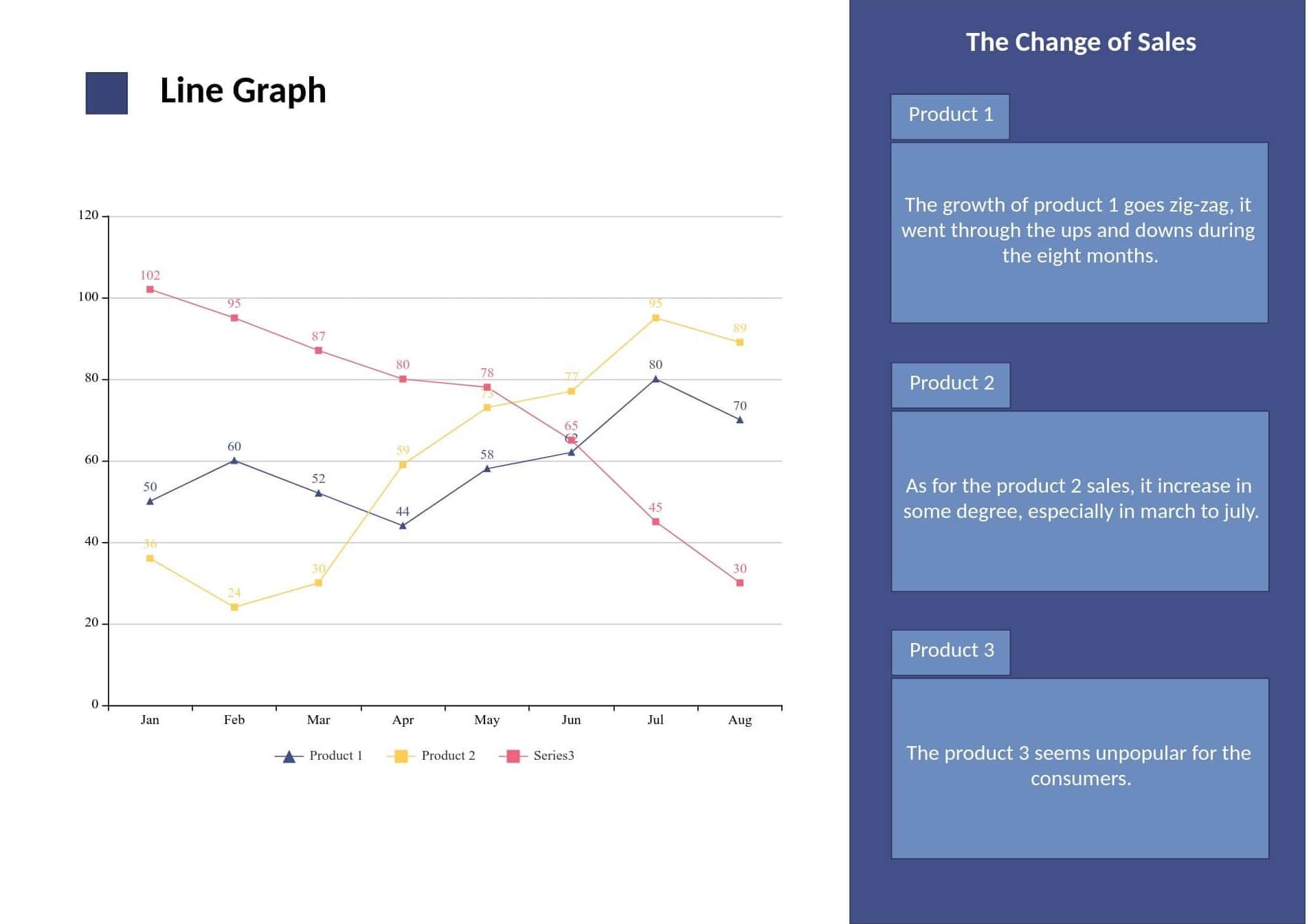
i. Line Graphs
Line graphs are typically used to compare the evolution of specific data points over time. They are well-suited for simplifying both simple and complex datasets. They’re used to identify minor trends, patterns, and changes in datasets over time that would otherwise be difficult to spot in raw data tables.
Designers use line graphs to identify trends in sales figures, website traffic, user satisfaction ratings, and all types of extensive data sets. Here’s an example of how line charts can be used to track changes in produce sales data over a specific time period:

(Source)
ii. Bar Charts
Bar charts are ideal for comparing quantitative data from different data groups/categories. They can also be used to track changes in data over time as well. Here are some ‘best practices’ for creating and using bar charts:
- Always start bar charts at zero-valued baselines; if your data doesn’t start at a zero baseline, clarify this on the chart’s Y axis
- Order your data groups/categories in a common-sense way (e.g., least to most important, highest to lowest, etc.)
- Use colors moderately to highlight important data groups/categories
- Label all of your axes/bars clearly
PRO TIP: Horizontal bar charts are easier to scan through, especially for non-expert audiences.

Horizontal and Vertical Bar Charts (Source)
iii. Scatter Plots
If you’re exploring the correlation between two complex datasets over an extended time period, scatter plots are your best friend. To understand why, assess this beautiful scatter plot published in the New York Times. This visualization illustrates the correlation between driving habits and gasoline prices between 1956 and 2010. The X axis represents the miles-driven-per-capita each year, and the Y axis represents the dollar-price of gasoline. Each dot represents a year of significance:

(Source)
In this scatter plot, all the dots are connected in a line. To understand the order of the key data points, follow this line. This makes it easy to understand how the relationship between driving habits and gasoline costs has changed over the decades. Here are the ‘best practices’ designers can learn from this scatter plot:
- Use clear and concise titles for the variables.
- Clearly label the x/y-axis with the names of the variables being plotted.
- Use a trend line to show the direction of the correlation between the two variables.
- Use colors to highlight important data points.
Be careful not to overcomplicate things. The scatter plot above is obviously intended for mature audiences. If your target audience is not expert level, you’ll have to create a more simplified and concise scatter chart.
iv. Pie Charts
Pie charts are circular statistical graphics that are used to show distinctive parts or categories of a whole data set. They can’t illustrate nuanced details like how data evolves over time. That’s why, it’s important for designers to keep things simple while creating pie charts:
- Don’t create more than 6-7 parts (pie slices) or else the chart may look crowded
- Order the slices logically (e.g., least to most important, highest to lowest, etc.)
- Use colors to differentiate each slice of the pie
- Label all of the slices clearly; use annotations to provide context for each slice
- Avoid using 3D effects, shadows, or other complex visual effects
v. Heatmaps
A heatmap is a data visualization technique which involves the use of colors to show the density of a specific attribute.
- In UI/UX design, heatmaps are typically used to track how users interact with websites or apps.
- Designers use heatmaps to identify the sections of an app/website interface that users click or tap on the most.
- Heatmaps are color-coded, with deep-red colors representing the areas where user engagement is the highest, and light blue colors representing the areas where users click/tap the least.
Heatmaps help designers understand users’ pain-points and meet their UX needs more effectively. They help UX designers make users a part of their design process.
All five of these popular data visualization techniques are useful in different scenarios. Choose a data visualization technique that will most effectively communicate the narrative you want to paint with your data.
4. Remove Unnecessary Elements That Could Distract from Your Purpose
Only include key information that you want to convey in your data visualization. Avoid overfilling your visualizations with unnecessary info. Remove any unnecessary labels, elements, gridlines, etc., that could distract from the narrative you want to create with your data. It is better to create a simple yet understandable chart than a complex and cluttered chart that’s difficult for your target audience to interpret.
5. Honesty and Transparency
The golden rule of data visualization is “Never Distort the Data”. Data visualization is one of the most powerful tools for communicating information and designers must use it responsibly. Distorting data can lead to severe misinterpretations and manipulate public opinion, even if you do it by mistake. Here are some examples of how data can be distorted in data visualization projects:
- Using a misleading scale
- Using confusing colors that are not intuitive to the reader
- Omitting important data points because they are outliers
- Using misleading tags or labels
Be transparent with your data by citing relevant sources. Use a scale that’s suitable for your data, message, and target audience. Never omit data points, even if they’re outliers and don’t support the narrative that you want to create. Always proofread the data in your visualizations carefully before publishing them.
6. Maintain Clarity and Coherency
Prioritize clarity at each stage of translating a complex dataset into a user-friendly visual. Make sure that the visualization technique you choose accurately shows the data that you want to present. Use clear and concise labels. Avoid using jargon/technical lingo that your audience may not be familiar with. Use a consistent design (the same colors/fonts/layouts) throughout the visualization so that users can easily follow the information.
7. Use Colors That Symbolically Represent Your Data
Color is a powerful visual tool that can be used in data visualization to evoke specific emotions from the target audience. When choosing colors for your next data visualization project, consider the following factors:
- The color palette you choose should complement the type of data you’re visualizing. For example, if you’re visualizing app subscription data, use green colors to represent increase and red shades to represent decline.
- Use colors that are easy to distinguish.
- Use colors that are consistent with the visualization’s overall design. For example, if you are creating a scatter chart that shows changes in two data variables over time, you could use a dark to light color scale to show how the data points have evolved over time.
- Use a limited color palette. Using too many different colors can make the visual cluttered.
There are three types of color palettes that professional UX designers like to use the most:
- Qualitative palette is used to present categorical data (e.g., different types of products in a specific category)
- Sequential palette is best for numeric data that needs to be presented in a hierarchical order (e.g., monthly sales figures)
- Divergent palette is a combination of two sequential palettes. They’re used to represent positive/negative values in a dataset.

Qualitative, Sequential, and Divergent Color Palettes (Source)
After creating data visualization, don’t forget to test it with your target users and stakeholders. Make your work public only if they say that the visualization clearly paints the data-backed narrative that you intended to paint.
Conclusion
Almost every company today is collecting large amounts of user-data. There’s an ever-growing demand for UX designers who can create effective data visualizations and communicate complex information in a clear and engaging way. Hopefully, this comprehensive guide on the best data visualization practices helps UI/UX design pros master the fundamentals of this essential industry skill. For more in-depth assistance on creating amazing data visualizations, contact Design Studio’s UX/UI design experts now!
comments
Add comment