
Dashboard UI Design Guide: Best Practices & Examples
A dashboard UI (user interface) is a very simple visual representation of crucial data. Through the dashboard, users can intuitively monitor vital information. Dashboards find widespread use in the domains of project management, analytics, and finance. They empower users to stay on par with key metrics, track changes, and accordingly optimize decision-making.
Unlike traditional reports or spreadsheets, which offer limited interactivity, the modern dashboard UIs that we find on apps, web apps, SaaS tools, etc., provide users with the ability to:
- Interact with data in real-time.
- Explore trends.
- Drill down into details without sifting through complex spreadsheets or static reports.
- Extract insights from various data sources with speed + flexibility.
Whether tracking a project’s Key Performance Indicators (KPIs) or conducting ad-hoc analyses – users can easily tailor their dashboard UIs to suit their unique data needs and preferences. Dashboard UI design is the process of creating these powerful visual data analysis tools.
A ‘well-designed’ dashboard UI is not just about pretty visuals—it is about clarity and impact. It should cut through noise, reduce confusion, and put critical insights front and center. When designed right, dashboard UIs empower organizations to transform raw data into actionable insights with unparalleled speed and agility.
Poor design?
That is where things break down.
Cluttered layouts waste time. Confusing charts mislead. Overloaded screens overwhelm. The cost? Frustrated users, slower actions, and missed opportunities.
This blog post is your guide to avoiding those pitfalls.
We’ll go through all the essential dashboard UI design principles and share key ‘best practices’: how to prioritize metrics, simplify navigation, choose visuals, and create dashboard UIs that people cannot afford to ignore using – regardless of what product or context they are being used in.
Whether you are building your first dashboard UI or refining an existing one, these dashboard design UI/UX guidelines will help you design tools that inform, engage, and drive action.
Why Dashboard UI Design Matters
Dashboard UIs are the backbone of many modern data-driven apps, serving 3 core functions:
- Data visualization – transforming raw numbers into visuals
- Analytics – enabling real-time data analysis + Exploration
- Control – centralizing critical metrics for easy monitoring
In an era where every business prioritizes data-based decision-making – the speed of making these decisions can be a huge differentiator. By serving these core functions, dashboard UIs enable fast, yet accurate decision-making.
They also enable clear communication of all data-based decisions within organizations across many industries including:
- SaaS Companies: By utilizing dashboards, SaaS teams can track engagement metrics and optimize product functionality based on live user data insights. SaaS platforms like Slack leverage dashboard UIs to consistently observe user activity and measure engagement levels.
- Fintech Platforms: PayPal and other financial technology firms use dashboards to analyze transaction data and detect fraud patterns instantly, ensuring rapid threat mitigation. Companies like Square have adopted tools that facilitate real-time monitoring. It helps to lower risks and effectively safeguards against market fluctuations.
- Healthcare Providers: Hospitals, clinics, and other providers in the medical domain utilize dashboards for patient outcome analysis and streamlining resource management. For instance, Cleveland Clinic has been efficiently able to manage compliance tracking and boost efforts toward coordinated care with intuitive dashboards. Epic Systems provides many healthcare organizations with dashboards that help manage patient care effectively.
By breaking down data silos and promoting collaboration, custom dashboard UIs enhance organizational agility across various other industries. They also:
- Empower Better Decision-Making: Leaders make use of the essential metrics obtained from dashboards to confidently make informed choices without losing much time.
- Enhance Operational Efficiency: As data gathering processes are automated through custom dashboards, it helps to boost accuracy and save time.
- Increase Team Productivity: You can curtail data retrieval time by using well-structured dashboards equipped with filtering tools, thus propelling analytical efficiency.
- Deliver Real-Time Insights: Live updates on performance metrics help organizations stay ahead of market trends.
- Streamline KPI Tracking: By displaying essential KPIs clearly, dashboards help maintain alignment across teams and leadership.
- Boost User Engagement: By adding interactive elements, the experience becomes more enjoyable, encouraging regular engagement.
- Support a Data-Driven Culture: Intuitive dashboards can help build an accountability-driven team or organization, by bringing data to the fingertips of all departments.
- Tailored Solutions: Custom-made dashboards target particular business requirements, whether for operational monitoring or strategic planning.
- Reduce Costs: Improved visibility through dashboards leads to clarity in decision-making, which in turn reduces operational expenses.
- Scalability: When you abide by industry best practices while crafting dashboards, it paves the way for scalability in terms of future data growth and adoption of emerging technologies like AI.
A dashboard UI can provide the above-mentioned benefits depending on how much it scores on usability. And, dashboard usability hinges on effective UI design. That is why businesses should not play down the importance of dashboard UI design.
Key Principles of Dashboard UI Design
To create a result-oriented dashboard UI, you need to strike a balance between user-centric thinking and technical precision. By following the below principles, you can streamline the design process, and create a functional and intuitive dashboard.
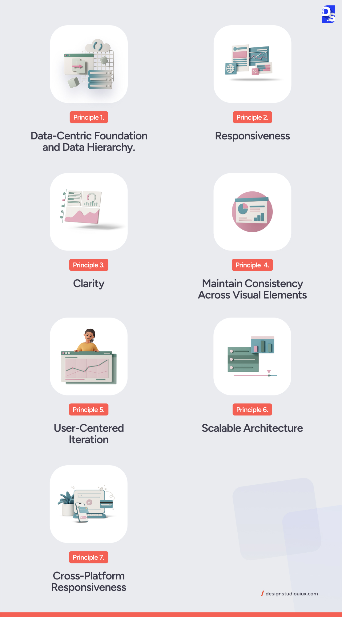
Principle 1. Data-Centric Foundation and Data Hierarchy
The data that any dashboard UI presents is undoubtedly its foundation. Hence, to make informed design choices and decisions, you should first be very clear about the category and structure of data that you would be handling through your dashboard.
There are two types of data to deal with:
Primitive Data: This includes basic data types such as:
- Quantitative Data: Numerical values that can be measured (sales figures)
- Ordinal Data: Ranked data that shows order but not the exact difference between values (user satisfaction ratings)
- Categorical Data: Labels or names used to categorize information (product types)
Complex Data: More advanced data types require specialized visualizations:
- Relational Data: Shows connections between different entities (social networks)
- Hierarchical Data: Displays nested relationships (organizational charts)
- Spatiotemporal Data: Combines time and location (tracking sales by region over time)
To organize and present these different sets of data in a user-friendly way in your dashboard UI, abide by these fundamentals of data visualization design.
Establish a Clear Data Hierarchy
Creating a clear data hierarchy is fundamental in guiding users to the most important information first. Following this, you can leverage visual hierarchy techniques to bring down cognitive load and ensure better understanding.
The most significant data must find place at the top of the dashboard because users have a natural tendency to look there first. Group related data points together to create a clear flow of information. Suppose you are creating a marketing dashboard. It is advisable to place campaign performance, budget, and ROI in a single section. If you use distinct borders and backgrounds for different groups, users can comfortably scan them and locate key insights quickly.
Use colors to distinguish categories, but keep bright colors for urgent alerts or anomalies. Font size and weight help create a visual hierarchy—larger fonts for key metrics and smaller fonts for supporting details. These design choices make dashboards easier to read, navigate, and use effectively.
Implement Progressive Disclosure
You should aim to ensure that users find things simple. So, begin with a clear summary, leaving scope for accessing more details as and when required. To make it possible for users to scan data step by step, drill-downs, filters, and other such interactive features are of great help. Use expandable panels to display additional details, so that you can communicate the required info without making the main view unnecessarily cluttered.
Filters allow date-by-date or category-wise sorting of data (you can employ other criteria too for sorting data). Again, if you use interactive tools to empower users to click on high-level metrics to view additional details, you are actually inviting them to explore more. Users can easily find the information appropriate to them without being bombarded by excessive data in a go.
For example, users can click on a sales revenue chart and find breakdowns by product category or region.
Provide Context for Data
Contextualizing information is vital for user comprehension. Ensure all visualizations are properly labeled with titles, axes marked in graphs, and comparison values provided where necessary.
Users can smoothly grasp the information conveyed by visuals if you incorporate tooltips or annotations that simplify intricate data relationships or trends. Again overcrowding is a big NO. At any single time, show only the essential visuals (an ideal number would be 7 to 8).
Principle 2. Responsiveness
If a dashboard is just a static display, it is not effective. It must promote user interaction to drive results. So, make users engage with the data by incorporating relevant features.
Allow users the freedom to explore particular data or get more well-defined data based on the criteria they choose. This can be done by including drill-downs and filters. Also using the real-time update feature, craft a dashboard that automatically refreshes itself, thereby updating the users with the most current information.
Do not forget that for your dashboard to survive and render optimal user experiences, it must adapt seamlessly to varied screen sizes and devices. So, roping in responsive web design principles while designing your dashboard UI would be a great step.
Principle 3. Clarity
A dashboard hardly serves any purpose unless it is clear. Give your dashboard a well-defined structure that minimizes clutter and scores high on user understanding.
- Visual Hierarchy: Organize information using size, color, and placement to emphasize key performance indicators (KPIs) and guide users’ attention.
- Coordinated Views: Link-related visualizations (such as maps and timelines) to enable comprehensive analysis across different dimensions.
- Avoid Misinterpretation: Steer clear of overly complex visuals or non-responsive designs that may confuse users.
For instance, a sales dashboard might use color-coded bar charts to represent regional performance alongside a linked map for geographic context.
Principle 4. Maintain Consistency Across Visual Elements
Data points must be easily comprehendible, and for that consistency is paramount. Ensure consistent use of colors, font styles, and iconography throughout the dashboard to create a cohesive look. Use similar layouts across different sections of the dashboard so that users intuitively know where to find specific types of info.
Principle 5. User-Centered Iteration
A well-designed dashboard should focus on the user’s needs. It must be tailored to their tasks for maximum efficiency. In healthcare, it should track patient health, give real-time updates, and alert doctors to critical changes. In finance, it should highlight fraud patterns, transaction trends, and risk assessments. By focusing on relevant data, dashboards help users make informed decisions quickly and effectively.
Regular usability testing helps improve design and enhance user experience. Feedback from real users allows designers to fix issues, improve functionality, and add useful features. Testing in stages ensures the dashboard stays easy to use, efficient, and adaptable to changing needs.
Principle 6. Scalable Architecture
Your dashboard should be built to grow and adapt as data needs change:
- Flexible Frameworks: Use tools like Dash or Shiny to easily add new features, such as advanced analytics or AI-powered insights.
- Modular Design: Organize your dashboard into layers—data processing, visualization, and user interface—to make updates and maintenance easier.
- Cloud Deployment: Host dashboards on scalable platforms to accommodate large datasets and high-user traffic.
For instance, a retail dashboard might begin with basic sales tracking but later expand to include predictive analytics for inventory management.
Principle 7. Cross-Platform Responsiveness
Make sure your dashboard works smoothly on all devices, including phones, tablets, and desktops. Adjust layouts and interactions for each screen size. For mobile users, use a touch-friendly design that supports swiping and tapping for easy navigation.
By adhering to these dashboard UI design principles, you create UIs that truly enhance users’ decision-making capabilities.
Common Challenges in Dashboard UI Design
Following the principles help you overcome many challenges that designers commonly face while working on dashboards. Let us see what these challenges are.
Challenge 1. Overloading Users with Data
When dashboards display excessive data points, users may struggle to focus on what is essential, leading to confusion and frustration.
How to Avoid Data Overload in Dashboards
- Identify and display only the most critical metrics that align with user goals.
- Use visual hierarchy to emphasize these key performance indicators (KPIs).
- Start with a high-level overview and allow users to drill down into more detailed data as needed.
- Use efficient database queries and caching mechanisms to reduce load times.
- Compress images, charts, and other visual elements to speed up rendering.
- Only load the data and visuals that are immediately visible – load extra content only after the user scrolls.
Challenge 2. Lack of Customization Options
Users have unique needs from dashboards. If they cannot tailor a dashboard to their specific requirements, then the tool is basically useless to them.
How to Enhance Customization in Dashboards
- Implement drag-and-drop features.
- Provide filtering options.
- Provide multiple dashboard templates that cater to different user roles or functions.
Challenge 3. Inadequate Performance on Smaller Screens
Mobile users may find it difficult to navigate or interact with dashboards that are not optimized for smaller screens. You should make it easier for users to engage with the dashboard on mobile devices.
How to Improve Dashboard UI for Mobile Users
- Implement responsive design techniques.
- Use simplified charts and graphs that are easy to read on smaller screens.
- Design interactive elements (like buttons and filters) that are large enough for touch interactions.
Challenge 4. Lack of Contextual Information
Data without sufficient context can lead to misinterpretation. Users may not understand what the numbers mean or how they relate to their goals without clear explanations.
How to Provide Context in Dashboards
- Use tooltips and annotations that provide additional information when users hover over data points.
- Ensure every chart and graph has clear titles and axis labels.
- Include a summary section at the top of the dashboard that highlights key takeaways.
Best Practices for Designing Effective Dashboards

Designing an effective dashboard also requires a thoughtful approach to organizing data, simplifying navigation, and selecting the right visuals. Here are some important dashboard UI best practices you should follow to get those steps right.
Prioritize Metrics
To ensure users focus on what matters most, strategically prioritize each metric you include in the chart. Identify KPIs that directly correlate with user objectives (for example, sales revenue for sales teams, and customer wait times for customer service dashboards). Place critical metrics at the top or center of the dashboard. Using larger fonts, bold text, or contrasting colors can highlight KPIs. Add brief annotations or trend arrows (↑/↓) to explain the metric significance.
Simplify Navigation
To make your dashboard’s UI clutter-free and easy to navigate. Group related metrics into labeled sections (for example, “Sales Performance,” “Customer Insights”), and use collapsible panels for secondary data to reduce clutter. Let users click on high-level metrics (for example, total sales) to view granular details (for example, sales by product category).
Add dropdowns or sliders to filter data by time, region, or category without reloading the dashboard. For hierarchical data (for example, organizational charts), show users their path (for example, Global > North America > USA > California) to avoid getting lost. Optimize layouts for mobile screens by stacking sections vertically and enlarging touch targets.
Choose Visuals
Use the following chart to determine which visuals to use for what types of raw data to help users derive actionable insights most effectively:
| Data Type | Best Visualization | Example Use Case |
| Comparisons | Bar charts, column charts | Sales by product category |
| Trends Over Time | Line charts, area charts | Monthly website traffic |
| Proportions | Pie charts, donut charts | Market share distribution |
| Geospatial Data | Maps with heat layers | Regional sales performance |
| Relationships | Scatter plots, network graphs | Customer behavior patterns |
To simplify complex data sets:
- Use treemaps for hierarchical data (like organizational budgets).
- Apply heatmaps to highlight patterns (such as peak website activity hours).
- Enable hover effects to show tooltips (like exact values on a line chart).
- Let users toggle between chart types (such as switch from bar to line chart).
Enhance Interactivity
Interactive elements empower users to explore data dynamically. Include key interactive features like live data feeds for metrics like stock prices or social media engagement. Offer theme options (dark/light mode) for readability.
Allow users to drag-and-drop widgets to rearrange layouts, and include buttons to export data to CSV/PDF or share dashboard links with stakeholders.
Mistakes to Avoid in Dashboard UI Design
In addition to following all of these dashboard UI best practices and design principles, make sure to avoid these common mistakes:
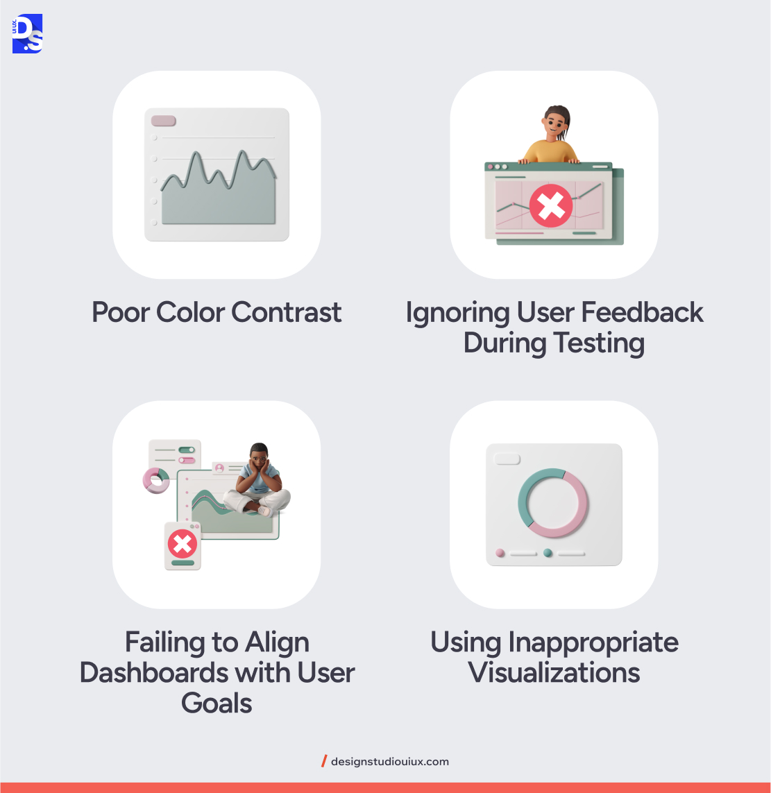
Poor Color Contrast
Using colors with insufficient contrast makes text and data visualizations hard to read. Use tools like Web-AIM’s Contrast Checker to ensure your dashboard elements’ text-to-background contrast meets WCAG AA standards (minimum 4.5:1).
Avoid relying solely on color to convey information (for example, use patterns or labels in charts). Test dashboards in grayscale to ensure readability without color cues.
Ignoring User Feedback During Testing
Professional designers make feedback-based design revisions an integral part of every UI/UX development process they oversee. Not doing that and skipping usability testing or dismissing user feedback can render your final UI design unusable.
Conduct iterative testing with real users during design phases. Use surveys, interviews, or A/B testing to identify pain points. Prioritize feedback from primary user personas (for example, executives, and analysts).
Failing to Align Dashboards with User Goals
Designing dashboard UIs without understanding user workflows or objectives results in irrelevant metrics and wasted screen space.
Define user personas (marketing managers need campaign ROI, while operations teams need real-time logistics) before designing. Use job stories (“When monitoring sales, I need to compare regional performance to allocate resources”) to guide your designs. Regularly validate the relevance of your dashboard’s UI elements with stakeholders.
Using Inappropriate Visualizations
Choosing flashy or complex charts over clear, purpose-driven visuals can lead to misinterpretation.
Use tools like Data Viz Project to explore + validate visualization options in advance. Match charts to data type (line charts for trends, bar charts for comparisons). Avoid 3D effects or radial gauges that distort data.
Also, use wireframing tools like Whimsical to test initial layouts before coding. Iterate continuously with each wireframe.
Future Trends in Dashboard UI Design
Before signing off, we want to discuss what the future of dashboard UI design might look like in the next 2-3 years. Here are some of the trends we are most excited about.
Real-Time Data Visualization
Imagine a dashboard UI at your workplace that displays and lets you interact with business-critical data seconds after it is generated. Such dashboards with live sales figures or up-to-date market info already exist and they are only getting more agile and better-designed.
AR/VR Dashboards
By immersing users in a 3D environment, Augmented Reality (AR) and Virtual Reality (VR) dashboards allow for more immersive interaction with complex data sets. These dashboards overlay digital info onto the physical world and let users interact with data in three dimensions.
Voice-Controlled Dashboards
Imagine entering your office and saying “Show me the last 6 weeks’ user retention figures,” and a dashboard UI on your work PC responding accordingly.
Such voice-controlled dashboards are gaining popularity as natural language processing (NLP) technology becomes more sophisticated.
Conclusion
Hopefully, this blog post has given you a foundational understanding of how to design a dashboard UI. More importantly, we hope it inspires you to create effective dashboard UI designs and turbo-charge your workflows with data-based insights.
Need help with the technical aspects of designing a cutting-edge dashboard UI?
Check out our UI/UX design services now! Once you learn what we do here at Design Studio – contact us to get a free explanation (and a free quote) on how we can bring your dashboard UI vision to life.
comments
Add comment