
How Color Psychology Impacts Web Design and User Behavior?
Color has always been a powerful communication tool in web design. Web designers use it to convey information, create moods, and influence the user’s psychology of decision-making. What’s the psychology of decision-making? Well, when making decisions, we form opinions and take actions via mental processes which are influenced by a multitude of internal biases, emotions, and memories.
This interplay of internal factors is called the psychology of decision-making. Color psychology in web design is the study of how different colors affect these internal processes in users and their psychology of decision-making.
It explores how different colors influence the psychological reactions users have as they browse through a website. In this article, we’ll explore the impact of color on web design and the collective psychology of website users.
By understanding the nuanced, psychological underpinnings of colors, web designers can refine the way they choose colors to create even more impactful web designs.
What Is Color Psychology in Web Design?
Color is a core aspect of visual perception. It falls under the “sensation and perception” category of psychological science. Color psychology is a subset of psychological studies that focuses on all aspects of color-vision processing in the brain. Right from how retinal images are processed by cone photoreceptors in the human eye, to the impact different colors have on human behavior, cognition, and actions – all of this falls under the purview of color psychology.
But, we are not discussing the biological or neurological aspects of this field. We are focused on the latter – how colors impact human behavior. That is because color psychology has become a major topic of interest in the design world mainly because of its use in marketing.
In fact, a lot of what we know about color psychology in web design comes from this recent knowledge of how colors are used in branding, advertisements, and other marketing efforts.
The Evolution of Color Psychology in Web Design
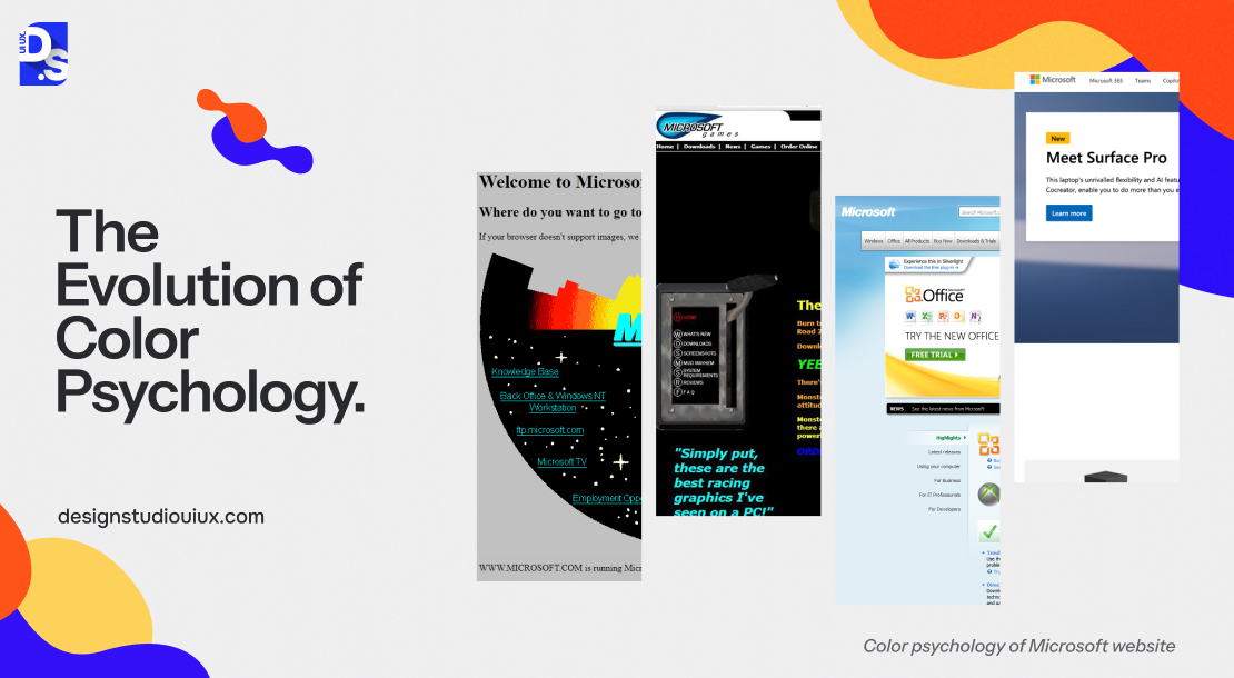
Color psychology today is disproportionately focused on a subset of topics regarding how colors in websites, apps, marketing materials, etc., impact human behavior. In fact, these topics are so vastly studied and applied in marketing, that new-age design psychologists are asking web designers and marketers to do more than just select the right colors for their brands. They also want them to carefully consider the hue, saturation, and brightness of the colors they choose.
According to them, these subtle characteristics of colors can influence human perception, as much as the colors themselves. And, are they right? Absolutely. The effect of hue, saturation, and brightness on the human eye – is a complex field of inquiry in itself. To understand it a bit, we’ll have to take a few notes from some of our fellow species and understand how they have evolved to react to light and colors:
- For most creatures, responding to light is crucial for survival. An amoeba can move toward or away from light by feeling its presence with its entire body.
- Earthworms, a more advanced organism, have light-sensitive receptor cells spread across their bodies. They use it to detect light. Snails have these receptors at the tips of their tentacles.
- These light receptors are also found in scallops, clams, and other nautiluses (members of the phylum Mollusca). These “eye spots” help them sense light from multiple directions and make sense of what direction they are taking.
- However, these light receptors or “eye spots” do not see much detail or color. The ability to focus on details like color likely started with fish, newts, salamanders, frogs, and cuttlefish.
- These animals have lenses that can move back and forth (similar to a camera lens) which allows them to focus on specific things at different distances.
- Over time, more advanced animals like snakes and turtles developed self-focusing lenses, eyelids, and the beginnings of color vision.
- Birds have a highly developed sense of color, while most mammals, except for apes and humans, do not see colors as vividly.
All of these creatures, from amoeba to apes, react to light and color instinctively. They do not have the brains to process colors in the nuanced ways we humans do it. So, how do we react to colors? How does the complex human brain process different hues, saturation, and brightness levels? It is both instinctive and conditioned.
How Do Humans Respond to Colors?
There are certain instinctive reactions to colors that we all have, just like mammals. These reactions have probably been built into our DNA over millions of years of evolution from apes to humans.
There is also a conditioning aspect to how we react to colors, because of all the extra ‘gray matter’ we have that other mammals do not. Colors have been an important part of all human civilizations and cultures. The way we perceive colors is hugely impacted by all the cultural conditioning we have been through over these tens of thousands of years of civilization.
For example, today, white is instantly recognized as a symbol of purity and celebration (weddings) in the West whereas, in most Eastern cultures, it is linked to grief. In the future, this cultural conditioning of whites may change in both cultures.
Why is all of this relevant to web design? Because web designers need to understand and navigate all the evolutionary, psychological, and cultural foundations of colors. They cannot just focus on one because their web designs are accessible to the world and they need to satisfy all users, across the globe.
Of course, we do not have the scope to discuss these factors at length today. So, let us point out the most important details that web designers need to know about how modern humans, aka website-visiting Internet users, perceive colors.
Color Harmony in Web Design
Our perception thrives on order. Our brains naturally try to bring order to any information we absorb through our senses. So, the most important thing about color psychology that web designers need to know is that they must use colors to create harmony in their designs. ‘Harmony’ is the opposite of chaos. In web design, this term refers to the way colors are placed and arranged. A color scheme that is ‘harmonious’ will add order to the design and make it appear more polished and professional.
This type of orderly and harmonious appearance is vital for building trust with users. Consistent use of harmonious color schemes also helps reinforce the brand’s identity on every webpage. So, how do you establish color harmony in your web design? Simple, you turn to what the experts do which is to use pre-existing color schemes:
Analogous Color Scheme
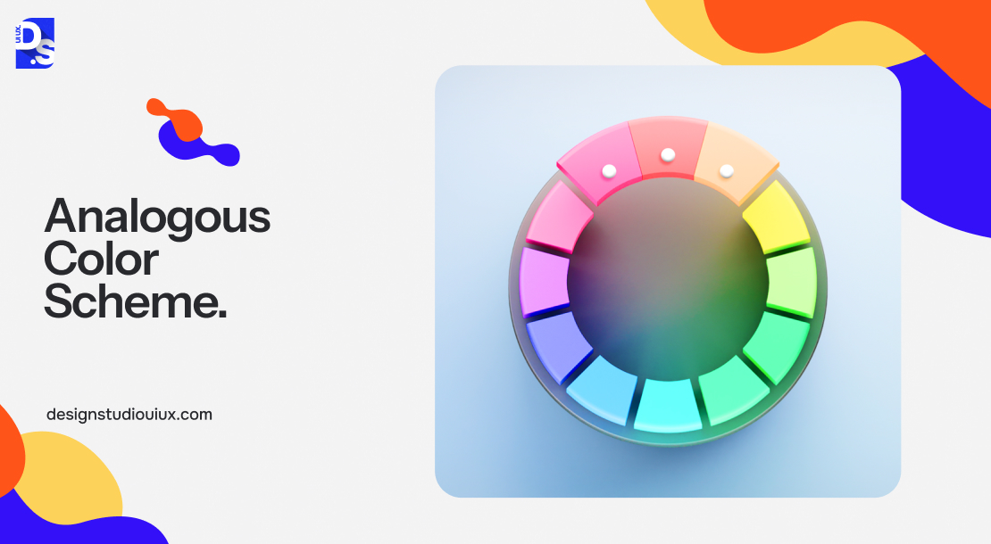
This color scheme focuses on using colors that are close neighbors on the color wheel. Yellow, yellow-green, green or blue, blue-green, and green are examples of analogous color schemes that always help create cohesive designs. The primary reason behind this is the fact that analogous colors naturally complement each other.
Complementary Colors

These color schemes feature colors that are at the opposite ends of the color wheel. Since complementary colors make each color stand out and create a strong contrast (e.g., blue and orange or yellow and purple), they are ideal for creating eye-catching webpages or page sections.
Triadic Colors

This color scheme features three colors that are evenly spaced out on the color wheel. Pretty specific, right? There are only four triadic color schemes – Red + Yellow + Blue, Orange + Green + Violet, Red-orange + Yellow-green + Blue-violet, and Yellow-orange + Blue-green + Red-violet.
By using any of these established color schemes, you can give your website a polished, professional, harmonious, and consistent appearance – qualities that are vital for building trust and familiarity with users.
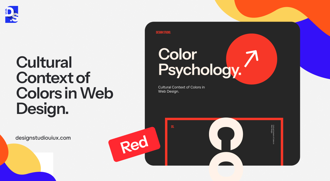
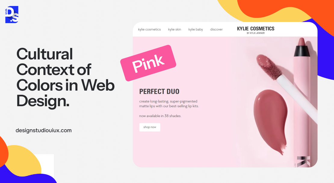
Cultural Context of Colors in Web Design
Another essential thing web designers need to be mindful of when using colors is the cultural context behind them. Since we don’t have time to list all the colors on the color wheel and the cultural nuances associated with them, we’ve created a shorter ‘essential colors only’ list:
Red: Aggression, passion, violence, romance, and authority – the color red has quite the reputation when it comes to what it represents. This reputation is the same in most cultures. The color’s ability to create urgency, evoke passion, and stimulate action makes it an ideal choice for web page sections that need to catch the eye. Hence, many CTA buttons have either red color-fills or red-colored borders.
Pink: If red stands for fiery passion, its diluted version stands for soft and gentle love. So, pink is widely associated with femininity, motherhood, and the LGBTQ+ community. If your brand is associated with such feminine qualities, using pink in your web designs will instantly let the world know the values you stand for.
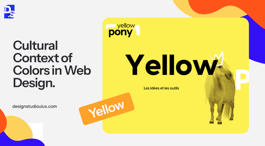
Yellow: Since this color reminds people of sunlight and spring flowers, yellow is widely considered to be a lucky, joyous, and noble color in most parts of the world. For example, in the West, people put up yellow ribbons on their walls as symbols of optimism. In the East, bright yellow has been historically associated with royalty. Web designers can use yellow whenever they need to evoke optimism and draw attention to important web page elements.
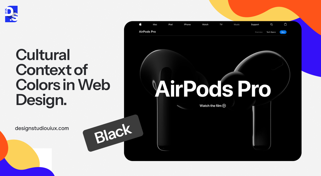
Black: Although black symbolizes death and mourning in most cultures, in design, it is widely accepted as a sleek and elegant color choice. This is especially true in minimalistic web designs. Even though some people associate black with doom and gloom, its ability to slim down design elements and create a chic neutral backdrop on webpages makes it ideal for minimalist designs.
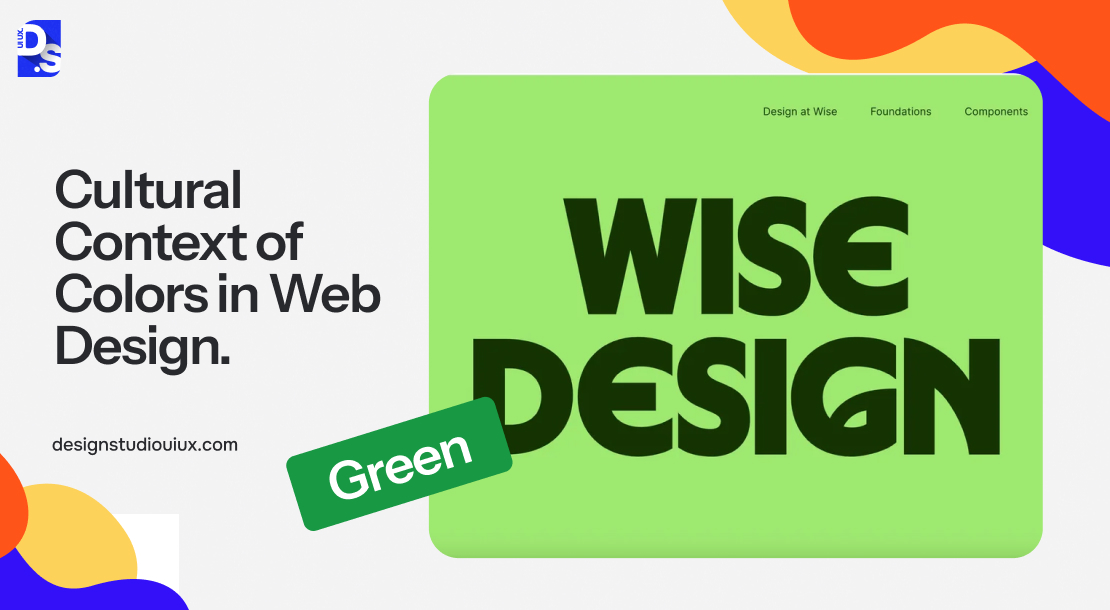
Green: Pretty much everywhere in the world, the color green symbolizes growth. In web design, green is frequently used by brands associated with nature, health, environment, sustainability, and tranquility. It is a great color for conveying a sense of freshness and renewal.
Blue: The color blue symbolizes calmness and authority. That’s why so many countries have blue-colored police officer uniforms. Blue has the same effect on web design. It is a widely popular color that oozes calmness and authority.
A culturally sensitive approach to color selection will help designers choose color combos that give the right connotations to all users in this globalized digital landscape.

Choosing the Right Colors for Your Website
If you think color psychology will help you narrow down user responses to different individual colors on websites, you’re wrong. You have probably understood by now that the topic of color is too subjective, too dependent on personal experiences, and too broad to be collectively translated to specific emotions and feelings.
What color psychology can do is help web designers strategically think of their color choices and whether they align with the website’s brand and user needs. So, how should web designers think of colors according to color psychologists? Here’s how:
- There are no clear-cut guidelines for choosing a website’s colors.
- Colors only come into play in web design when they can be used to match a brand’s desired personality.
- Without context, choosing one color over another doesn’t make much sense.
The relationship between websites and color hinges on the apparent suitability of the color being used for the specific brand. In simpler terms, does the color ‘fit’ the website – that is the first thing website visitors will think of when they land on a site.
For instance, using cooler colors like blue or green can make your website appear more professional, eco-friendly, and trustworthy. But if the brand behind your website does not stand for these values, the color choices will make no difference in the long run.
Similarly, warmer colors like orange can create a sense of comfort on a website. But if the website is not designed to facilitate smooth user interactions, the initial color-based impression that users have, won’t mean anything after a few minutes.
Studies such as ‘Exciting Red and Competent Blue’ and ‘The Interactive Effects of Colors,’ have confirmed these findings. According to these studies, user intent is affected by colors due to the impact they have on how a website is perceived.
Colors influence how users view the website’s ‘personality.’ If the website’s functionality, aesthetics, and user experience match this perceived personality, you are doing color psychology right. If not, here’s what you need to know:
- Certain colors broadly align with specific emotions. For example, red invokes excitement, green means calm, and brown is associated with ruggedness.
- But that does not mean you should always align with conventional color associations.
- Think of the personality you want to portray to website visitors. Then pick a color combo that matches this personality.
- Just because you sell durable shoes on the Internet, does not mean your website’s main color should be brown.
- So, if your shoe brand’s personality is quirky (and not rugged) you can use red, violet, orange, or any other color scheme. As long as the color scheme matches your website’s vibe – you are good.
- Also, consider the color combos your closest competitors are using. Colors are meant to help your website stand out.
- If all of your competitors are already using the color schemes you want, do not refrain from experimenting with unorthodox color hues and combos.
If you do choose to ‘break the rules’ and pick a color combo that is not typically associated with your website’s niche, test every potential test at least 20 times. Use A/B testing to carefully refine your color choices. Make sure your final pick reflects your brand’s personality and values in some way. It does not have to be a “green = calm” type of stereotypical reflection. It just needs to match your brand’s personality and the vibe you want to give to website visitors.
Your final pick should somewhat respect your target audience’s cultural connotations of colors. Here are five popular websites rated based on the requirements we just discussed:
| Brands | Color Combination | Reflects Website’s Personality | Target Audience | Different from Competitors | Emotions Evoked |
| Blue and White | Trustworthy, professional | Appeals to professionals and businesses | No. Common in corporate | Conveys calmness, security, and reliability | |
| Coca-Cola | Red and Black | Bold, energetic | Appeals to energetic users | Iconic but used by many of Coke’s competitors | Evokes excitement, urgency, and passion |
| Whole Foods Market | Green and Brown | Nature, sustainability | Appeals to eco-conscious users | Used by most competitors but Whole Foods is the more iconic brand | Conveys warmth, stability, and renewal |
| Fanta | Orange and Gray | Modern, creative | Appeals to younger, creative audiences | Moderately unique | Evokes enthusiasm, creativity, and energy |
| T-Mobile | Purple and Gold | Luxurious, innovative | Appeals to premium customers | Used by some luxury brands but not by T-Mobile’s competitors | Conveys elegance, wealth, and creativity |
Make sure to rate your color choices in the same way before applying them to your web design. Also, review the Web Content Accessibility Guidelines (WCAG) regarding website colors to ensure your choices are compliant. Use tools like Color Contrast Checker to streamline this process. This tool will automatically review your design for compliance with all relevant accessibility standards.
Integrating Chosen Colors with Your Website
After choosing the brand and target-user appropriate color scheme, apply it consistently across all website touchpoints – from the homepage to the navigation menus. Here are some of the main website touchpoints where you can strategically apply color psychology:
- Follow the 60-30-10 rule: 60% primary color, 30% secondary color, 10% accent color
- Use contrasting colors to make CTAs and links stand out
- Use colors to differentiate visited and unvisited links
- Make use of color to create a visual hierarchy
- Use color to draw attention to important webpage sections
- Leverage white space effectively to create an uncluttered background
- Choose background colors that complement the color scheme
- Only use images and graphics that align with the color scheme
These subtle design decisions will help you maintain harmony in your website. The more you apply them consistently, the more memorable and recognizable your website will become over time. This will ultimately highlight the importance of web design in creating a brand identity that automatically attracts users and leads them toward conversion.
Current Color Trends
We have discussed the billion-year-old amoeba reacting to light. Now, let us talk about the ‘trendiest’ things that most of our colleagues are interested in:
- Bright, saturated colors are the trend of 2024 – a year where so many websites are making bold, brand-defining statements
- Soft, muted, and pastel shades (e.g., beige (#DDD0C8) or dark grey (#323232)) are still uber-popular on minimalistic websites
- Dark Mode, i.e., websites with dark backgrounds but light text are the talk of the town
- Rainbow gradients with dark text (popularized by the likes of Stripe) are in fashion with many tech brands
- Every other year or so, many brands are experiment with futuristic pastels and primary colors
Check out these trends before finalizing your color decisions.
Conclusion
There you have it – an abridged yet all-encompassing explanation of color psychology in web design. Treat this article as an instruction manual and remember to test every color scheme you create.
At Design Studio, a UI/UX Design Company we use tools like Adobe Color, Coolors, and Color Hunt to create and test hundreds of color combinations every month. Constant user testing keeps our color senses sharp and in tune with user expectations.
comments
Add comment