
Top 10 UI/UX Design Website Examples
In the world of user experience (UX) design, the pursuit of greatness transcends aesthetics. Yes, an eye-catching color scheme or an engaging interface is important for grabbing initial attention; but beyond that, usability takes center stage. The hallmark of successful UX design lies in its ability to seamlessly guide users towards their goals, while simultaneously delighting them with an engaging experience.
To show you what good, user-focused UX design looks like in action, we have assembled a collection of 10 UX design examples that have kept users engaged and wanting more. Before we discuss those examples, let us define what we mean by good and bad UX design.
What is Good and Bad UX Design?
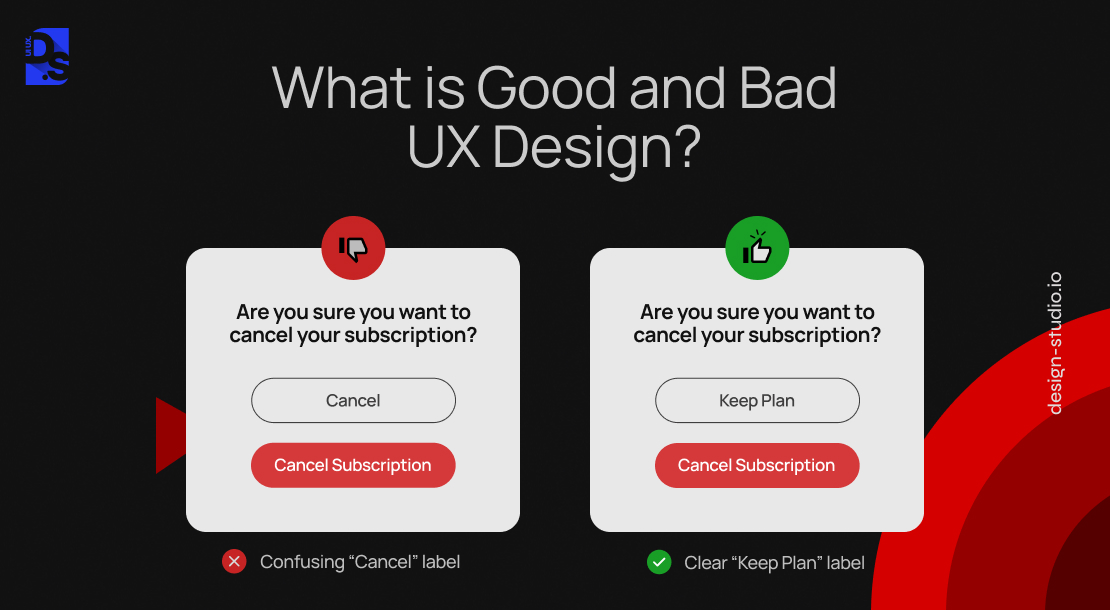
The concept of “good UX design” often sparks debate, particularly when the concept of subjective artistic appreciation is brought up. In simpler terms, is good UX design subjective? No, it is not. While aesthetics and subjective preferences undeniably play a role in user experience (UX) design, its success hinges on a more measurable foundation.
Unlike personal art appreciation, where “good” can be entirely subjective, effective UX design adheres to a set of objective criteria that can be evaluated and optimized.
- A captivating painting may hang on a museum wall based on its artistic merit, regardless of how many people can grasp its complexities.
- On the other hand, a poorly designed website, regardless of its visual appeal, will fail to retain users if it is difficult to navigate or fails to meet their needs.
This begs the question: can UX design truly be classified as good or bad without succumbing to individual preferences? The answer lies in the core purpose of UX design – to maximize usability and create meaningful experiences for users. The success or failure of UX designs has always been demonstrably quantifiable.
Metrics like task completion rate, error rate, user abandonment rate, and time on task provide objective data points for evaluation. These metrics highlight the core principle- “good UX design” guides users toward their goals seamlessly, minimizing errors and frustrations. Let us delve into some key UX design principles that contribute to this success:
- Usability: Users should be able to navigate and interact with your website intuitively. It means clear information architecture, easy-to-use features like search filters, and a logical layout. Think of it like organizing a store so your target audience can find what they want quickly and easily.
- Functionality: All features should work flawlessly, in proportion to the nature of your digital product. For example, an online store with thousands of products will need a robust filtering tool that delivers accurate search results without bugs.
- Information Architecture: Users should find whatever they are looking for effortlessly. We are talking about a clear search bar, well-organized categories, helpful filters, clear product names, a simple layout, and other design features that help users find what they need effortlessly.
- Credibility: The presence of elements like customer reviews, security badges, and team bios helps establish user confidence. This trustworthiness contributes to a more positive experience.
- Accessibility: Ensure everyone can use your website, even those with technical or physical limitations. Your site should handle high traffic without crashing, and information should be presented in a way that suits different users’ needs (e.g., mobile and desktop users).
By focusing on these core principles (and constantly measuring their impact through user data) you can create a “good UX design” that is demonstrably successful in guiding users towards their goals.
Bad UX Design

Unlike art, which serves the artist’s expression, design inherently strives for objectivity. Good design solves problems while bad design creates them. When users encounter repeated difficulties navigating an app or website, it is a red flag for bad UX design. Let us explore some common culprits:
- Confusing or Cluttered Layout: A poorly organized interface makes finding info or completing tasks frustratingly impossible.
- Slow Loading Times: Nothing frustrates users like a sluggish website.
- Difficult or Unintuitive Navigation: Unlabeled links, unclear clickable elements, broken links, missing call-to-action buttons (CTAs): these types of navigation-related design mistakes make users feel lost in the sales funnel.
- Outdated Visual Design: While aesthetics is not everything, an outdated or poorly designed interface can turn users off.
Examples of UX Design
Now that we have unpacked the hallmarks of good and bad UX design, let us bridge the gap from theory to practice. We sought insights from a panel of product and UX design experts, asking them to share their favorite mobile app designs and the specific features that make them shine. Here are some real-world examples of UX design that exemplify user-centric design excellence:
1. TAG Heuer
Classic Homepage UX Design
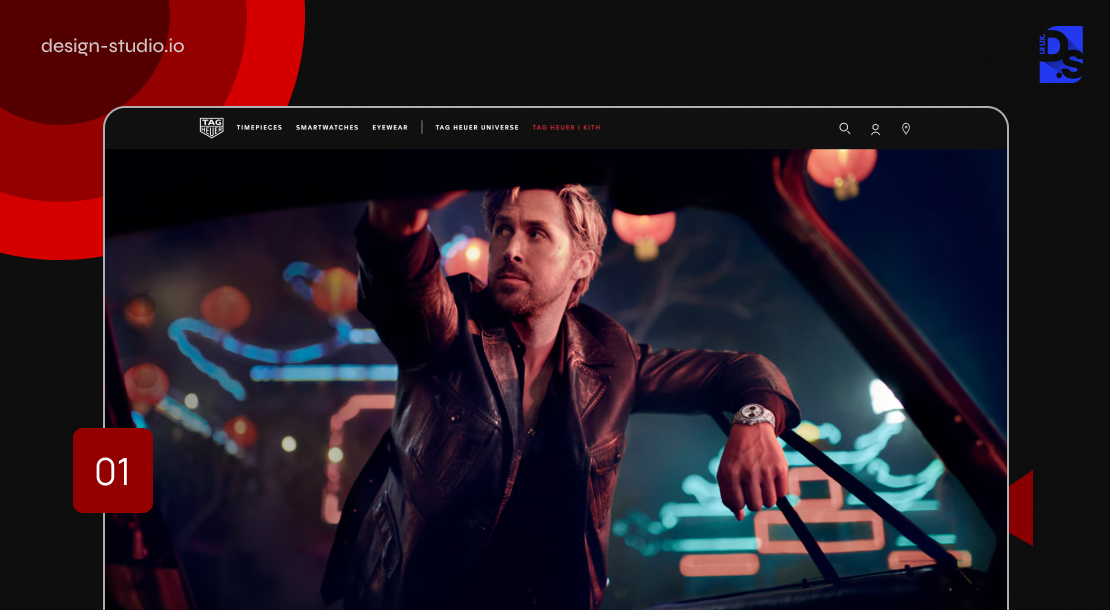
The homepage is a critical entry point for all websites, especially for eCommerce sites. While users might land on products, categories, or landing pages directly, the homepage still serves as a critical hub for generating positive first impressions and guiding users toward their goals. TAG Heuer’s homepage exemplifies effective homepage UX design by seamlessly integrating different product categories into the main navigation:
- Instant Context: Landing visitors are immediately greeted with a clear understanding of the site’s purpose and core offerings.
- Prominent Product Categories: The main navigation bar prominently displays product categories, allowing users to instantly grasp the site’s offerings.
- Mobile-First Optimization: This emphasis on clear categorization is particularly important for mobile users with limited screen real estate. By prioritizing a readily accessible category list, TAG Heuer ensures a seamless browsing experience regardless of the device.
- Seamless Interlinking: The homepage seamlessly interlinks different content sections (like the catalog and the product guides). This allows users to effortlessly navigate between both products and informative brand-related content, fostering a more engaging experience.
By prioritizing user-centric design principles like clear product categorization and intuitive navigation, the TAG Heuer homepage sets the gold standard for effective eCommerce UX design.
2. Wolt App
Gamifying Convenience in Food Delivery

The Wolt app stands tall as a user-centric example of UX design in the food delivery space. This is not just another food delivery app with a long list of restaurants that leaves you scrolling endlessly, wondering where to begin. Wolt is a food delivery powerhouse that understands the value of time and convenience. Through exceptional categorization, strong search functionalities, and simple content display, this app delights millions of users every year.
Wolt’s intuitive search interface makes finding food a breeze. Easily discoverable food items, clear meal categories, and dynamic pricing ensure there is never any room for confusion. But what truly elevates Wolt above the competition is its meticulously crafted order flows and the ingenious way the app’s interface handles wait times:
- Wolt tackles the dreaded “hangry” wait time with a touch of gamification in ux.
- The “In Delivery” interface displays a timer alongside a large, tappable button.
- Users can tap as many times as possible during the countdown.
- If they surpass the target number of taps, their delivery fee is entirely waived!
This playful twist cleverly transforms a potential pain point into a delightful user experience. Wolt empowers users with various other features that are designed for maximum satisfaction. This includes a built-in translator, easy-to-use order customization tools, a unique “Order Together” feature, and a new “Slide-to-Confirm” checkout mechanism.
This mechanism prevents accidental orders. By prioritizing user needs at every touchpoint, Wolt’s app transforms the food ordering process into a fun and engaging journey.
3. Chewy
A Masterclass in Product Listing
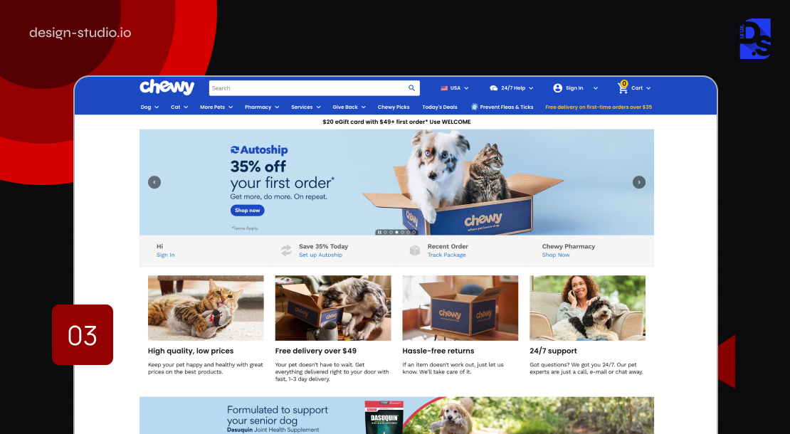
It is no surprise that poorly designed interfaces with no filtering or sorting tools have staggeringly high abandonment rates. Users are way more likely to abandon their carts if they encounter difficulties finding information or products due to poor interface design. Product listings and their accompanying filtering tools are the lifeblood of any digital platform.
They empower users to navigate vast product or information catalogs with ease, ultimately influencing their decision to browse further or abandon ship. Pet food company Chewy’s website and app exemplify this principle beautifully, delivering a masterclass in user-centric product list design. Here’s what Chewy gets right:
- Thematic Filtering: Forget generic filtering options like “price” or “brand.” Chewy provides thematic filters that cater to specific user needs. Think “breed-size,” or “special dietary requirements.” By allowing pet owners to search for pet food based on highly specific health considerations, Chewy empowers users to swiftly find what they are looking for.
- Breadcrumb Navigation: Getting lost in a labyrinth of subcategories is a common pain point for pet owners. To avoid this risk, Chewy incorporates a clear breadcrumb navigation system within its category product lists. This visual hierarchy allows users to always see their present location within the website’s structure. When they drill down too deep, the breadcrumbs provide a clear path back to broader categories.
- Live Product Updates: As users apply specific filters, Chewy’s interface updates dynamically, reflecting the refined product selection in real time. No more endless reloading or irrelevant results – Chewy instantly displays only the relevant options, keeping users focused on the products that matter to them.
These careful and user-centric improvements in filtering and sorting can dramatically reduce any digital platform’s abandonment rates.
4. Target
Highlight Key Features in Product Pages

Product pages often serve as a template for your entire app or website. A single UX design misstep on a product page can create a ripple effect of user abandonment across your entire site. Target understands this challenge and prioritizes exceptional UX design on their product pages. They prioritize user needs by placing the most important product features directly in the product titles. Imagine browsing for a smart inverter on the Target app or website – the title might read “Wall-Mounted Smart Inverter – 500-Watt.”
This upfront clarity empowers users to make informed decisions quickly, without the need to sift through mountains of text. Target also features product videos within its main image galleries, encouraging users to explore the products in greater depth. Target does not leave UX to chance. They have created a standardized product page template that ensures consistency across their entire product catalog. Users instinctively know where to find key info regardless of the product page/category they are browsing.
5. Google Maps
Prioritizing Functionality and Multimodal Data Presentation

True UX success lies not in a visually captivating interface, but in the interface’s ability to demonstrably fulfill user needs. Google Maps showcases this principle beautifully and stands out as an exceptional example of UX design. The design of both the web and mobile apps is clean, straightforward, and focused on making navigation easy. There are no unnecessary flashy UI elements that could potentially distract users from their primary goal: efficient route planning and location awareness.
However, that does not mean the app just shows you how to get from A to B. Google Maps is amazing at multimodal data presentation. It gives users comprehensive information about their destination, including:
- Rich text descriptions that provide users with a strong understanding of their target location.
- A curated library of User-Generated photographs that offer visual glimpses into the destinations
- Reviews composed by fellow users
- By seamlessly presenting this multifaceted data, Google Maps transcends its role as a navigation tool and becomes a comprehensive geospatial information hub.
6. Apple’s Shopping Cart and Checkout
Transparency and User Empowerment
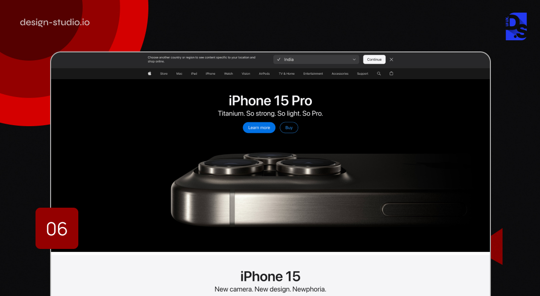
A lack of upfront transparency can make your interface appear untrustworthy, no matter how well it is designed. This is especially true for your app or website’s shopping cart and checkout pages. Informative, easy-to-use, and transparent shopping carts and checkout processes are crucial for delivering reliable and user-friendly experiences. Apple’s meticulously crafted shopping cart experience serves as the blueprint in this regard:
- Apple provides a comprehensive cost estimate as soon as the user initiates product selection and customisation for purchase. This estimate includes the base product price, estimated shipping costs, and tax calculations. It presents a clear picture of the total cost upfront. This transparency eliminates uncertainty and encourages users to proceed with confidence.
- Apple takes the shopping cart experience a step further by delivering ultra-relevant cross-sell suggestions/promotions. These recommendations are meticulously curated based on user data This personalized approach to product suggestions fosters greater engagement.
- Their website uses high-quality images/videos to showcase their products in an attractive and informative manner. This commitment to visual fidelity enhances the shopping experience.
Apple’s website also features interactive elements like the product color comparison slider. Users can effortlessly compare the specific features and color options of different phone categories by clicking on them.
7. Nike
Leveraging Spatial Psychology to Influence User Behavior
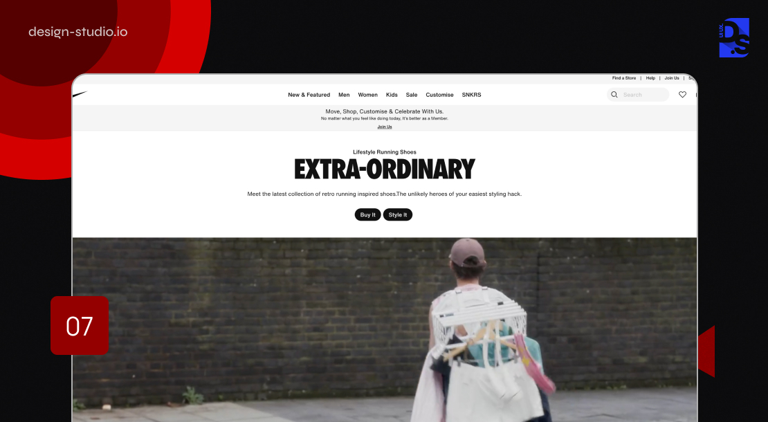
Nike’s product pages (on their app and website) exemplify the power of spatial psychology in influencing user behavior. This is achieved through a combination of meticulously measured layout dimensions, product image sizes, and the strategic placement of the “Add to Cart” button, consistently implemented across all platforms. Plus, by segmenting categories and subcategories into clear and well-defined sections, Nike ensures a user-friendly experience that promotes effortless product discovery.
By strategically manipulating these design elements, Nike creates a visual hierarchy that draws users’ attention toward the main product offerings and simplifies their path to conversion. The design makes adding items to the cart feel effortlessly enticing.
8. Pinterest
World-Class Content Presentation

Pinterest’s UI uses two key techniques to masterfully present eye-catching content:
- Card-Based Content: Pinterest leverages the card-based content delivery method to present images, videos, and product listings. Each card on the screen features a specific piece of content. Scanning through the cards is very easy. This modular approach helps users efficiently browse through tons of content without feeling overwhelmed.
- Waterfall Content Presentation: To further improve user engagement, Pinterest also employs the waterfall content delivery method. As you scroll, new content appears smoothly without any interruptions like page breaks or loading screens. This keeps users immersed in the experience, encouraging them to explore more for longer periods.
As a noteworthy example of UX design, Pinterest keeps things simple with a clean look that puts images and videos first. Even on small screens, the app’s design is clear, organized, and distraction-free. Users always get what they want (well-organized content, smooth scrolling, and helpful visuals) and that is why they love it.
9. Uber
Simplicity, Intuitiveness, and Practicality

Uber’s ridesharing app is a great UX Design Example synonymous with simplicity and user-friendliness. The app’s interface is packed with large, easily identifiable buttons that minimize the potential for user error. An uncluttered information architecture ensures key details are readily available to users. This simplistic approach minimizes the friction commonly associated with requesting rides. Another cornerstone of Uber is its map-centric interface.
This clear visual representation offers real-time tracking of drivers’ locations, eliminating all anxieties associated with unfamiliar locations and wait times. Users can effortlessly monitor their rides’ progress and share the information with their close friends and family. This real-time info stream eliminates the need for excessive refreshing or anxious wonderings about the drivers’ whereabouts.
10. Airbnb
Effectively Address Travelers’ Needs and Pain-Points

The Airbnb app has established itself as the go-to online hub within the hospitality industry by prioritizing a UX design that effectively addresses travelers’ needs and pain points. The Airbnb app’s design revolves around a singular, prominent search bar. This search-centric approach empowers users to discover new destination ideas and transition from browsing to planning. All prices are displayed directly on the app’s main map so that users can compare pricing options across entire geographic regions at a glance.
This commitment to addressing user needs also manifests in the form of streamlined booking processes, visually compelling presentations, and multiple clearly defined accommodation options (entire homes, pet-friendly listings, etc.) By prioritizing practical travelers’ needs and pain points, Airbnb has carved a niche for itself within the travel booking industry.
Final Take: Why Is Having Good UX So Important?
A meticulously crafted UX design serves as the ultimate catalyst for conversion. By prioritizing user needs and fostering a frictionless user journey, businesses can directly boost their conversion rates. By implementing data-driven, iterative UX enhancements, like in the examples mentioned above, businesses can progressively refine their user interactions and secure more meaningful conversions. Investing in UI UX branding design services ensures a strategic approach to these enhancements.
For more examples of UX design and in-depth guidance on great UX design, contact Design Studio now!
comments
Add comment