
Best Practices & Guide for Effective B2B Website Design
In 2022, ‘digital’ surpassed ‘in-person’ as the most effective B2B sales channel. In 2023, B2B buyers are voting with their dollars. The average B2B buyer today conducts independent research online and does not rely on sales calls or in-person meetings to make business-related decisions.
According to a recent survey by McKinsey, most corporate decision-makers are now 100% comfortable making big-budget purchases online. 15% of the decision-makers that were surveyed claimed that they are comfortable finalizing million-dollar deals on websites.
The bottom line?
If you run a B2B business in 2024, your website is your biggest asset. That is great news because when it comes to reaching out to potential customers, a website is the best tool for B2B sellers. It is low-cost, high-reach, infinitely flexible, trackable, available 24/7, and easy to update.
But, is your website easy to navigate, visually stunning, and offers compelling customer experiences?
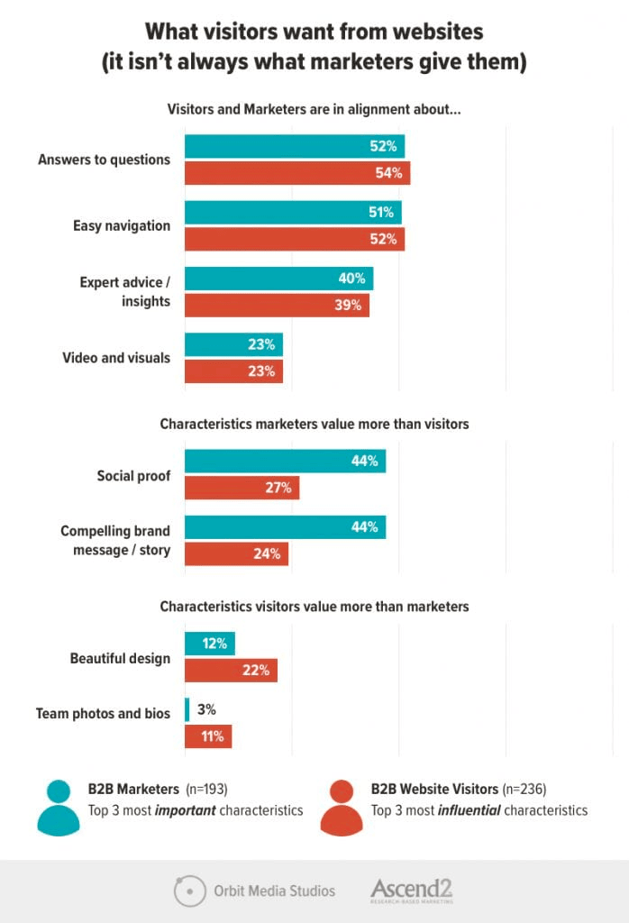
These are the critical qualities that new-age B2B website visitors value the most. Orbit Media and Ascend2 did some amazing research into this topic in 2021. According to their study, B2B website visitors value design-related qualities like easy navigation, high-quality visuals, and high-quality content the most.
Here are some of the other qualities B2B website visitors care about. Notice how most of them are design-related:
The first impressions buyers get from B2B websites determine whether or not they want to continue their journeys. Hence, simple design practices like improving the site navigation or presenting eye-catching content can make a massive difference in a B2B website’s success.In this article, we will discuss these all-essential B2B website design best practices in great detail. Before that let us define what a “B2B website” is and what “B2B website design” means just to make sure that we are starting off on the same page.
What is B2B Website Design?
B2B website design is the process of creating websites for businesses that regularly conduct deals and transactions with other businesses.
- The target audience of a B2B website is typically business professionals who are looking to buy or learn about specific products/services.
- A well-designed B2B website should reflect the professionalism, reliability, and user-friendliness of a B2B company.
- A typical B2B website will feature multiple product pages, product catalogs, order management systems, landing pages, payment processing tools, and account management features.
Here are some examples of popular B2B websites; check them out to get a clear idea of what B2B websites look and feel like:
B2B Website Design Examples
We’ve analyzed these websites and pinpointed ten best practices for B2B website design that every B2B firm can and should incorporate into its website design strategy. If you’re seeking guidance on enhancing your website, consider consulting a specialized B2B Website Design Agency for expert assistance.
10 B2B Web Design Best Practices
1. B2B Website Design Audit
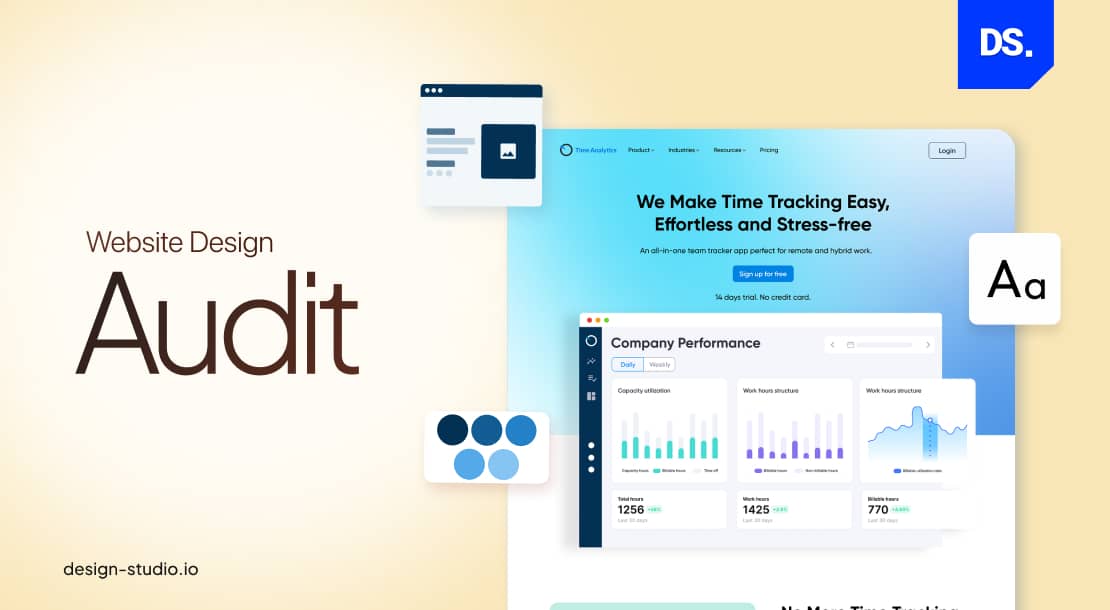
The word “audit” rarely incites enthusiasm among the masses. But, for web designers, this word stands for something completely different. Conducting a web design audit is the first step toward improving the way people interact with your B2B website. That is because conducting a web design audit means answering important questions like:
- Are there any usability issues on your site?
- What are the user engagement and satisfaction rates on each webpage?
- Which design enhancements can improve the overall perception of your brand?
- Is the visual design, layout, and navigation user-friendly?
- Is the website responsive?
If you want your B2B website to provide easier user journeys, you will have to audit your existing website. Use the results of the audit to either level up your design or to keep it on a consistent track.
But, what if you do not have an existing B2B website to work with? Then, conduct design audits on your competitors’ websites. It will help you monitor your competitors’ online strategies and identify opportunities for your brand that you might have overlooked. We audited three B2B websites: Asana, DocuSign, and Zendesk. Here is a chart comparing the findings of our three-stage web design audit:
| Design Quality | Asana | DocuSign | Zendesk |
| Visual Design | Clean and minimalistic design; efficient use of brand-consistent colors | Professional design; consistent, corporate-style branding | Clean design; limited yet effective use of visual elements |
| Layout | Well-organized layout; user-friendly and intuitive structure | Structured layout; very easy to navigate | Structured layout; fast-loading sections; easy to navigate |
| Navigation | User-friendly navigation menu | Logical hierarchy; easy-to-find navigation elements | Intuitive navigation; easy-to-access product pages |
| Responsiveness | Fully responsive design across all types of screens/devices; no broken links | Fully responsive design across all types of screens/devices; minimal errors | Fully responsive design across all types of screens/devices; zero broken links |
| Content | Well-structured content; efficient use of whitespace | Clear content with easy-to-read headlines; well-segmented info | The contrast between the text and background is great |
| Call-to-Action | Prominent call-to-action buttons | Call-to-action elements spread across all website segments | The contrast between call-to-action buttons and the background makes them highly visible |
| Brand Consistency | Consistent use of brand colors and branding elements | Consistent use of logos, brand messages, brand colors, etc. | Consistent use of the same color scheme |
| Accessibility | Generally accessible on all devices | Clear text hierarchy | Easy to read; great color contrast ratios |
Use this basic checklist to audit the design of your own or your competitors’ websites.
2. Adopt a Professional Tone
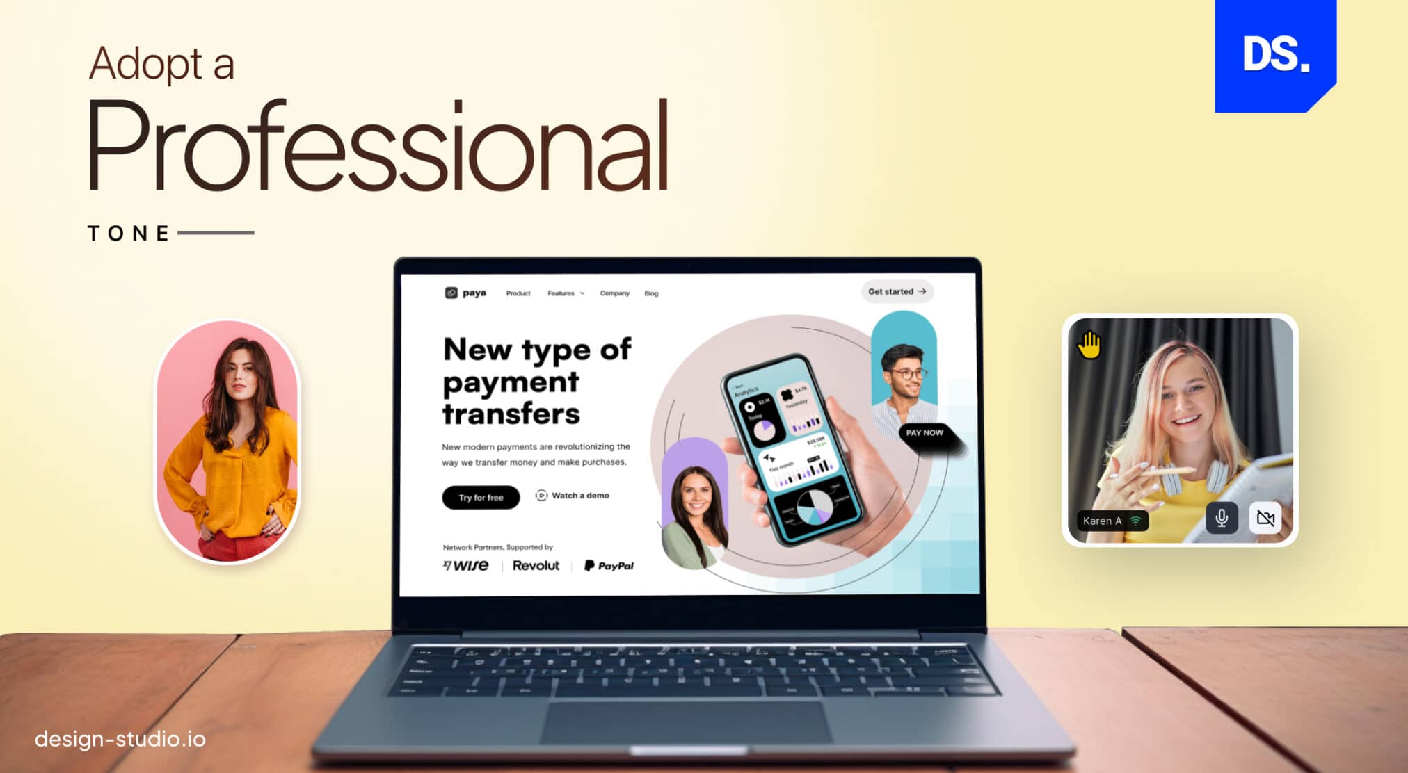
B2B websites should have a professional tone and appearance. From the moment a visitor sets eyes on your homepage, they should infer qualities like authority, expertise, and respect within the industry.
Imagine the websites of serious B2B companies like Oracle or Baymard Institute being full of meaningless design elements. Their customers would wonder whether their products were equally silly.
To ensure that does not happen with your B2B site, try out the following design practices:
- Use a professional logo of your brand on all pages of the site.
- Use high-resolution images and videos.
- Use a simple, clutter-free design that is easy to navigate.
- Use clear and easy-to-read fonts that suit your brand.
- Avoid using bright/contrasting colors; use a neutral color palette instead
- Use a professional tone of voice across all site content
Feel free to add technical language throughout your website. B2B website visitors are typically up-to-date with the latest technical specifications. While B2C websites can never get away with such industry-specific lingo, for B2B customers it is required data.
3. Design a Clear and Clutter-Free Home Page
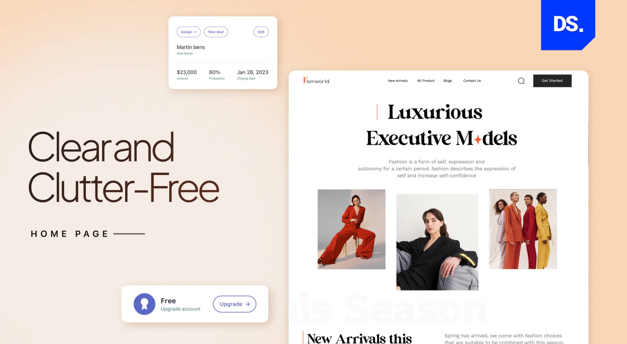
The homepage is generally the most-checked page on a website. When a customer arrives on your B2B website homepage, the messaging and design they see should be optimized to help them fulfill their main mission: make purchases on the site with the least amount of friction.
The simplest way to add these qualities to your homepage is to use customer-centric messaging. Here is an example of how you can add customer-centric messaging to your homepage:
- Explain why visitors should care by detailing your value proposition on the home page.
- Write headlines that succinctly explain what problems your products/services solve.
- Do not use brand speak or fancy buzzwords.
- Write in the second person. Use words like “you” to place visitors at the center of the steps you want them to take on the site. Here are some examples:
“YOU can control the financial future of your firm with reliable financial advisory software.”
“YOU deserve to give your customers faster shipping with next-day delivery.”
By prioritizing visitors and their objectives on your B2B website’s homepage, you can empower them to quickly achieve their goals and solve their problems.
4. Information Architecture and Navigation Design
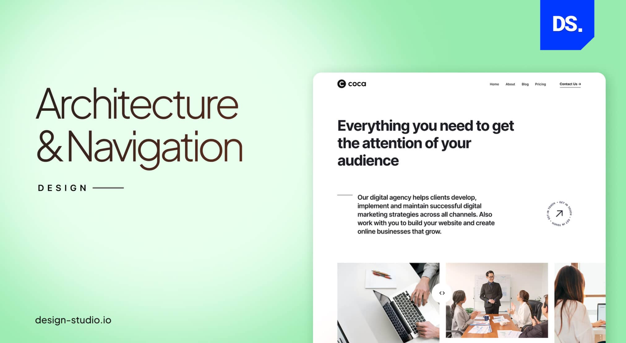
In website design, Information Architecture (IA) design is the practice of structuring info in ways that make it easier for users to find and understand. Efficient IA design is the key to making a B2B website more user-friendly. Here are some IA design tips that can help any B2B website deliver better experiences and secure more traffic:
- Understand your users and their needs before organizing your content in a logical way.
- Label all pieces of content clearly and concisely; use keywords that your target users are likely to search for.
- Navigation should be simple and consistent across the B2B website.
- A search bar should always be visible and accessible on all pages.
- Information should be well-structured and easily scannable.
- Location-related details and contact information should be easy to find.
IA design is something that should be tested with users frequently. Always collect IA-related feedback from real users to make necessary refinements.
5. B2B Forms and Elements
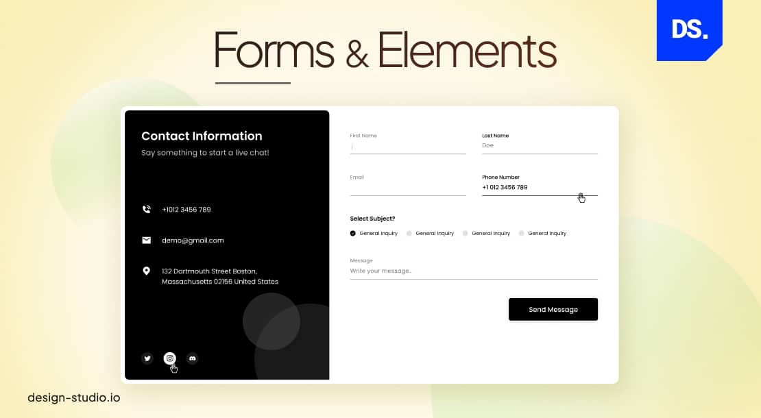
In B2B website design, the term “forms and elements” is loosely used to refer to all the different interactive and non-interactive elements that make up a site. This includes text, menu buttons, all media elements, etc. The specific forms/elements used in your B2B web design will differ based on your specific business goals. However, most high-ranking B2B websites tend to feature the following forms and elements:
- A clear value proposition that summarizes what your B2B firm does and why it is better than the competition.
- Calls-to-action that encourage visitors to take specific actions like scheduling a consultation.
- High-quality visuals to illustrate your products/services.
- Testimonials to build credibility among visitors.
- A blog and links to your social media profiles.
- Typography should be the same throughout the site.
- Dropdown menus and menu buttons should be properly sized and easy to click; they should feature concise text-based instructions.
6. Usability on All Devices
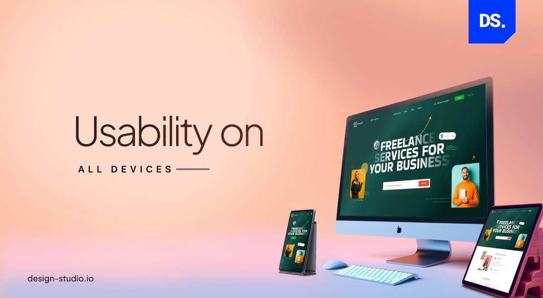
More often than not, your B2B website visitors will visit your site via their mobile phones. Deliver gratifying experiences to them whenever they do. To do that, you will have to ensure that your site is mobile-first responsive and loads smoothly on all other devices. Here are some other ways to boost the usability of a B2B website:
- Install a chatbot to gather visitor data and answer user questions in real time.
- The contrast between the text and the background on each webpage should be pleasing to the eyes.
- Links should always direct users to the intended pages.
- Relevant images should be used to make certain aspects of your products/services easier to understand.
- The design should be accessible for users with disabilities
- The signup process, including all input forms, should be easy to use and ask for only relevant customer info.
- The overall website design should follow a clear set of branding guidelines.
7. Content Basics
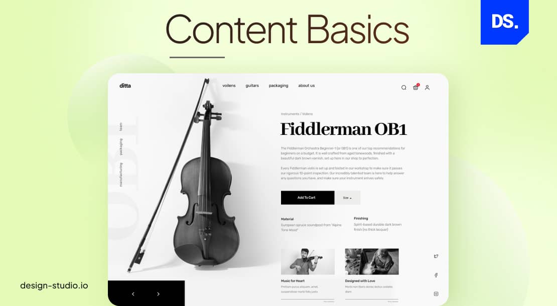
There are two types of content on most B2B websites:
- Content That Visitors are Looking For: Simple answers to basic product/service-related questions, team bios, reviews, and testimonials.
- Content That B2B Websites Want Visitors to Find: The “brand story,” answers to unasked questions, calls-to-action, whitepapers, and case studies.
A well-designed B2B website will feature both of these types of content. Of course, the first type of content, the content that visitors are looking for, is more important. But, after you give users access to the content they need, feel free to present all types of SEO-optimized content. Just make sure that the content is well-segmented and easy to navigate.
8. Build Trust into Your Design
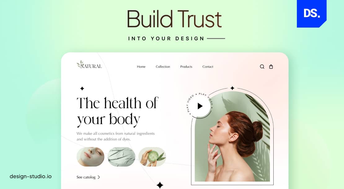
B2B website visitors often have multiple other options up their sleeves. If your site does not win their trust and loyalty early on, they might not choose you over your competition. To avoid that fate, build trust in your B2B website design. For guidance on achieving this, explore our B2B website design examples to see how effective design can create a strong first impression and establish credibility.
Use testimonials and customer reviews including the real names of the firms you work with on the homepage. This type of content will improve the credibility of your website and your brand. If needed, mine for reviews on product-review sites like G2, Product-Hunt, or Capterra.
9. Use Stock Images Strategically
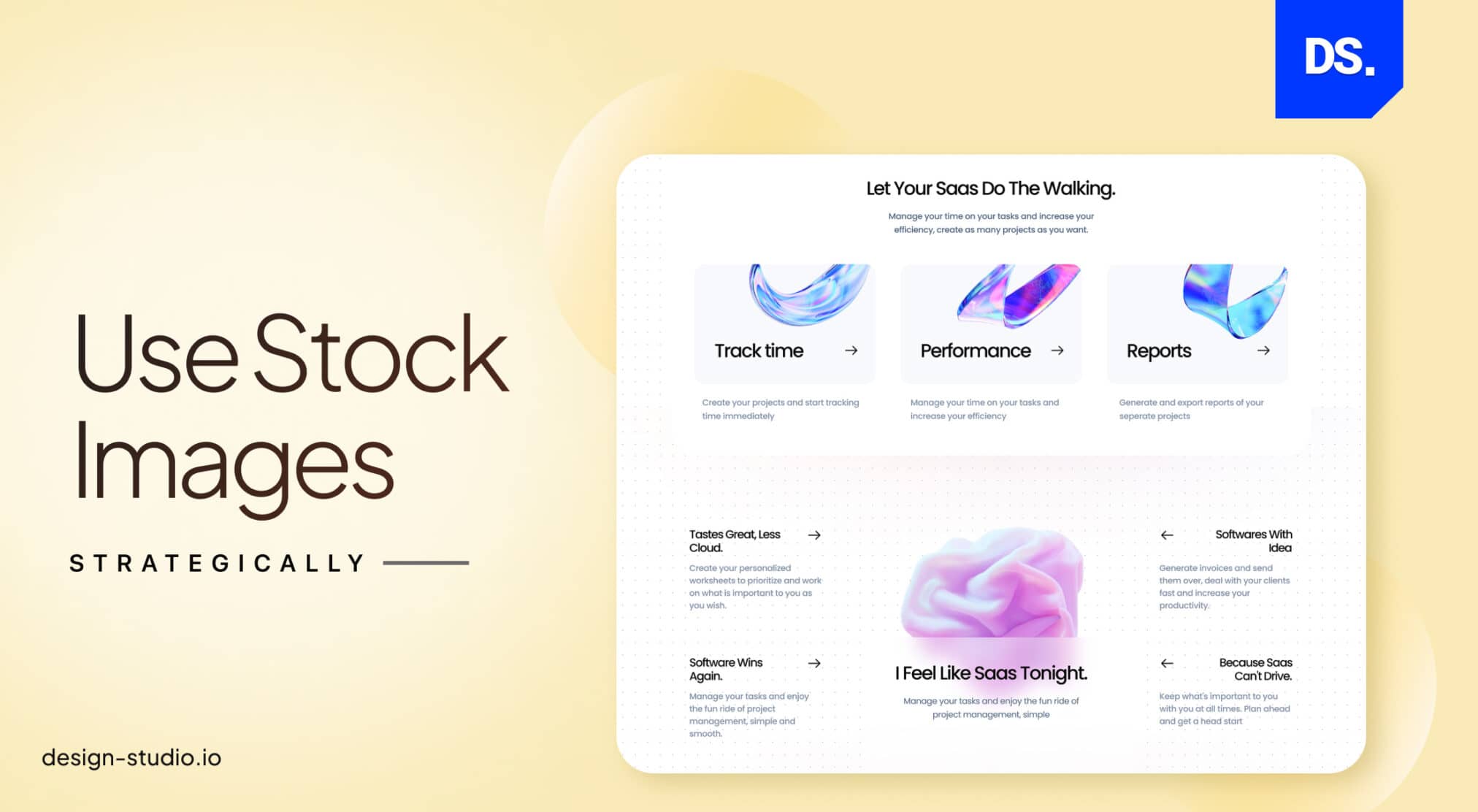
One design mistake that can be spotted in many B2B websites is the overuse of stock imagery. Yes, you can use stock images that are customized with your logo, brand colors, and other personalized elements on some sections of the site.
But, many B2B companies make the mistake of using stock photos as backgrounds for text or as solitary pieces of graphics on webpages. Such use of stock images can make your site design feel impersonal.
To avoid this, use stock images sporadically. When you do use them, make sure that they are in line with your site’s existing design style. Also, consider using custom-created graphics and art in conjunction with stock photos.
10. Create a Culture of Testing and Refinement
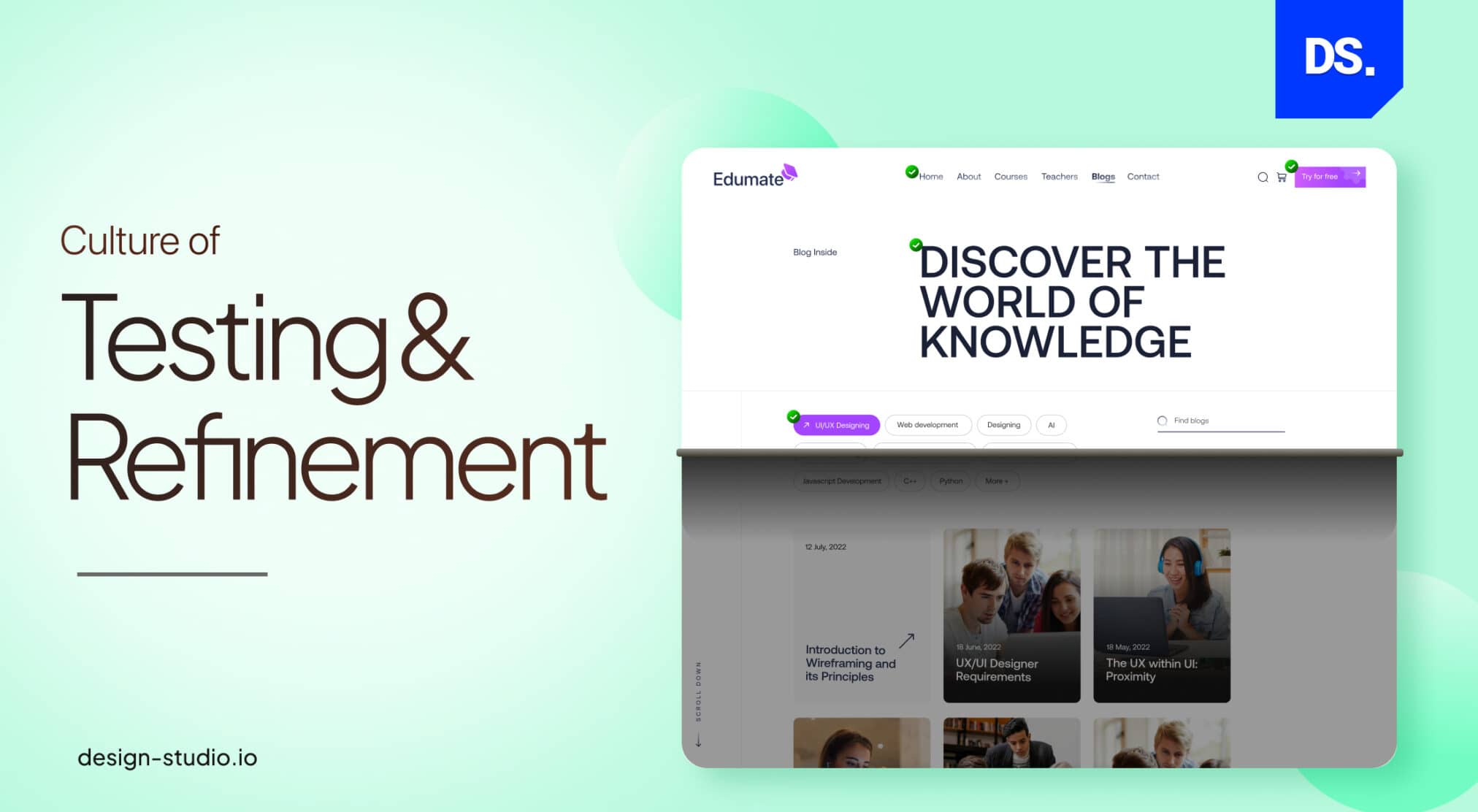
This final practice is the most important. Your B2B website design strategy should always be focused on constant refinement, which is a hallmark of successful B2B web design companies. This means testing every little design detail with real users on a regular basis. Here is an example of some tests and adjustments that web designers should perform on their B2B sites on a regular basis:
Weekly: Check for broken links, update website content, and test website forms.
Monthly: Scan the website for design vulnerabilities, and optimize each design element for search engines.
Quarterly: Review website usability, survey visitors, and make necessary changes to the website.
Annually: Redesign website, reevaluate website testing and refinement plan.
Assign testing responsibilities to specific people. Keep surveying users for their input. Monitor site traffic patterns and improve website navigation accordingly.
Furthermore, keeping an eye on emerging B2B Web Design Trends ensures your website stays ahead in the competitive digital landscape.
Final Take
Designing the ‘perfect’ B2B website can seem like an impossible task. But if you apply the above ten actionable practices mentioned above to your design strategy, you can get as close to perfection as possible with the expertise of a specialized B2B Website Design Agency.
comments
Add comment